Employee number six at the startup that became Taleo, and its first designer. I built the recruiter-facing interface from scratch, over nine years. Trademarked Recruiter Webtop™, it became the central UI of a platform used by HP, American Airlines, Deloitte and hundreds of Fortune 500 companies across more than 190 countries. Oracle acquired it in 2012 for $1.9 billion.
The startup that became Taleo — Recruitsoft, Quebec City, 1999 — was building enterprise recruiting software when most companies were still tracking applicants in a spreadsheet. I was its sixth employee and its first designer: there was no design team to join, and the recruiter-facing interface was mine to build from scratch. Nine years later, when I left, the trademarked Recruiter Webtop™ was the central UI of the Taleo platform.
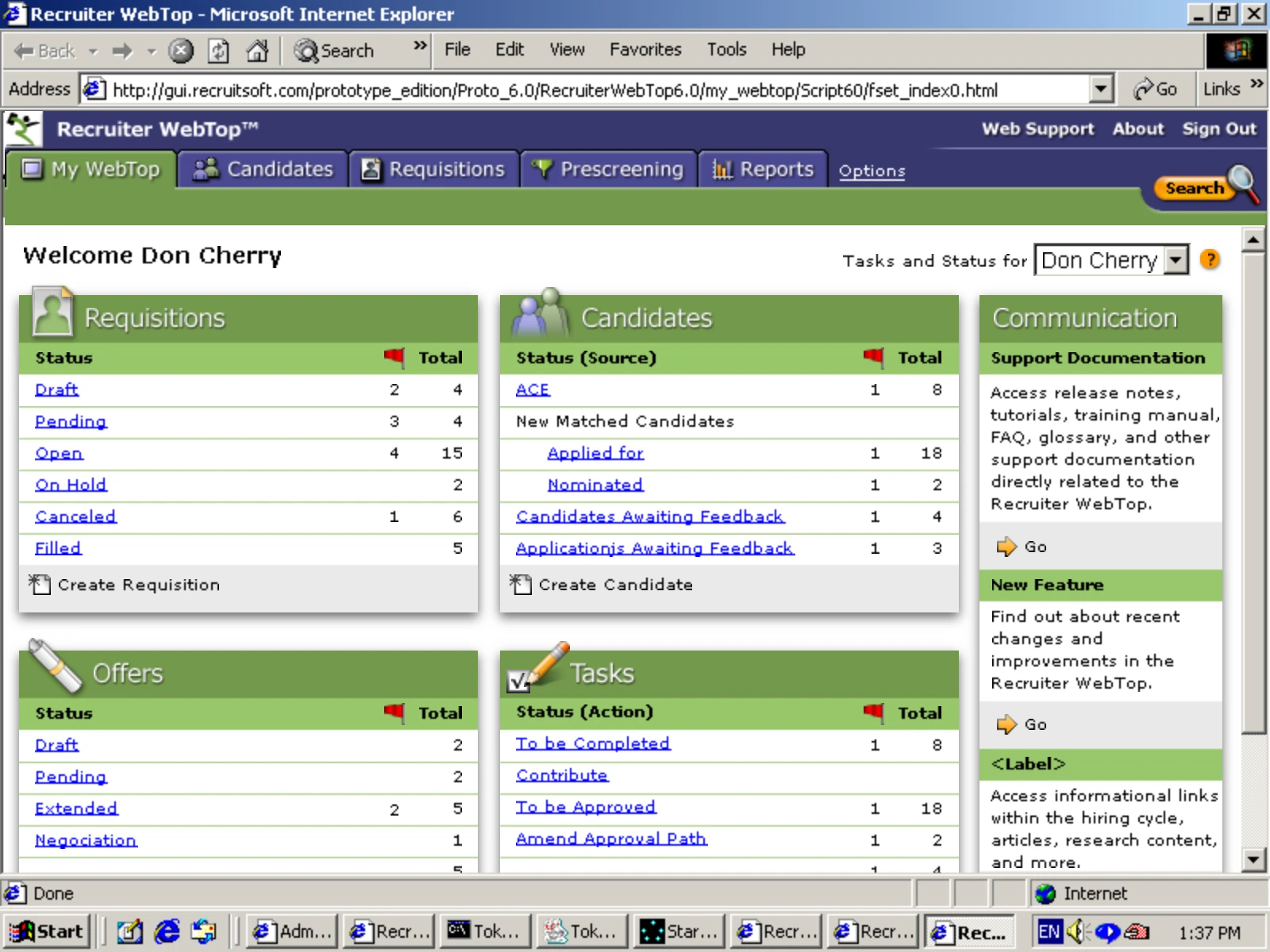
A recruiter at Bombardier or HP or American Airlines worked through hundreds of requisitions a week, each with a candidate pipeline, each with screening and scheduling and references and offers. The market at the time split that work across separate tools. The thesis behind Recruiter Webtop was that one workspace should hold all of it — requisitions, candidates, offers and tasks standing in a single frame, each showing what is waiting and what is overdue — so that the recruiter’s day had one place to happen.
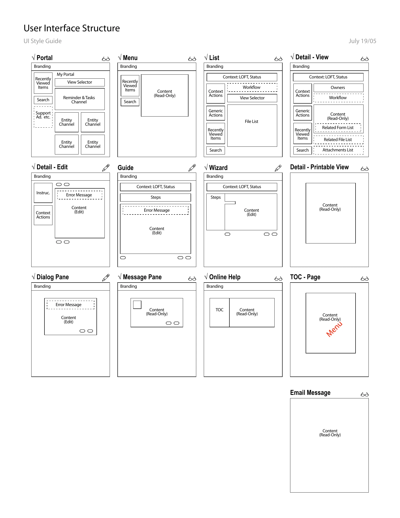
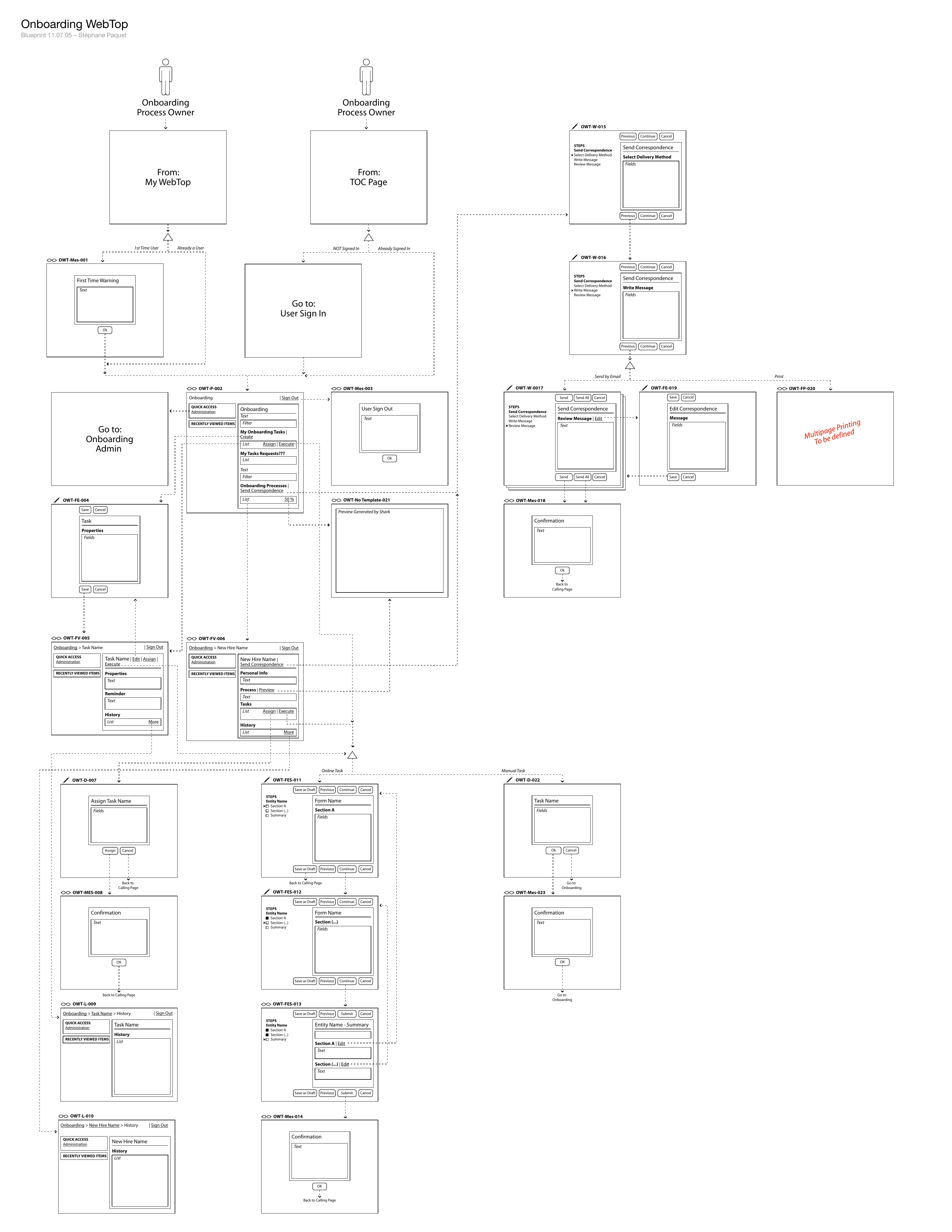
What is hard to convey now is how much of the work was not screens but a kit. By 2005 the platform had a page-type system — Portal, Menu, List, Detail-View, Detail-Edit, Guide, Wizard, Dialog, Message — each specified as a structure rather than a picture, and new WebTops were assembled from it rather than drawn fresh. An Onboarding blueprint from that November codes every screen it defines by its page type. That is the part that actually scaled: the interface had to absorb every change in compliance, language, integration and customer-specific workflow without losing the basic shape that made it usable on a Tuesday morning.
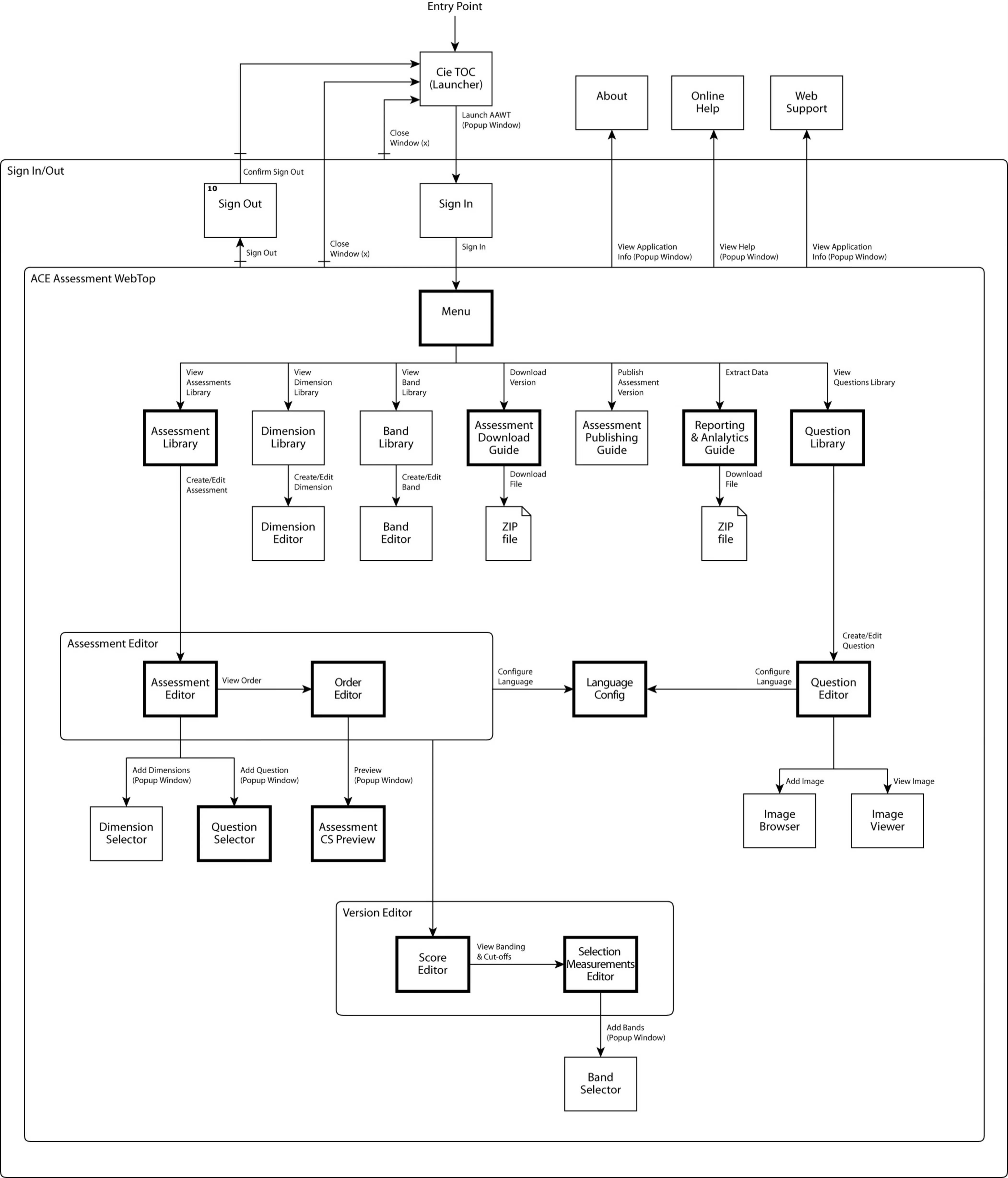
One of the platform features I contributed to as part of a team was ACE Assessment WebTop — Taleo’s psychometric screening tool, rebuilt multilingual. An assessment is a measuring instrument, so it cannot simply be translated in passing: the item a candidate reads in their own market has to be the item the psychologist approved for that market. Language became a property of the question itself, and an untranslated item announces itself in red rather than failing quietly.
By 2008 the Webtop had been shipping and scaling for years, and the harder question was the one above it: how should a director of staffing see the whole business at once, without opening every requisition? Monarch was the attempt to answer it by replacing the list with a funnel. The metaphor arrived on graph paper on April 30, was a rendered dashboard the next day, and spent the following three weeks being attacked — eleven personas, a written defect list, two rounds of pencil over printouts. It consolidated into a specification on June 5, presented to product management, and reached customer-branded mockups for Starwood and Starbucks and a working Adobe Flex prototype.
I left before Monarch moved into production, and it did not ship in this form. Recruiter Webtop kept shipping. Oracle acquired Taleo in 2012 for $1.9 billion, the Webtop ran on under Oracle Talent Management for years afterwards, and it was finally sunset in 2024 — twenty-five years after the first screen.
I — One Workspace
The whole argument of the Webtop is visible in one screen: everything a recruiter owes somebody, standing in a single frame. The hero above is the recruiter’s home. This is what one requisition looks like once you are inside it.
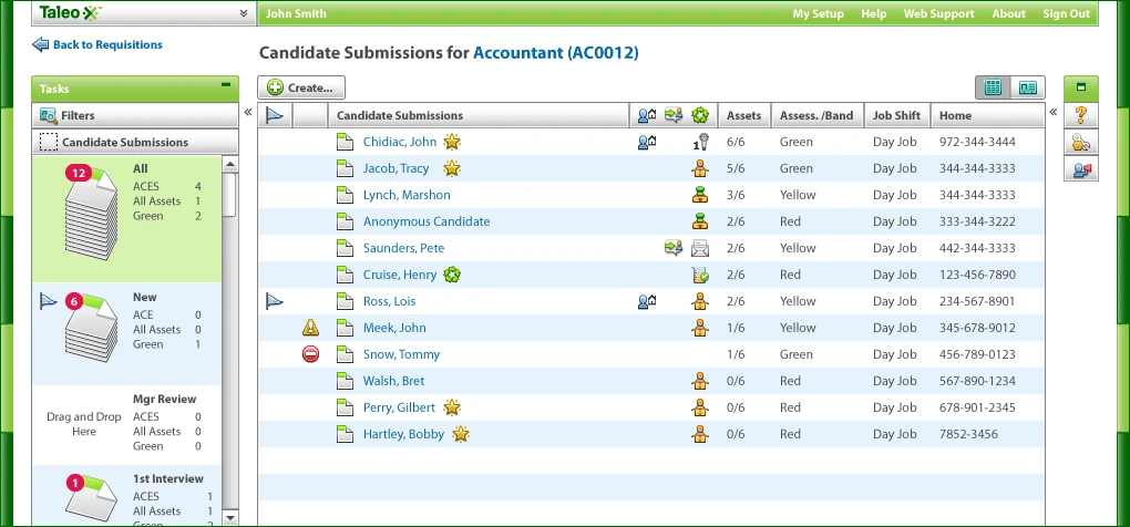
fig. 1 — One requisition, and the recruiter’s whole obligation to it in a single frame: tasks and filters on the left, the phase stacks — All 12, New 6, Mgr Review, 1st Interview 1 — each carrying its own counts, and the submissions themselves in the middle with assets, assessment band and shift. The Mgr Review stack reads Drag and Drop Here. The pile is not a metaphor added later by a concept project; it was already how the shipped product moved a candidate forward.
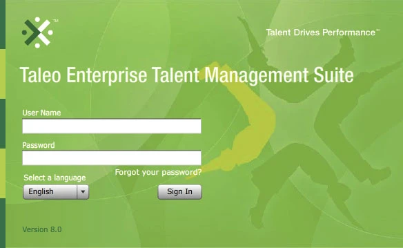
fig. 2 — The front door, at version 8.0. The language selector sits on the sign-in screen rather than in a preference found later, which is the platform’s multilingual claim made structural: you choose the language before you are anybody, because every tenant ran its own set.
II — The Kit
A platform that has to run in every country, for every customer’s idea of a hiring process, cannot be drawn screen by screen. By 2005 it was not being drawn at all — it was being assembled from a kit of page types, and the kit is the reason a decade of change never cost the product its shape.
fig. 3 — July 19, 2005 — the platform’s page types on one sheet. Thirteen of them, and each drawn as a structure rather than a picture: where branding sits, where context actions sit, where the content goes and whether it reads or edits — the glasses mean read-only, the pencil means editable. A tick means the type is settled. This is the vocabulary every WebTop was then assembled from, three years before Monarch.
fig. 4 — November 7, 2005 — the kit applied, at the scale of a whole product. Every screen in the Onboarding WebTop is coded by its page type: OWT-P-002 is the Portal, OWT-L-009 and -010 are Lists, OWT-W-015 through -017 are Wizard steps, OWT-FES-011 to -013 are the Form Editor by Steps. The reads-or-edits mark from the style guide rides on each frame. Nobody had to invent a screen — they had to choose a type and say what goes in it.
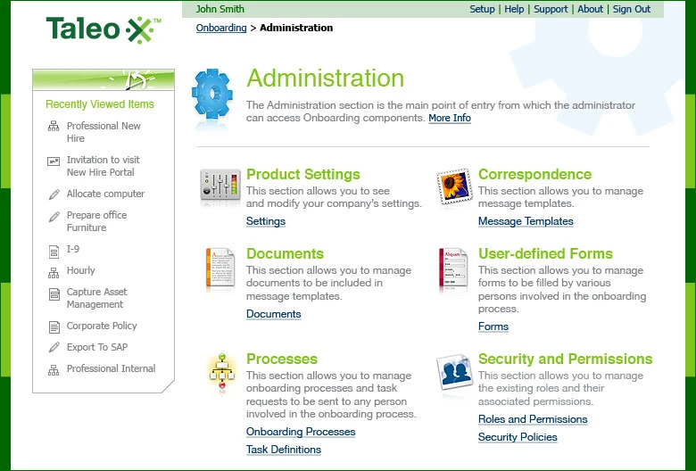
fig. 5 — The Menu page type, shipped. Six components of the Onboarding WebTop sitting exactly where the 2005 template says a Menu puts them, with Recently Viewed Items in the left rail the kit specifies — I-9, Allocate computer, Export To SAP. The distance between a template and a live product is usually where design systems die. Here the template is still legible in the thing that shipped.
III — Measuring People
ACE Assessment WebTop is where the platform’s multilingual rule met the one kind of content that cannot bend to it. A validated instrument only holds if the item a candidate reads in their own market is the item the psychologist approved for that market — so translation state had to become something the tool tracks in the open, rather than something a process quietly promises.
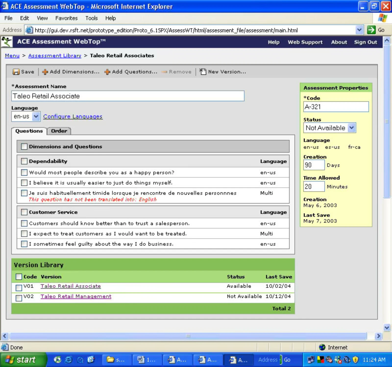
fig. 6 — The rule, enforced in the interface. A French item is sitting inside an English assessment, and rather than hiding it or substituting a machine translation, the editor says so in red: this question has not been translated into English. Every row carries its own language, so the psychologist can see the holes in an instrument before a candidate falls into one.
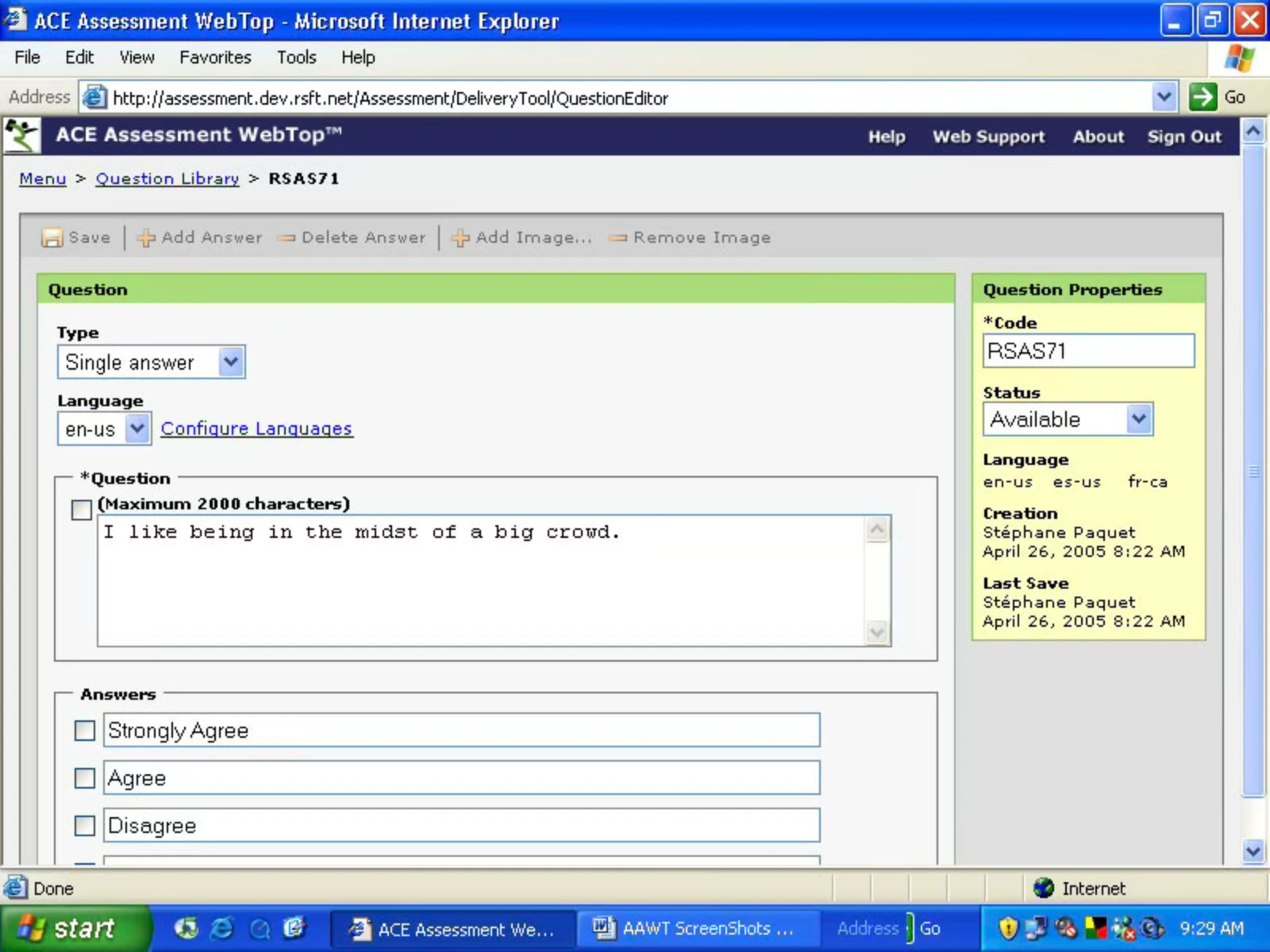
fig. 7 — One item, authored once. The question and its answer scale are a single unit — you cannot translate the statement and leave the scale behind, because in a psychometric instrument the scale is half the measurement. Language sits in the properties panel next to code and status, which is the whole design decision in one screen: a language is not a copy of the question, it is an attribute of it.
fig. 8 — The author’s map of the tool. Assessments, dimensions, bands and questions are each their own library, so an item can be written once and used in many instruments. The detail that matters is in the middle: both the assessment side and the question side run into one shared Language Config. There is a single place where a language is turned on, which is why the red flag two figures ago can be trusted.
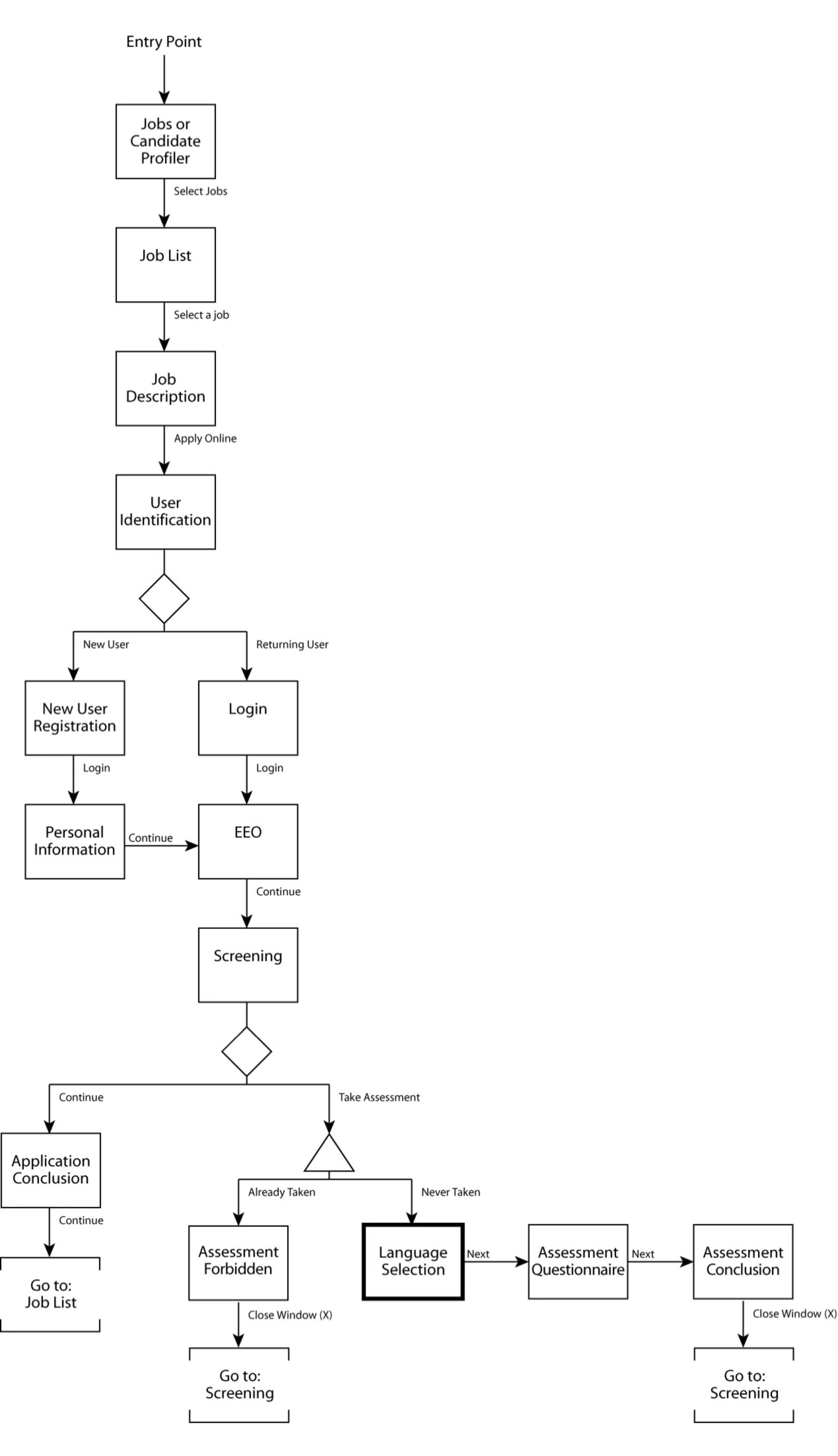
fig. 9 — The candidate’s path, with the awkward cases drawn rather than left to the implementation. Language Selection is the candidate’s own choice and sits immediately before the questionnaire, so the market language is picked by the person being measured. The fork above it is the one that protects the instrument: already taken sends you to Assessment Forbidden and back to screening — a dead end drawn on purpose.
IV — Monarch: The Vocabulary
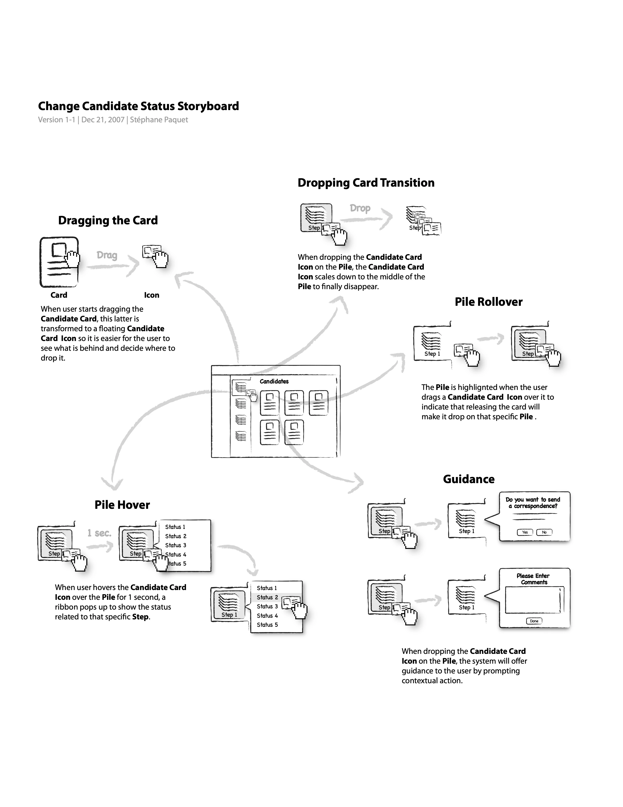
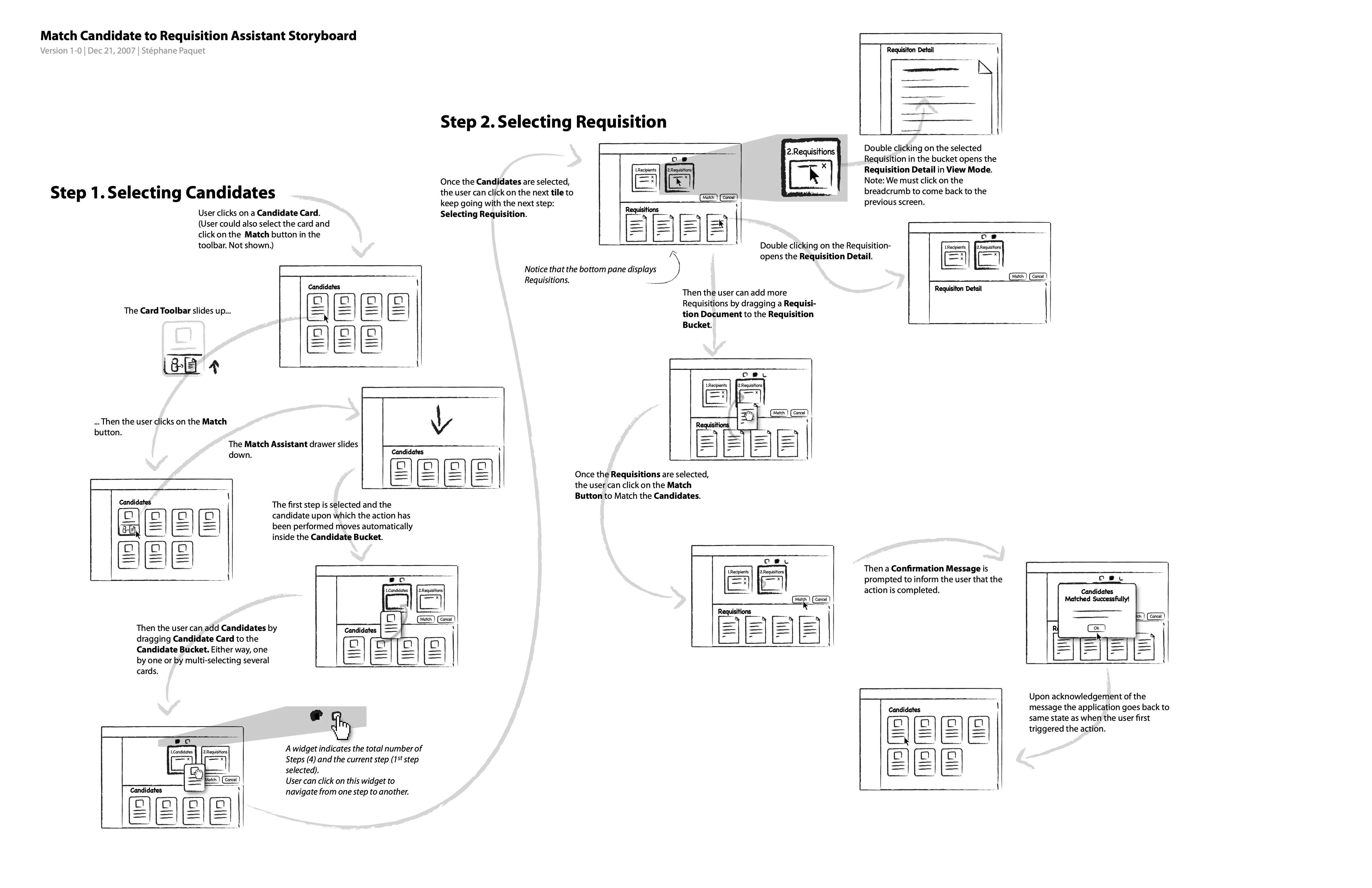
In 2008 the platform tried to replace itself. What follows is Monarch — a successor to the Webtop that reached a formal specification, customer-branded mockups and a working prototype. It did not ship. It begins five months earlier, and not with a funnel: two storyboards from December 2007 work out how a candidate is handled at all — how you pick one up, where you can put it down, and what the system says back.
Not shipped
fig. 10 — December 2007 — changing a candidate’s status, drawn as physical handling, and formalising the pile the shipped product already had. The card becomes a floating icon while dragged “so it is easier for the user to see what is behind and decide where to drop it”; the pile highlights when you cross it. Bottom left is the beat that matters: hover a pile for one second and a ribbon of its statuses opens. That one second reappears, unchanged, in the June specification.
fig. 11 — The Match Assistant, drawn as a drawer that slides down over the work rather than a page you are sent to. A widget tracks the total number of steps and which one you are on, so the assistant is navigable rather than a one-way wizard — and the sheet follows the two selection steps all the way through to the confirmation and back to the state the user started in.
V — Monarch: The Metaphor
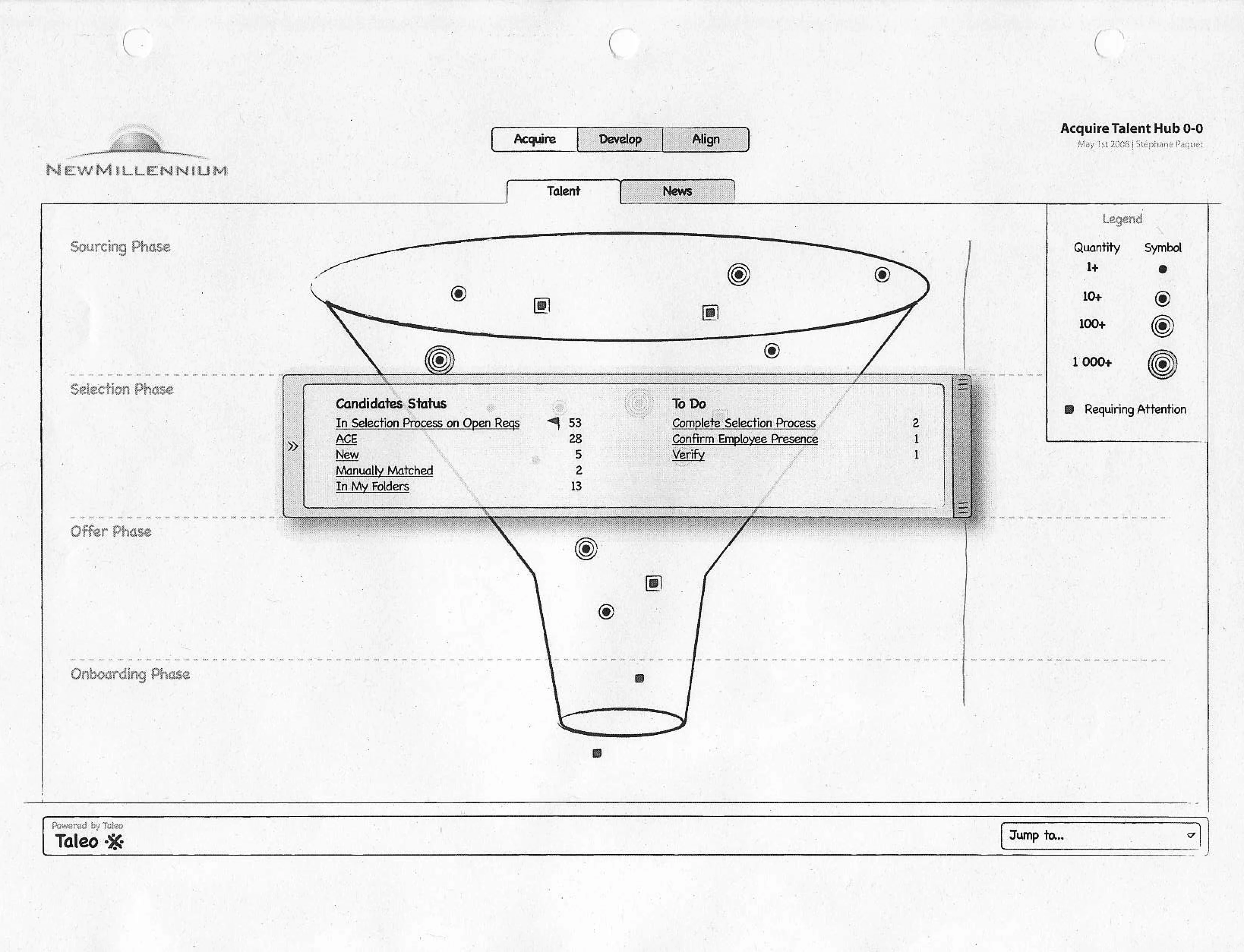
The funnel arrives on April 30 and is a finished artifact on May 1. The interesting thing about these two pages is how little distance there is between them — the sketch is not a rough idea that a mockup later rescued. It is the whole system, and the mockup is a transcription.
Not shipped
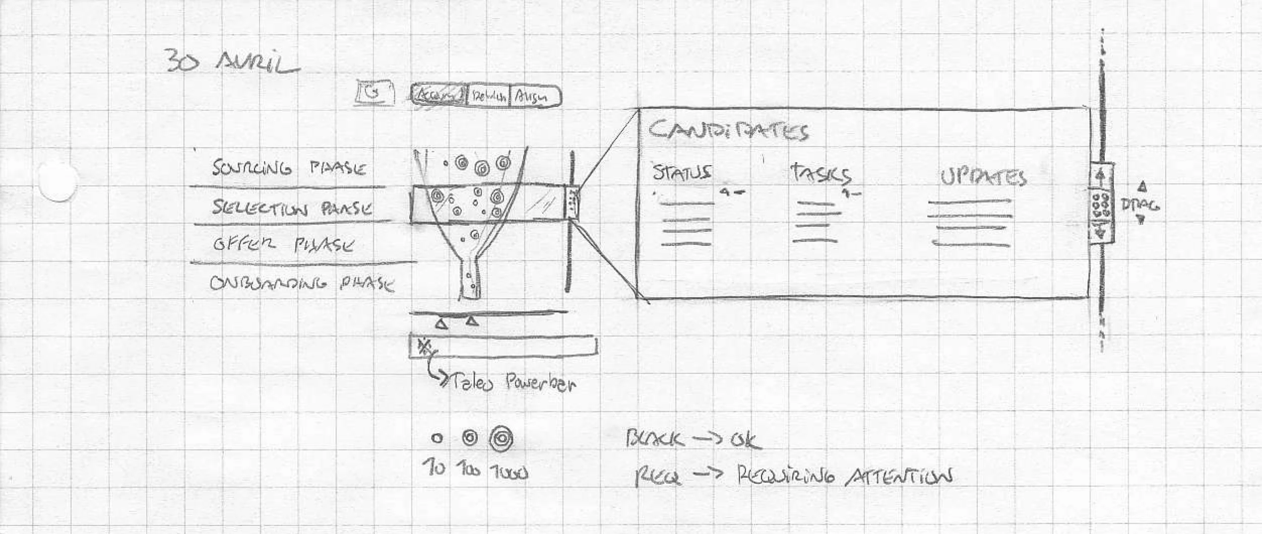
fig. 12 — April 30, 2008 — the origin sketch, in French, on graph paper. The four phases are already named and in order, the concentric icons already encode quantity at 10, 100 and 1,000, and the colour rule is already written down: BLACK → OK, RED → REQUIRING ATTENTION. Everything the specification would argue five weeks later is on this page.
fig. 13 — May 1, 2008 — one day later, under a fictional customer’s brand. The legend is the pencil scale, promoted to a rule: quantity reads as concentric rings at 1+, 10+, 100+ and 1 000+, and a filled square means requiring attention. The panel across the waist is the recruiter’s half of the screen — In Selection Process on Open Reqs, ACE, New — laid over the director’s half rather than replacing it.
VI — Monarch: Interrogating It
The metaphor took a day. The next three weeks were spent trying to break it — first by asking who would actually use it and whether a funnel is even the right picture for them, then by listing its faults in writing, then by printing it out twice and going at it in pencil.
Not shipped
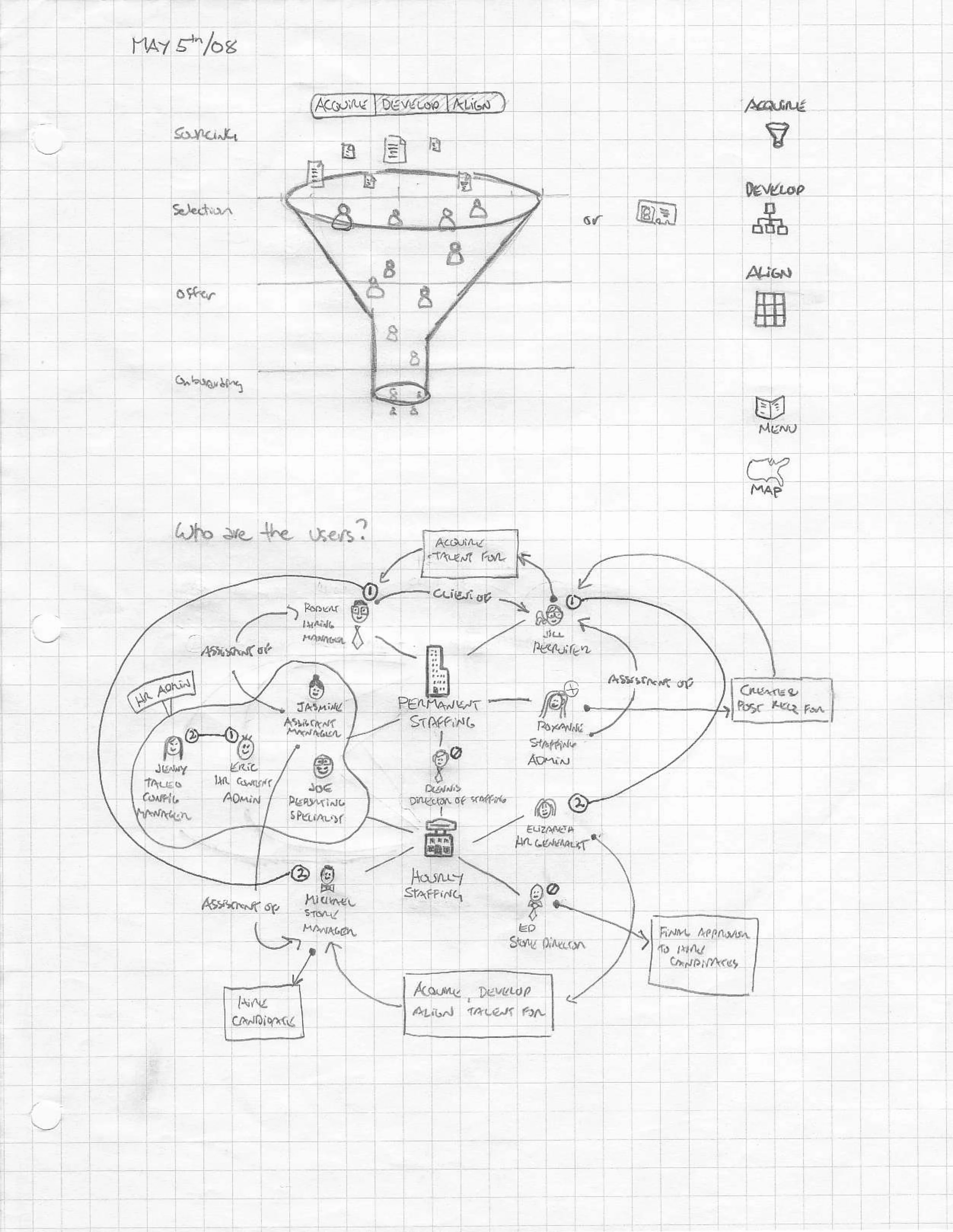
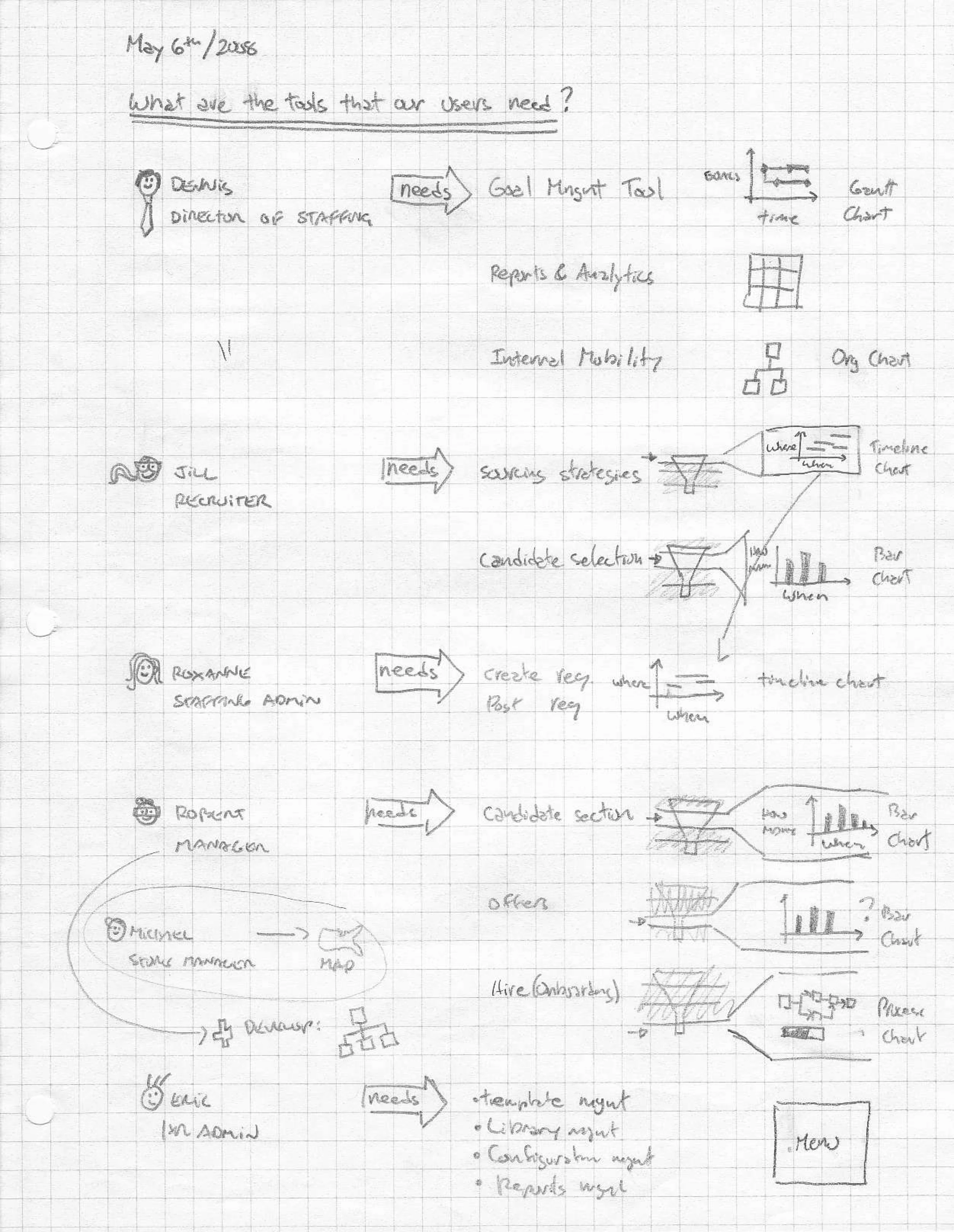
fig. 14 — May 5 and 6 — the two questions that decide whether a funnel is even the right answer. Eleven personas, mapped by what they do to each other rather than by demographics: who is the assistant of whom, who gives final approval to hire, which of them lives in permanent staffing and which in hourly. Then each of them resolved to the chart their need actually wants. Michael, store manager, gets a map. Three weeks before Starbucks appears, the map is already in the analysis.
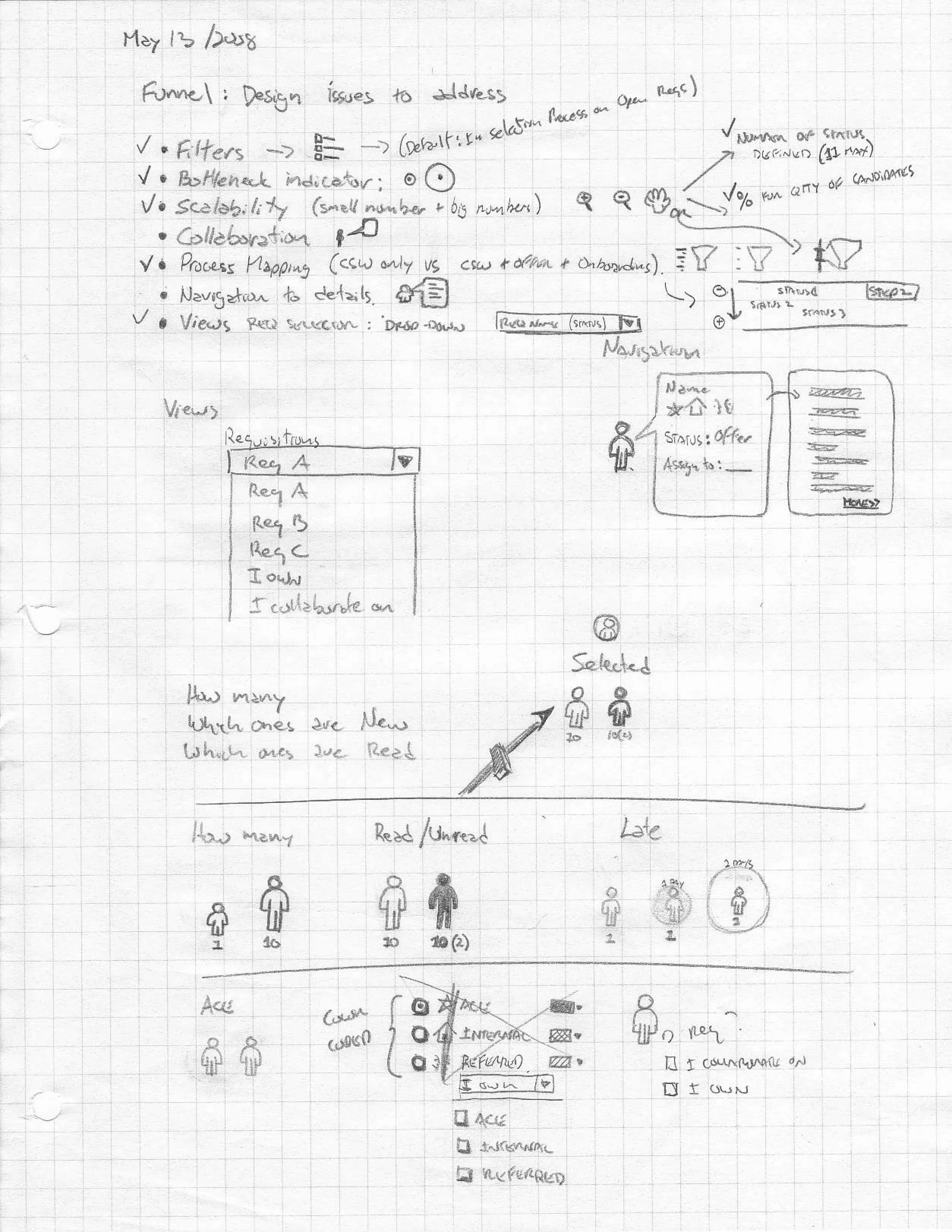
fig. 15 — May 13 — the funnel’s own defect list, written by the person who drew the funnel. Seven problems it has not yet solved, each ticked as it falls: filters, bottleneck indicator, scalability at small and big numbers, collaboration, process mapping, navigation to details, views. Three weeks later these are the specification’s table of contents. The habit worth noticing is that the list exists at all — the metaphor was never allowed to be self-evident.
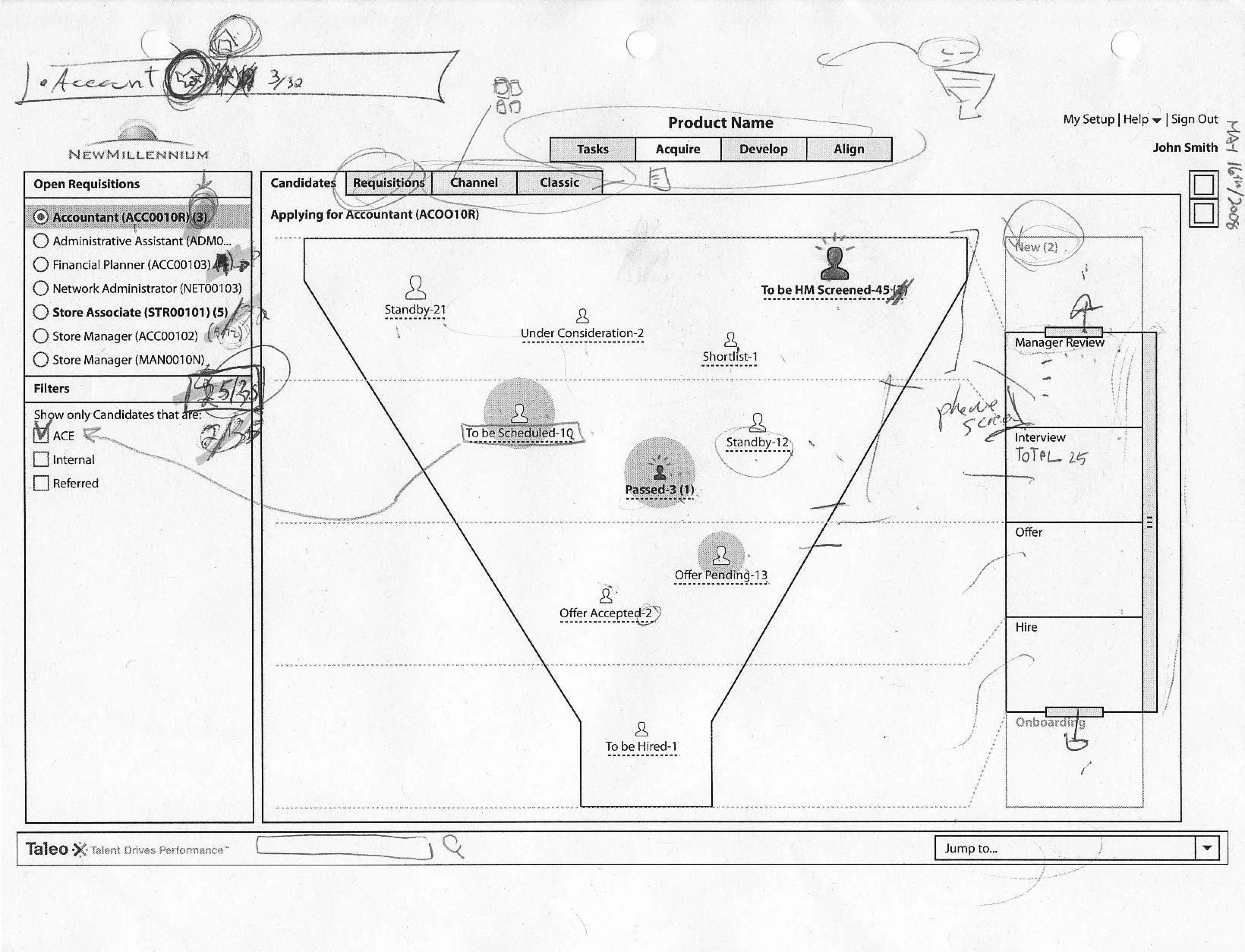
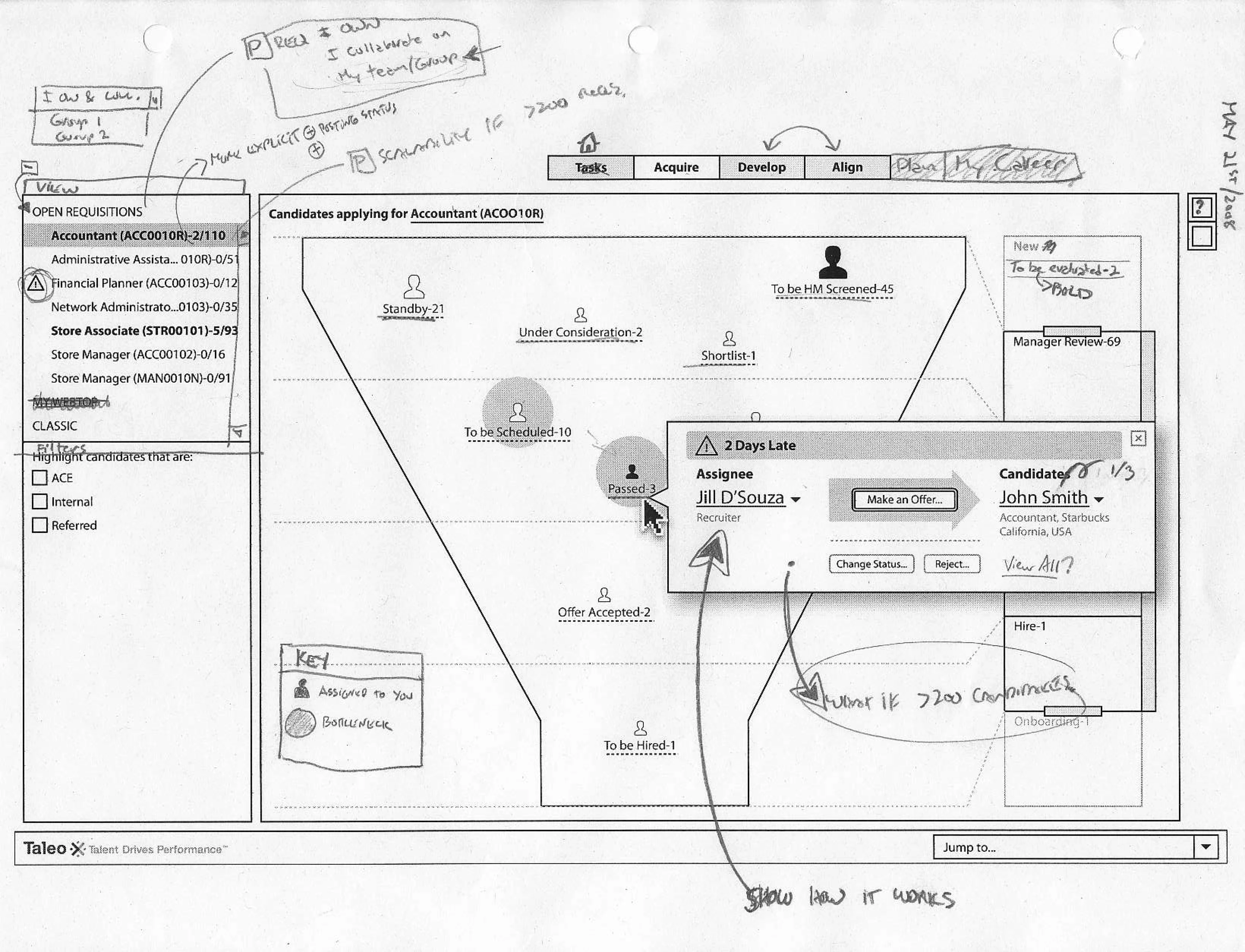
fig. 16 — May 16 and May 21 — the same screen, printed and attacked twice. The critiques are not polite: what if there are more than 200 candidates, what if there are more than 200 requisitions, SHOW HOW IT WORKS. By the second pass the counts have been rewritten as ratios (2 of 110 open, 5 of 93), a hand-drawn KEY has appeared because the icons were not self-explanatory, and the callout that answers “what must I do” is sitting on the screen.
VII — Monarch: The Specification
On June 5 the thread consolidated into a formal specification and went to product management. A metaphor is cheap; a metaphor that survives 5,000 candidates, defines what “clogged” means numerically, and tells a named person what to do next is a product proposal.
Not shipped
fig. 17 — June 5, 2008 — the cover, and the butterfly the programme was named for.
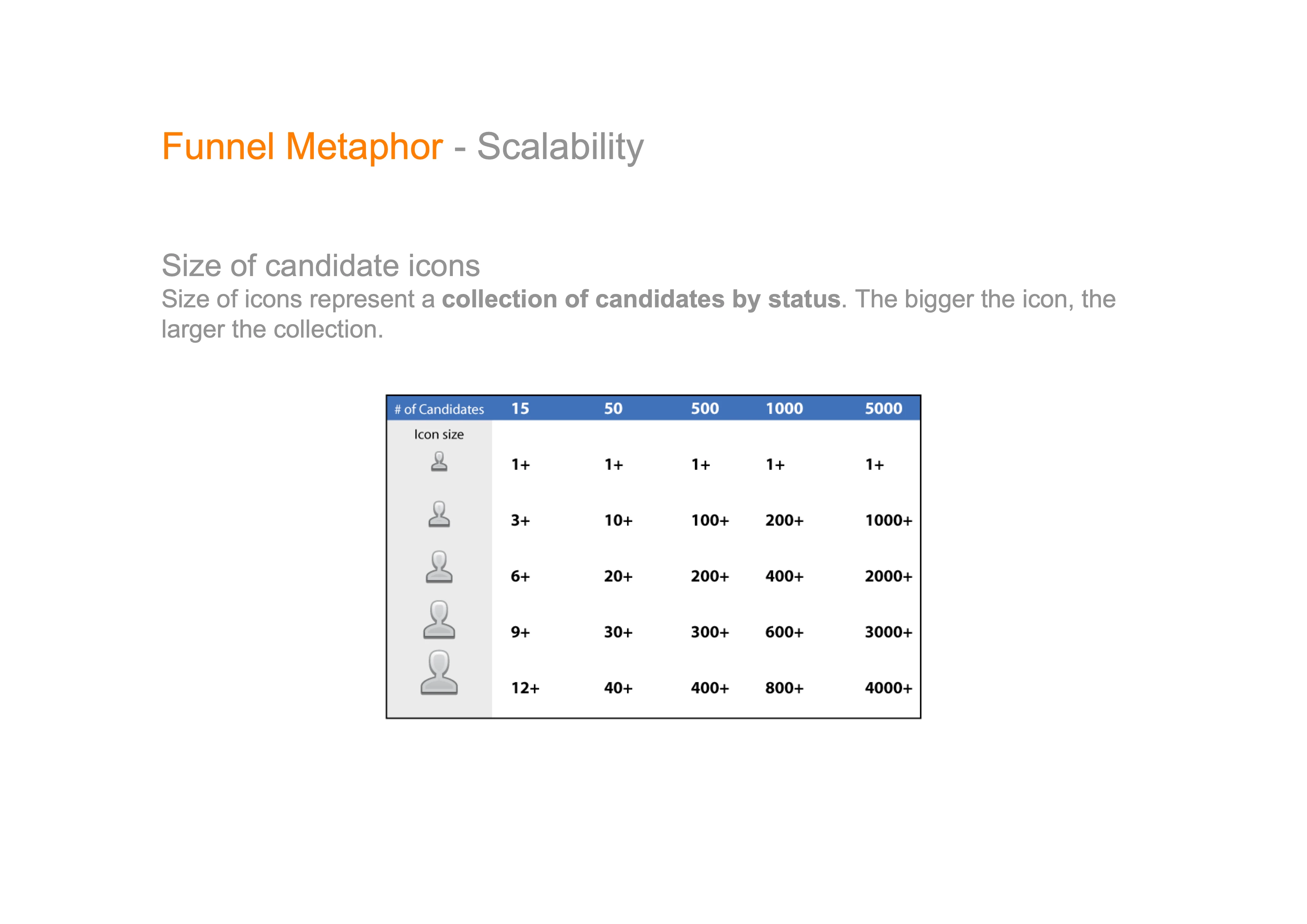
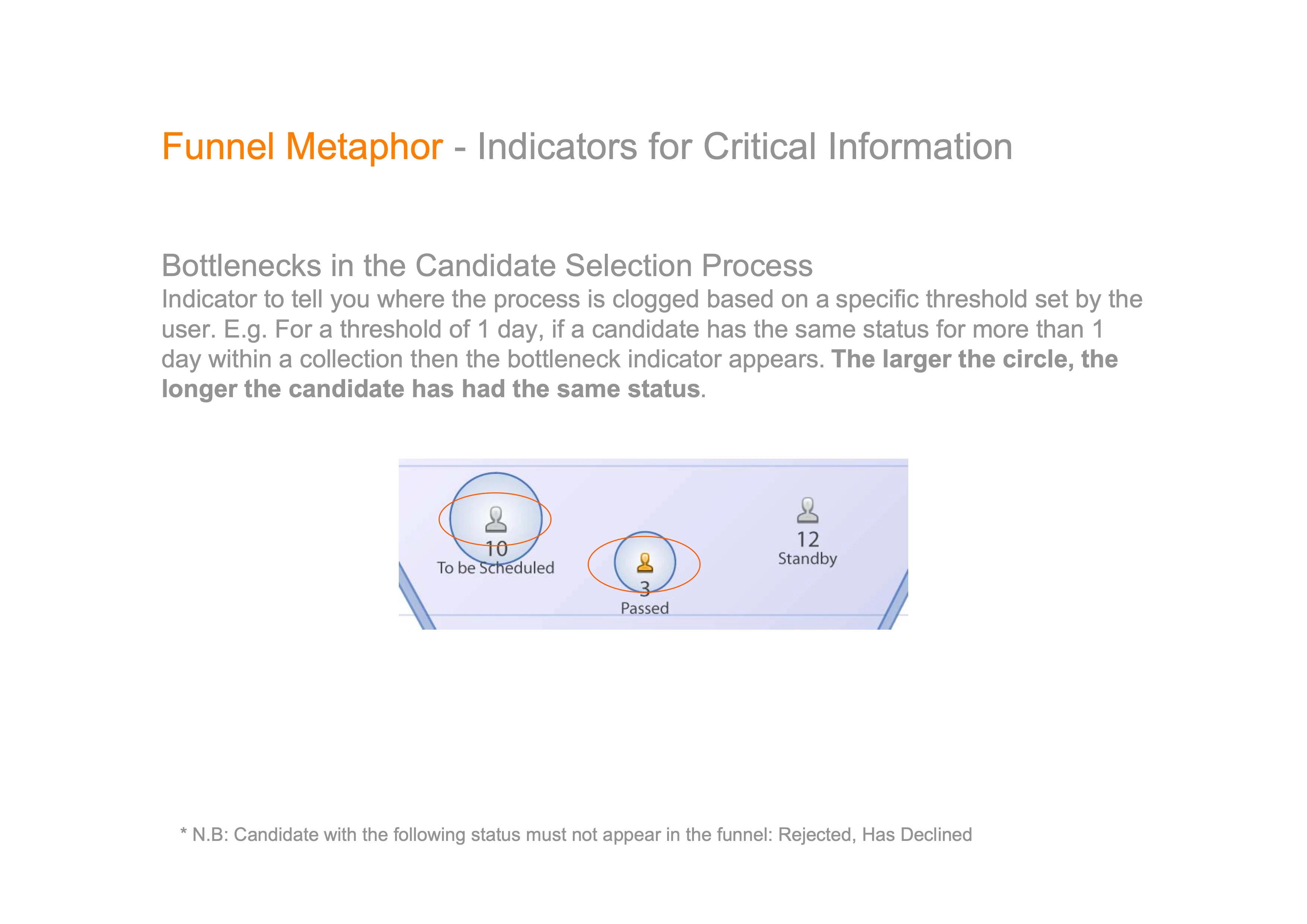
fig. 18 — The two things a metaphor has to answer for. Left: the icon scale is not one scale but five, re-calibrated per pipeline — the same icon that means 3+ in a fifteen-candidate requisition means 1 000+ in a five-thousand one, so the picture stays readable at either end. Right: a bottleneck is not a colour someone chose, it is a threshold the user sets — same status for longer than a day — and the circle grows with the wait.
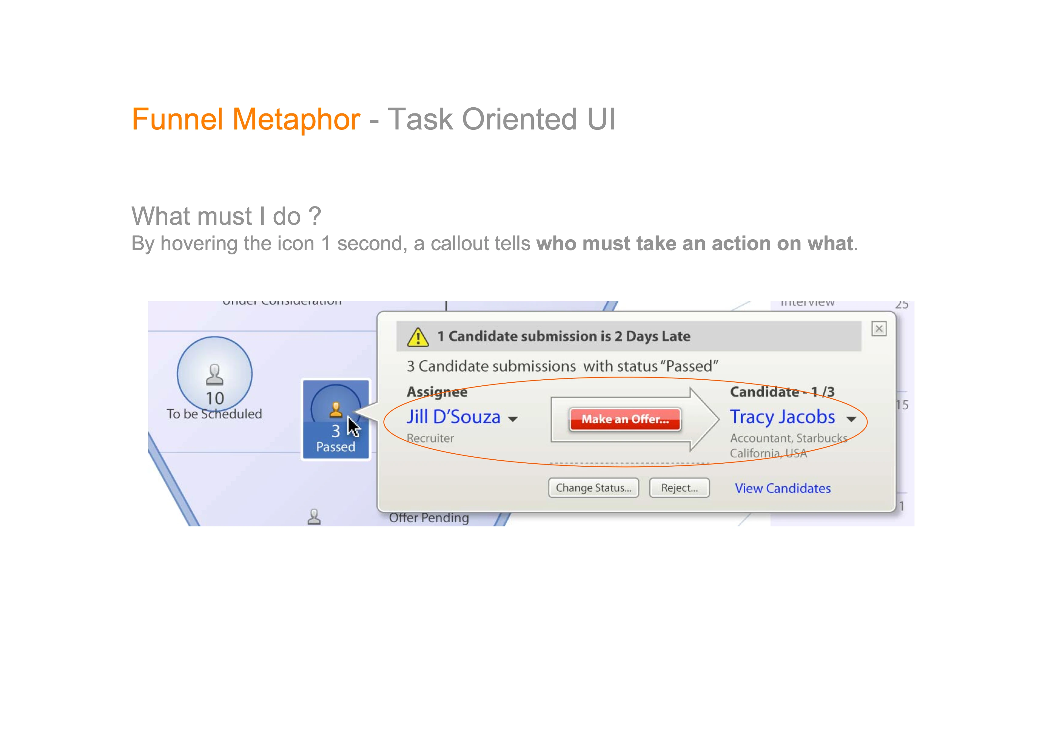
fig. 19 — The specification’s sharpest page, and the one that answers the pencil note. Hovering a collection for one second says one candidate submission is two days late, and then does the thing a dashboard usually refuses to do: it names the person who must act, the action, and the candidate it concerns, in one sentence you can read left to right. The hover interval is the one drawn in December 2007, unchanged.
VIII — Monarch: Same System, Different Person
Two customers took the system into their own context, and the funnel did not follow into both. That is the point rather than a compromise: the May 6 analysis had already said the store manager needs a map, so when Starbucks arrived, the map was waiting.
Not shipped
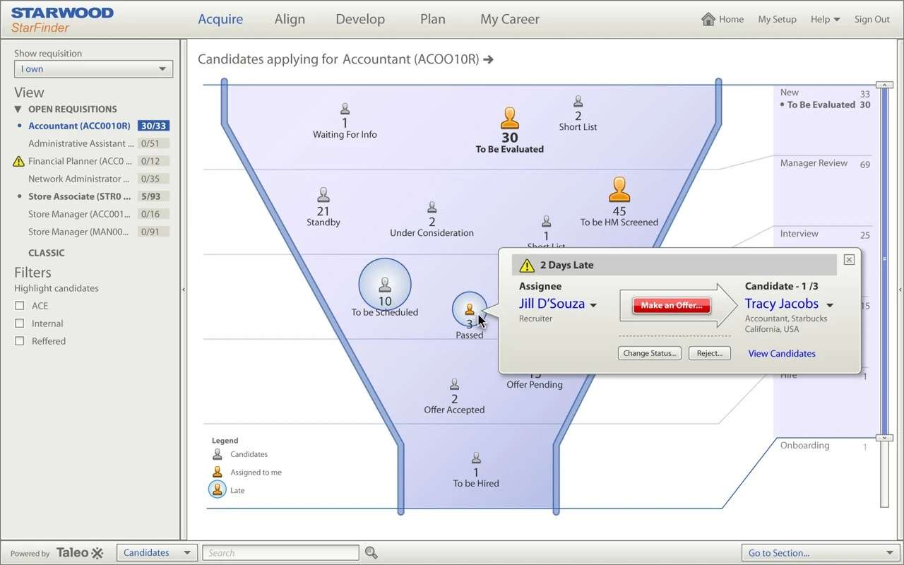
fig. 20 — Starwood’s StarFinder — the concept at its most finished, and the closest Monarch came to looking like a product. Everything the five weeks argued for is present and working together: the phases, the collections sized by quantity, the bottleneck rings, the legend, the process rail down the right, and the callout open on a late offer. Powered by Taleo, in someone else’s colours.
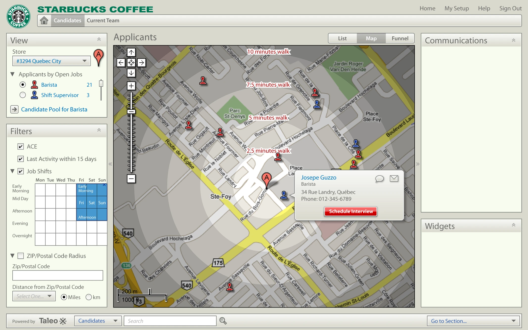
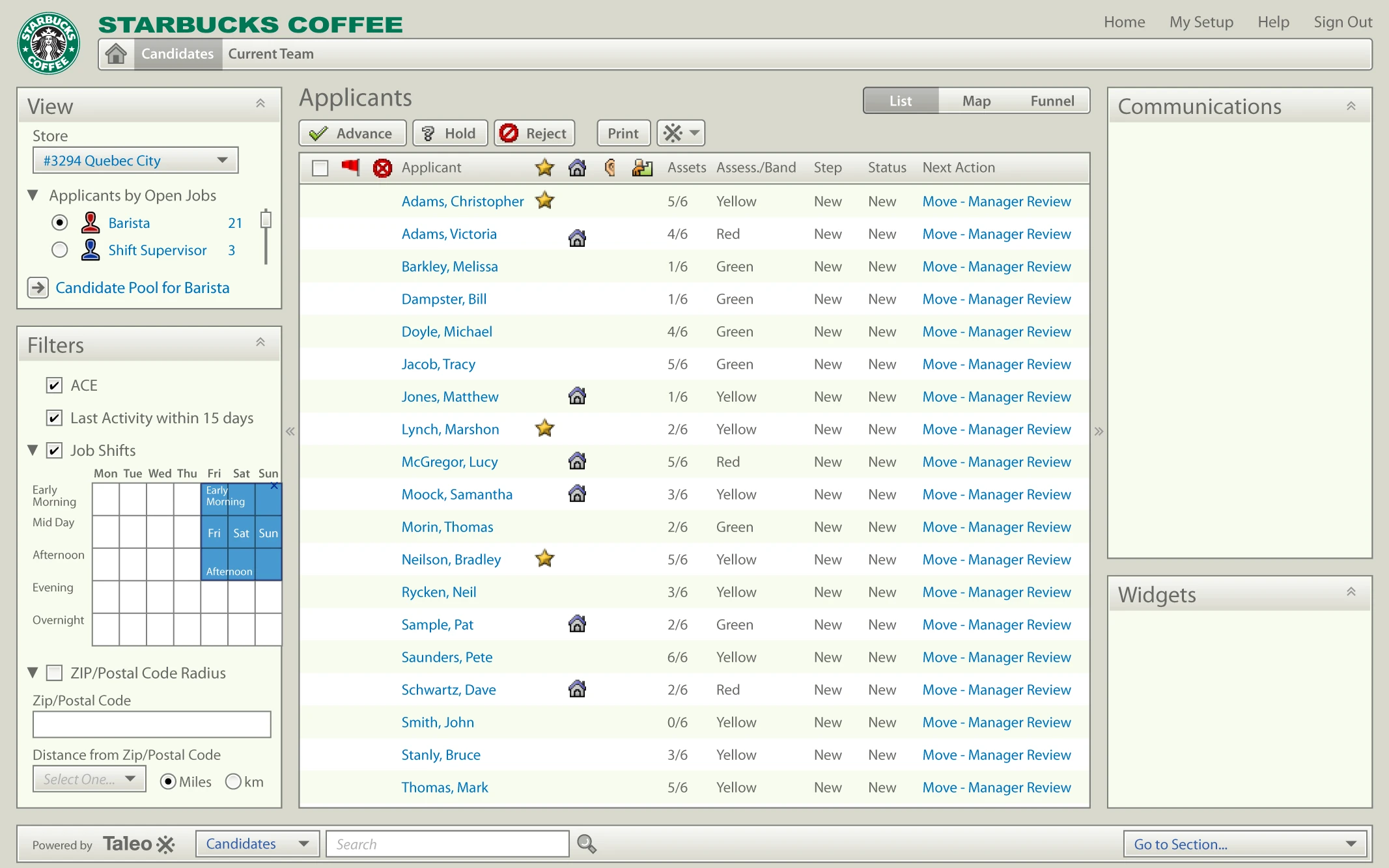
fig. 21 — Starbucks — the store manager’s funnel is a map. For hourly retail hiring the two questions that decide everything are how far away someone lives and whether they can work the shift you need, so the visualisation answers those directly: applicants plotted in walking minutes around store #3294, filtered by a shift grid. Then the same data, the same store, the same filters, one toggle away — List, Map and Funnel together at the top right. The whole argument of the programme, reduced to a three-item control.
IX — Monarch: What Was Built, and What Came Off the Desk
Monarch was not only paper — and it was not only the funnel. Alongside that thread the core requisition screens were running as an Adobe Flex build on an internal trunk, and a separate March–April thread asked the same question one level up: if the interface is a system rather than a set of screens, what happens when you carry it off the desk?
Not shipped
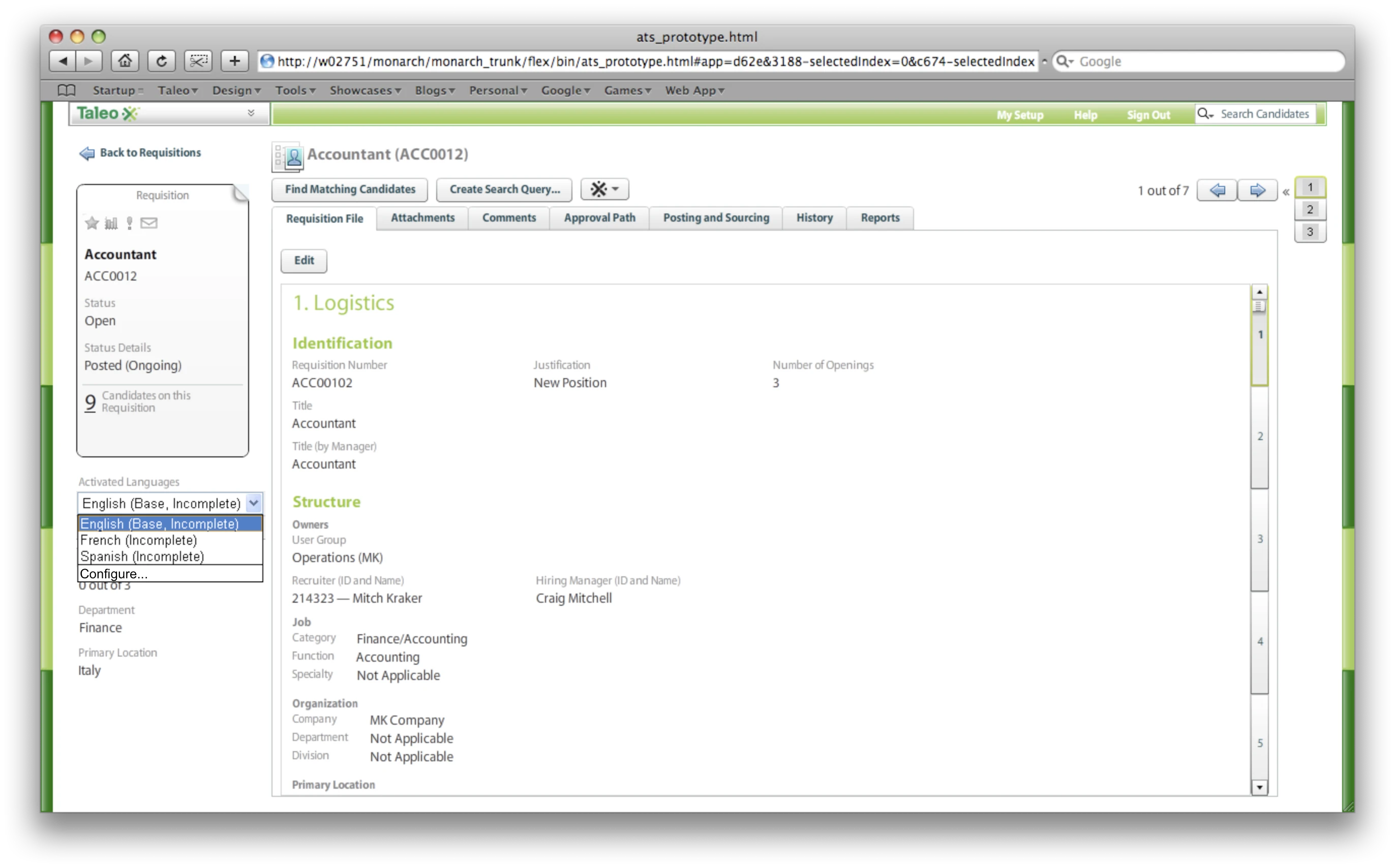
fig. 22 — Not a mockup — a running build, captured with the address bar left in. The path reads monarch_trunk, in April 2008, two weeks before the first funnel sketch: Monarch was the programme and the funnel was one thread inside it, which is why a prototype can predate the concept it supposedly follows. The open menu is the other thing worth seeing — language is a property of the requisition itself, activated per tenant and honest about being incomplete.
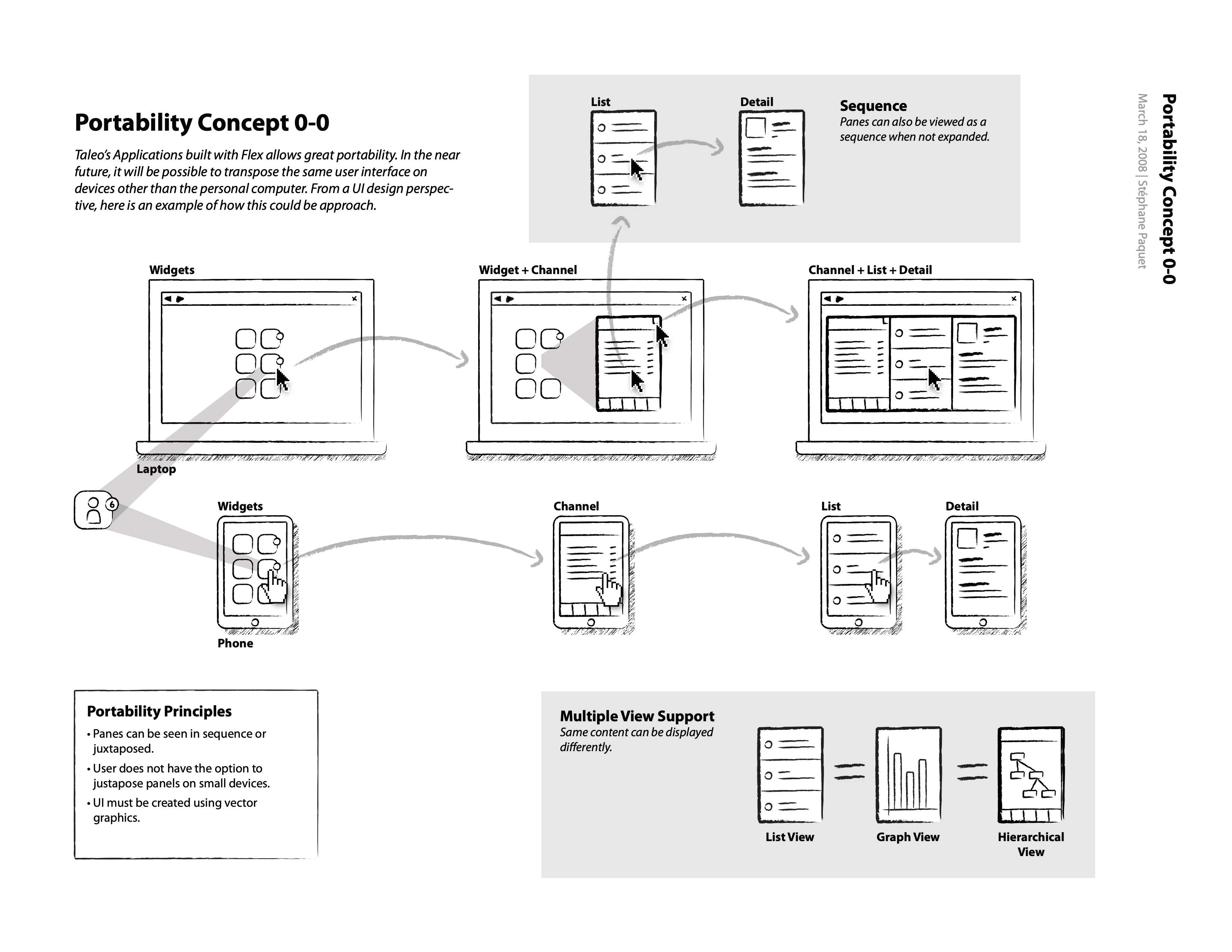
fig. 23 — March 18, 2008 — the same interface, transposed rather than redrawn. The laptop expands panes side by side; the phone walks the identical panes in sequence. The three principles in the corner are the whole idea: panes can be seen in sequence or juxtaposed, the user does not get to juxtapose on small devices, and the UI must be built in vector graphics. Responsive layout and resolution independence, written down as rules, in early 2008.
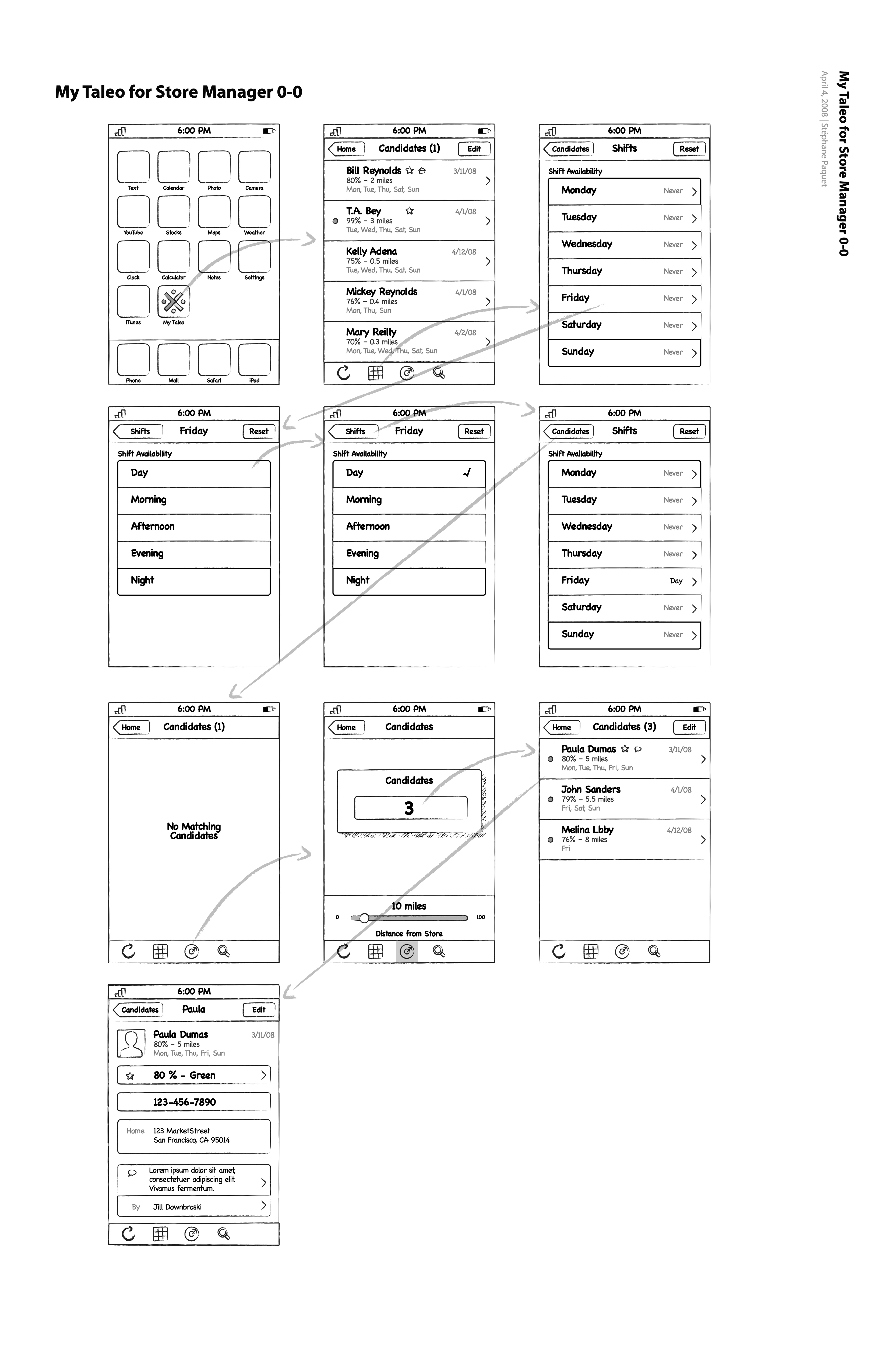
fig. 24 — April 4, 2008 — a My Taleo icon sitting on the home screen of the original iPhone, three months before the App Store existed to put it there. The store manager’s job is compressed to what a phone is good for: who matches, how far away they are, which shifts they can cover, call them. The empty state is drawn too, which is the tell that this is a designer working rather than a demo.