Lead Designer, InfraRed
Lifting the Veil
Lead designer at Liquidnet’s New York office, 2009–2011. InfraRed turned the institutional demand moving through one of the world’s largest trading networks into something a public company could actually read — delivered to issuers through NYSE Euronext’s NYSEnet portal, and shipped across web, mobile, and HTML email. I learned the market structure first, in notebooks, then designed the thing that made it legible.
Liquidnet ran one of the world’s largest institutional trading networks. The institutions inside it bought and sold constantly, and that activity said something about a company that the company itself could not see: whether the people who owned the stock were quietly accumulating it, or quietly leaving. A public company had its share price and its volume, which is history. It had no read on intent.
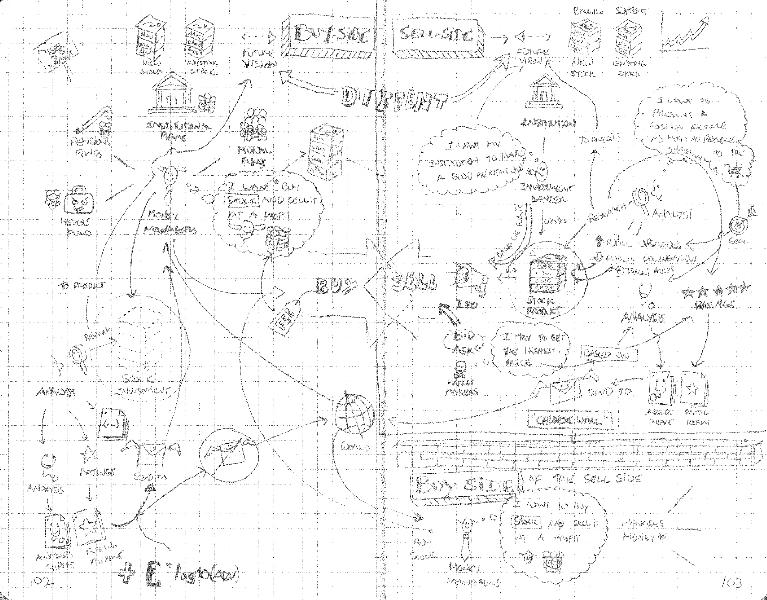
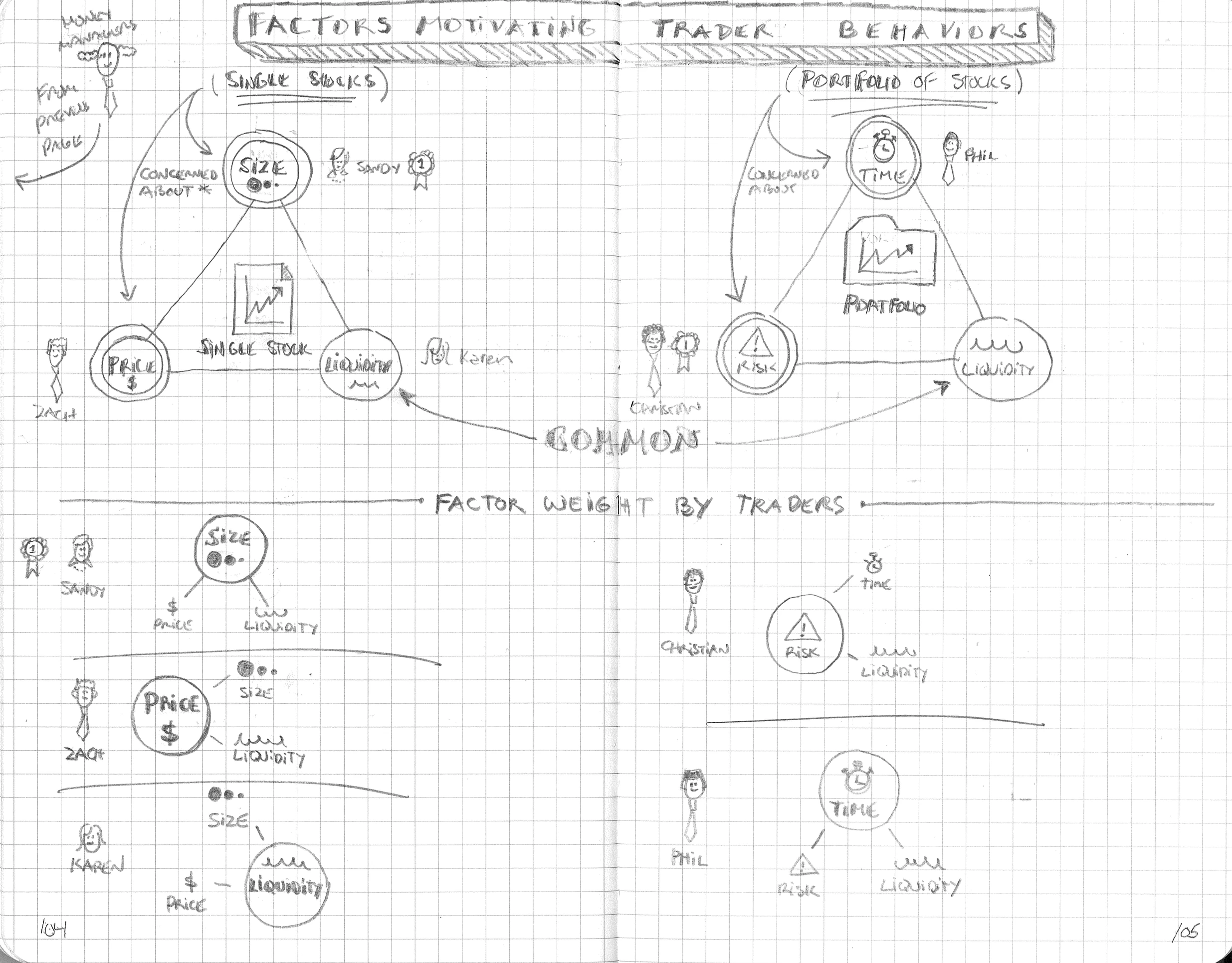
I did not know this world when I arrived, so I drew it. Buy-side and sell-side rendered side by side, actors with motivations in their own voice. Then the people inside it — five trader personas weighted against Size, Price, Liquidity, Time, Risk, with Liquidity identified as the common vertex between single-stock and portfolio decisions. Liquidity was what Liquidnet existed to serve. The user’s mental model and the company’s value proposition met at the same point, and that point is what the product was built on.
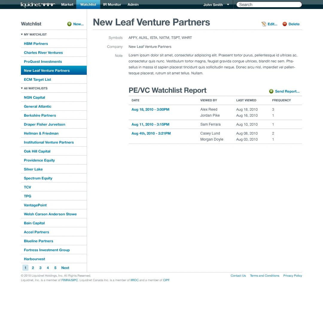
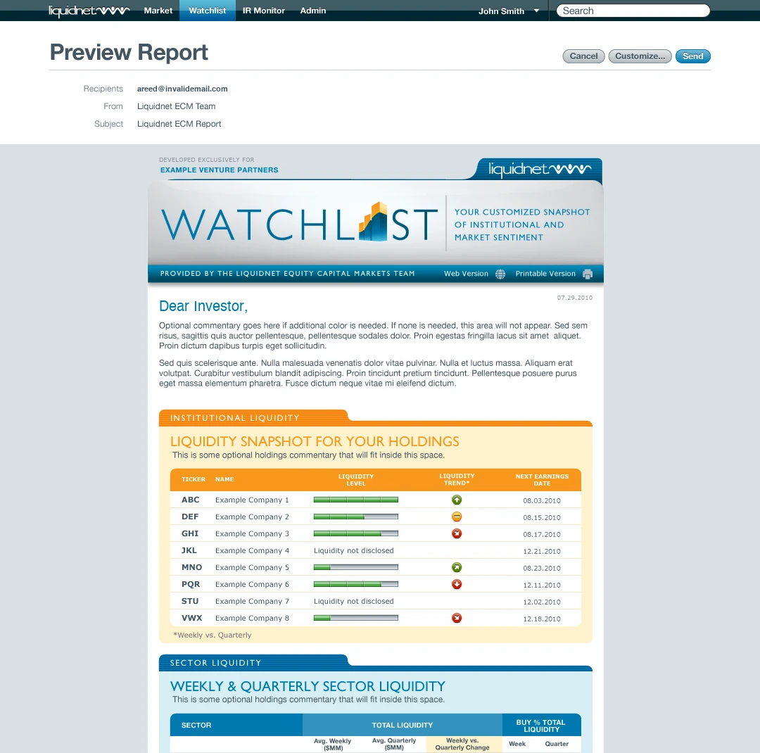
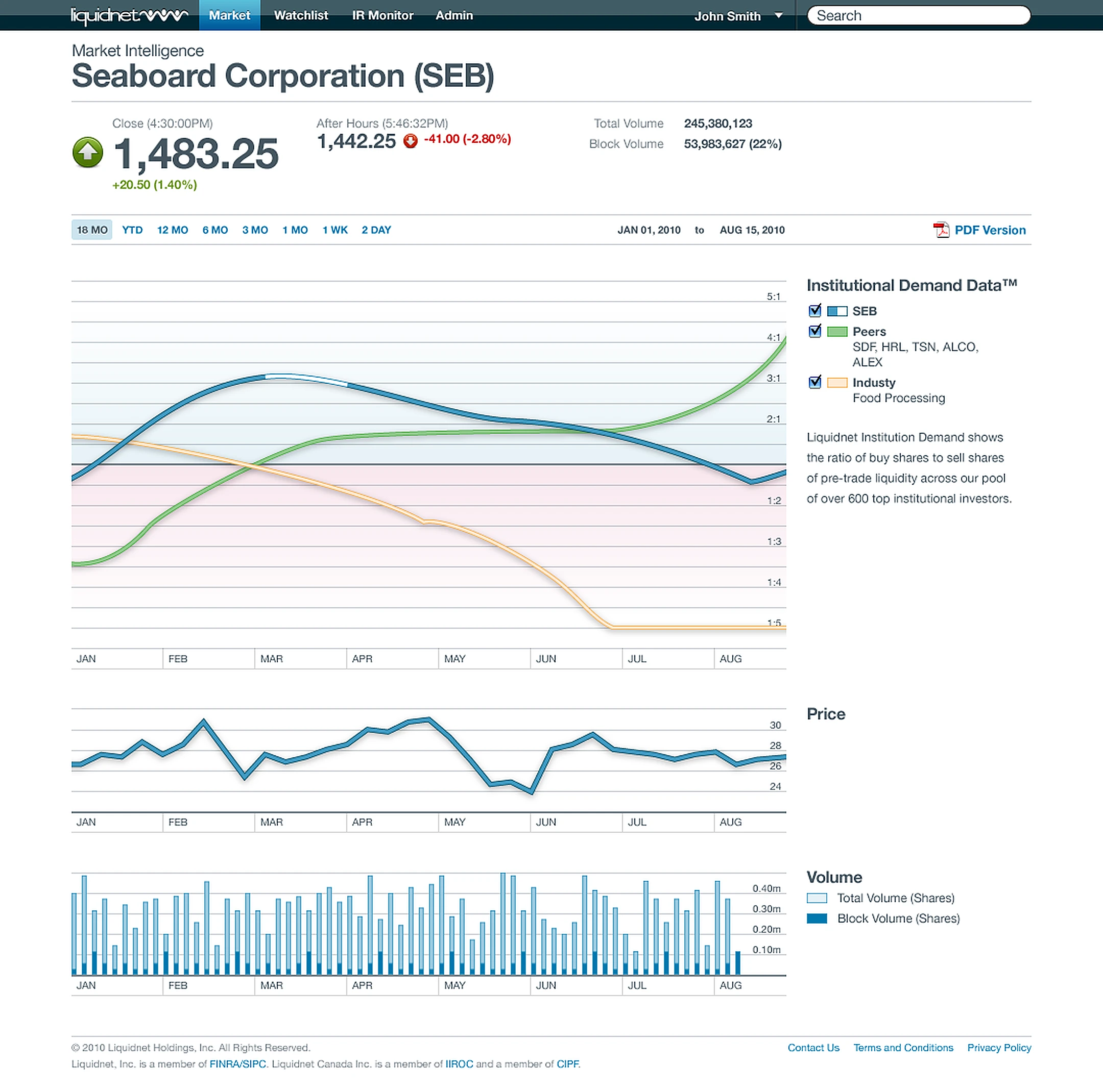
InfraRed, the institutional intelligence product, was the last thing I worked on at Liquidnet. Delivered to issuers through NYSE Euronext’s NYSEnet portal, the product turned the network’s own pre-trade data into Institutional Demand Data™ — the ratio of buy shares to sell shares across a pool of more than 600 institutional investors. It shipped on two surfaces: a web application, and a set of HTML email reports delivered to clients’ inboxes.
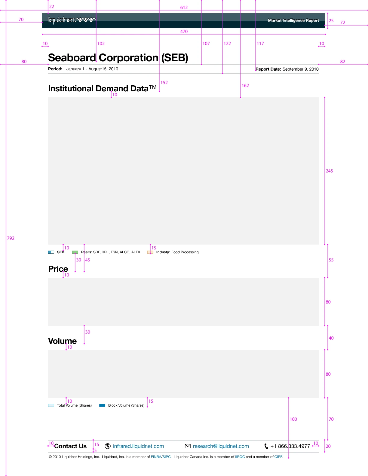
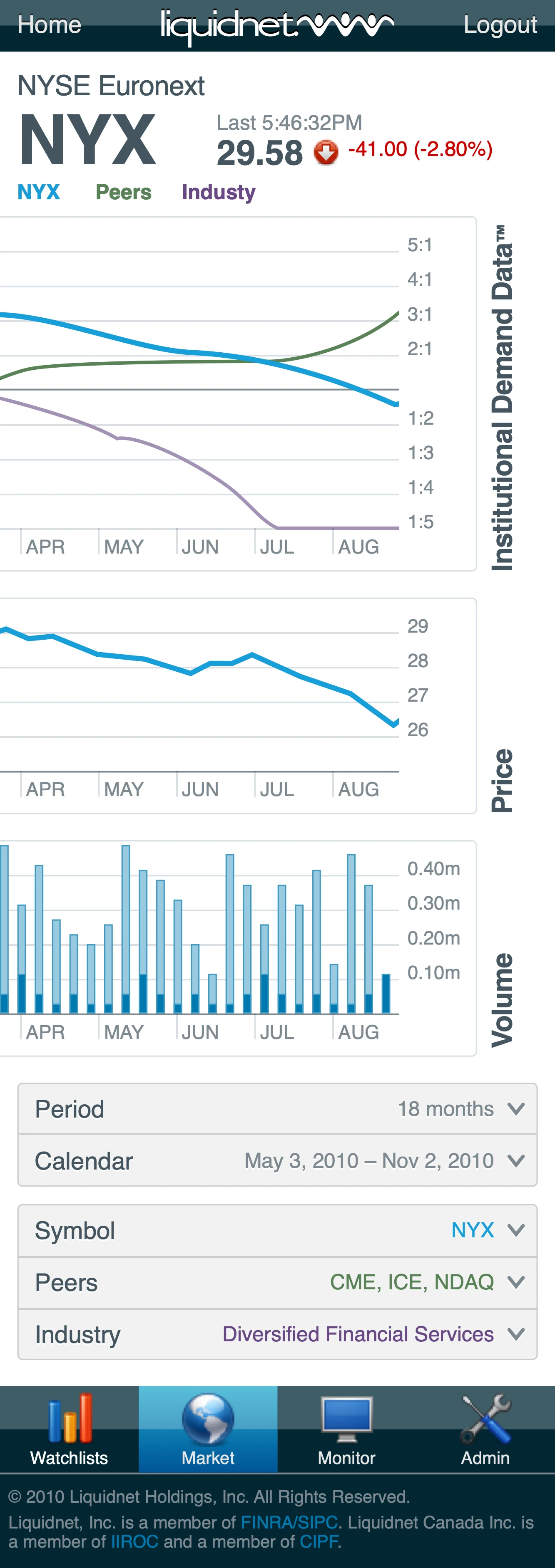
The hero of the web application was the Market Intelligence screen: one shared timeline carrying institutional demand, price, and volume, so intent and history could be read against each other at a glance. The reports were the harder half. They went out as HTML email, which meant the product ended somewhere it did not control — an inbox — with no layout engine to fall back on and no way to know which client would open it. Every margin had to be specified rather than trusted to the render. The mobile design carried the same modules at thumb scale, and was handed to engineering before my contract ended.
I — Learning the Domain
Before the product, the world the product would report on. Two notebook spreads from 2009 — the first mapping the industry, the second mapping the people inside it. Neither was a deliverable. They are how I learned institutional trading well enough to design for it.
II — InfraRed
InfraRed was the last thing I worked on at Liquidnet, and the thread where the mapping paid off. It turned the pool’s own pre-trade data into a product — Institutional Demand Data™, the ratio of buy shares to sell shares across more than 600 institutional investors — and shipped it on two surfaces: a web application, and HTML email reports delivered where clients already were.