Permission to Interrupt

Senior UX Designer, Browser Toolbar

Permission to Interrupt

072011–2012

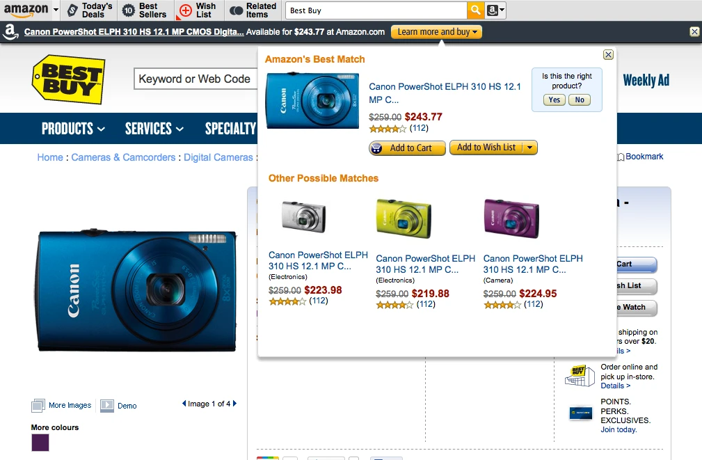
Senior UX designer at Amazon in Seattle, selected from more than two thousand candidates. The product was a browser toolbar — a category built on interrupting people — that surfaced Amazon’s daily deals and quietly found you a cheaper match while you shopped on somebody else’s site. The Firefox plugin reached 250,000 downloads.

A browser toolbar sits on the same strip of screen all day, on every site, whether or not it has anything worth saying. That is the entire design problem. The moment it does have something — a lightning deal with fifty-three minutes left on it, a camera twenty dollars cheaper than the one on the page in front of you — it has to say so without becoming the thing people uninstall. Everything I drew for that product was a rule about when to speak and when to stay quiet.

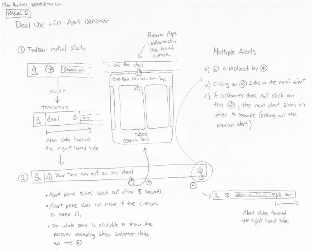
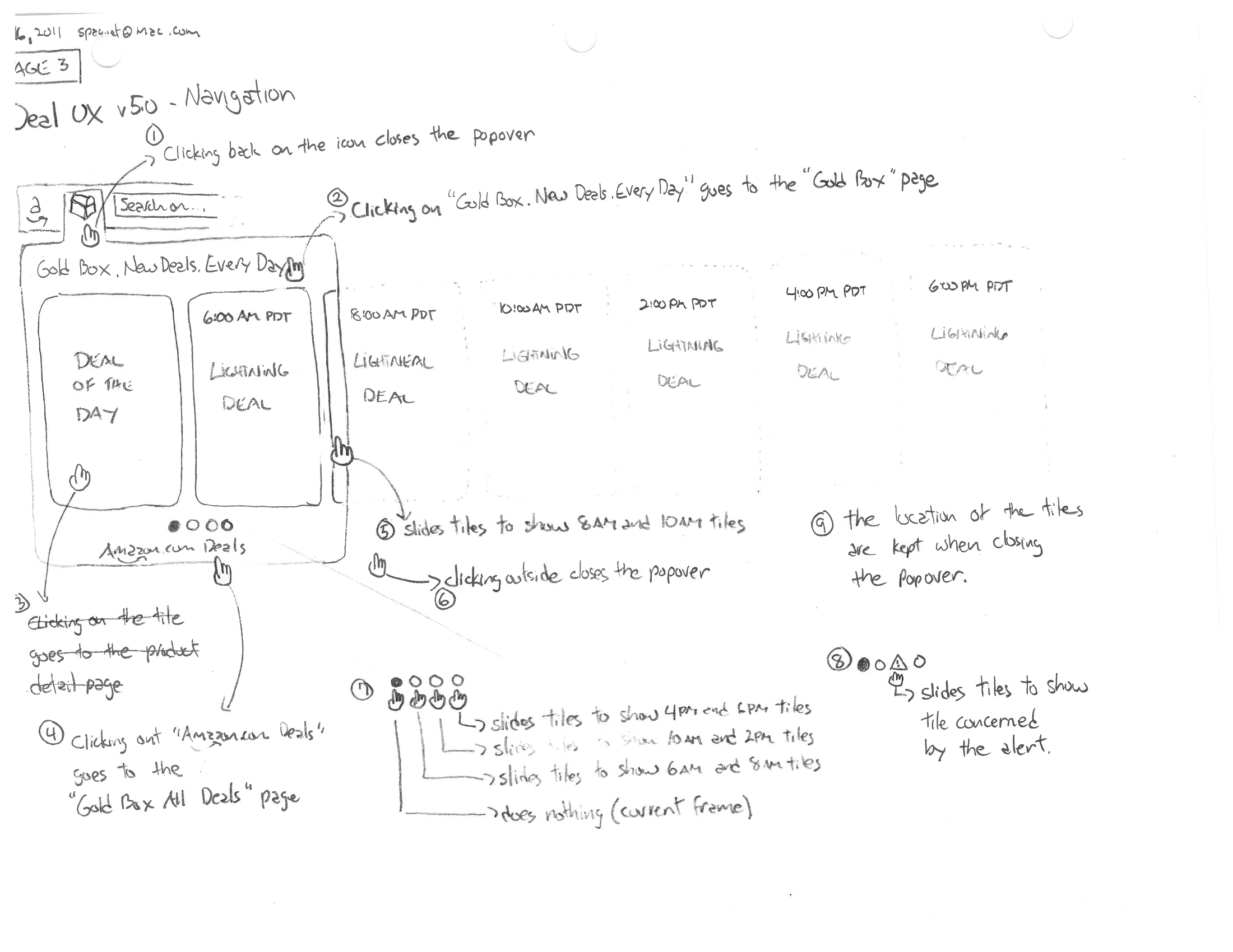
The deals half was specified the way you would specify a machine: page by page, in pencil, version after version through the spring of 2011. The initial state. The alert sliding in from the right-hand side. The popover of Gold Box tiles underneath it. What happens when the customer ignores all of it. The rules got very specific, because vagueness in a product like this is what turns it into a nuisance. The alert pane does not move while the cursor is over it. It slides back out after fifteen seconds. If a second alert arrives before the customer has clicked, the new one pushes the old one out. Close the popover, reopen it, and the tiles are exactly where you left them. Each of those is a decision not to take attention that was not offered.

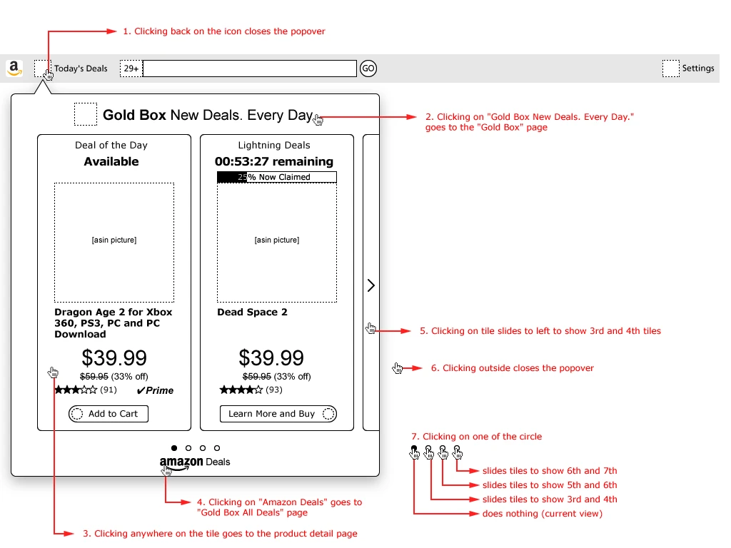
Then the same specification again as a wireframe, with seven numbered click targets and no ambiguity left anywhere in it — down to what the first carousel dot does, which is nothing, because it is the view you are already looking at. Naming that as a behaviour is the difference between a spec and a wish.

The other half was harder, and it is the half I am still proud of. It detected that the product on the page you were reading — someone else’s store, someone else’s customer — was available cheaper on Amazon, and told you. Done badly, that is the single most obnoxious thing software can do. I drew the assertive version, and then argued against it in my own margin: if it is too intrusive, do not prompt the popover at all, and let a badge and a colour change on the search button be the only things asking for attention. That note is the whole job in one sentence.

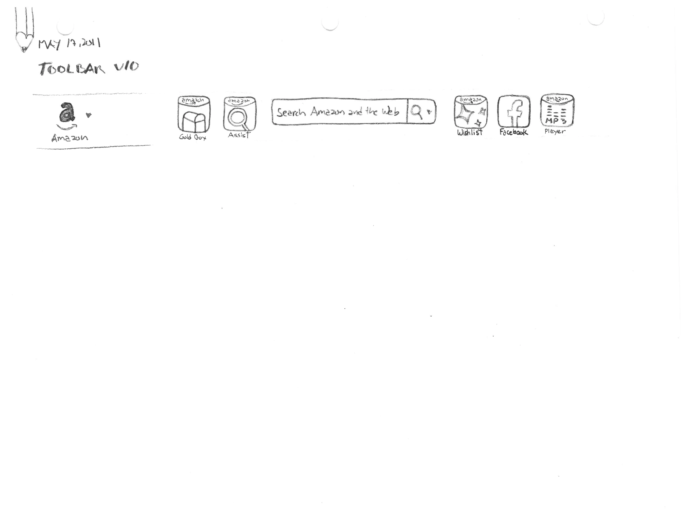
I left the staff role in May 2011 to come home to my family, and kept designing for the same product under contract into 2012 — the search auto-suggest, the app icons, and finally a Windows 8 “Metro” version, drawn in ink in March 2012, seven months before Windows 8 shipped. That last one was designed to spec and never built. It is here because the thinking in it is good, and because a concept you can read is worth more than a shipped thing you cannot.

I — The Rules of Interruption

Deal UX, drawn across March 2011 as a numbered pencil document and resolved into a wireframe.
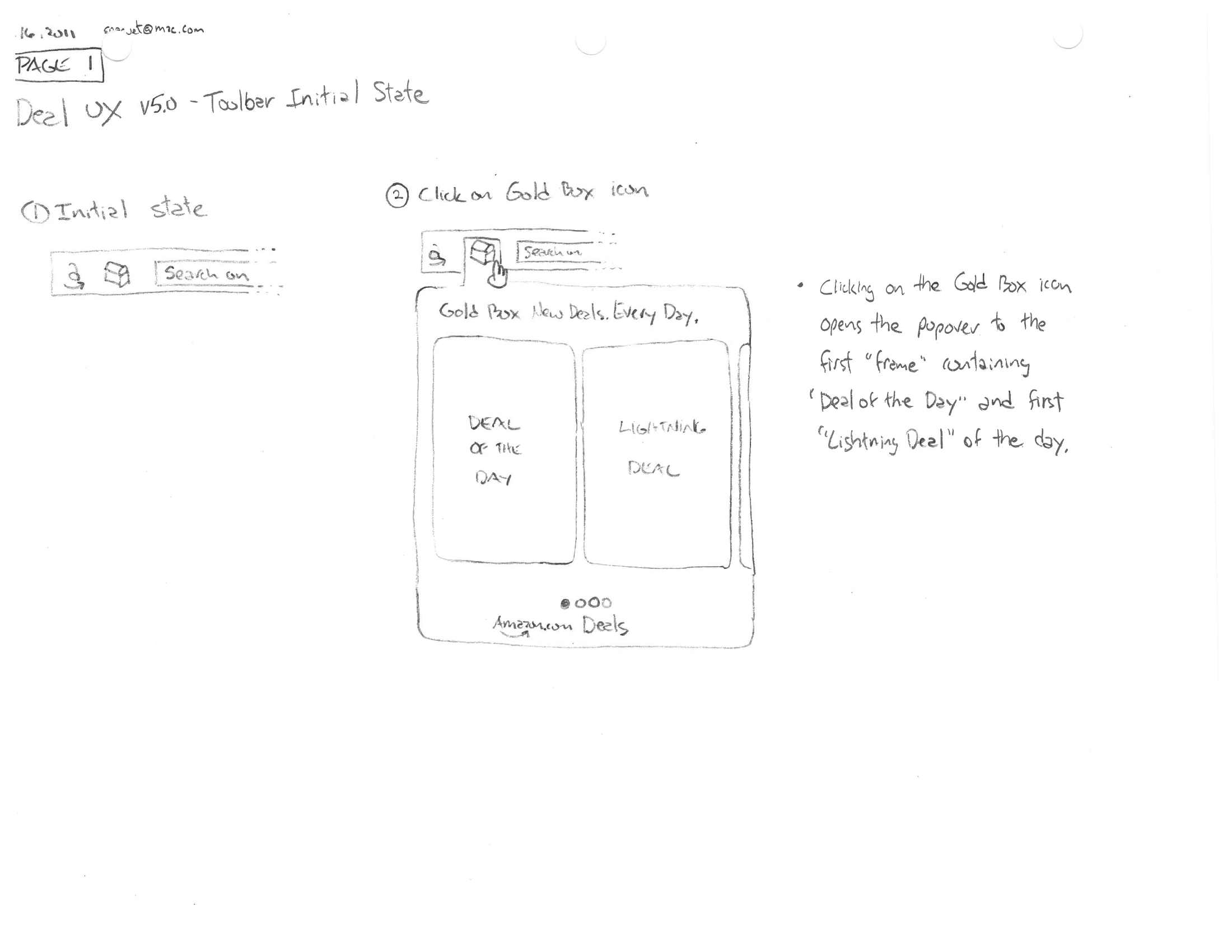
A pencil sketch headed “Deal UX v5.0 — Toolbar Initial State”, showing a slim browser toolbar at rest, then the same toolbar with a popover open beneath it containing two tiles labelled “Deal of the Day” and “Lightning Deal”, with handwritten notes at the right.
fig. 1 — Page one of the spec, 16 March 2011. The toolbar at rest is three elements wide — that restraint is the baseline everything else has to earn its way past.
A pencil sketch headed “Deal UX v5.0 — Alert Behavior”, with a transition diagram of an alert sliding into a toolbar, a popover, and a right-hand column headed “Multiple Alerts” listing lettered rules.
fig. 2 — The timing rules, written as prose because they are prose problems. The alert pane does not move if the cursor is over it. It slides back out after fifteen seconds. A second alert pushes the first one out only if the customer has not engaged.
A pencil sketch headed “Deal UX v5.0 — Navigation”, showing a popover with deal tiles and a row of time-stamped frames from 6:00 AM PDT to 6:00 PM PDT, annotated with nine numbered navigation rules.
fig. 3 — Nine numbered rules over one drawing, including the one that matters most: the location of the tiles is kept when closing the popover. The product remembers where you were, so you never pay twice for the same orientation.
A clean digital wireframe of the toolbar popover with two deal tiles — “Deal of the Day, Available” and “Lightning Deals, 00:53:27 remaining” with a claim bar — surrounded by seven numbered red callouts describing each click target.
fig. 4 — The pencil resolved. Seven numbered click targets, each with its destination named — and the fourth carousel dot documented as doing nothing, because it is the current view. Unspecified behaviour is where products go vague.
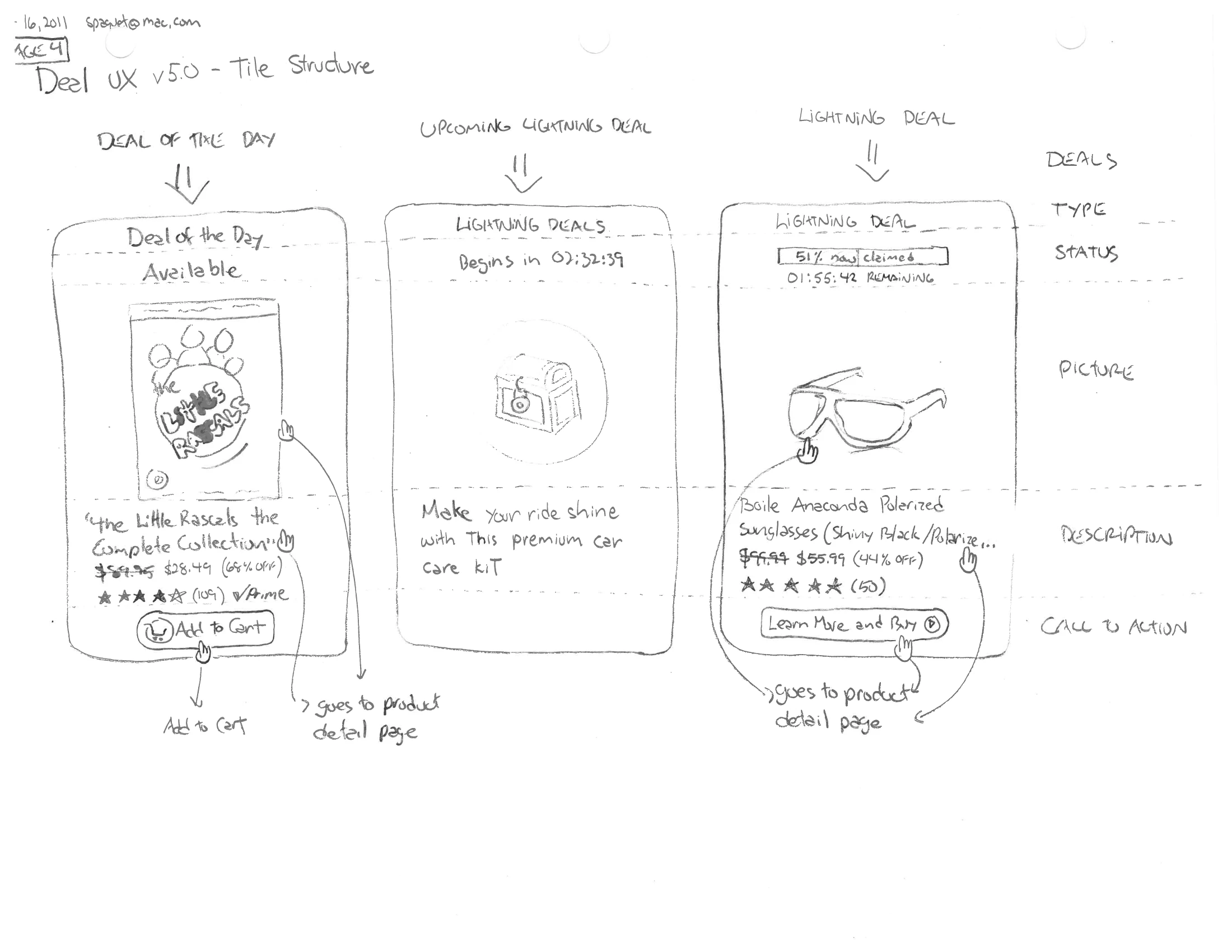
A pencil sketch titled “Deal UX v5.0 — Tile Structure” showing three tile variants side by side: a deal available, a lightning deal beginning later, and a lightning deal in progress, each annotated with what it must show.
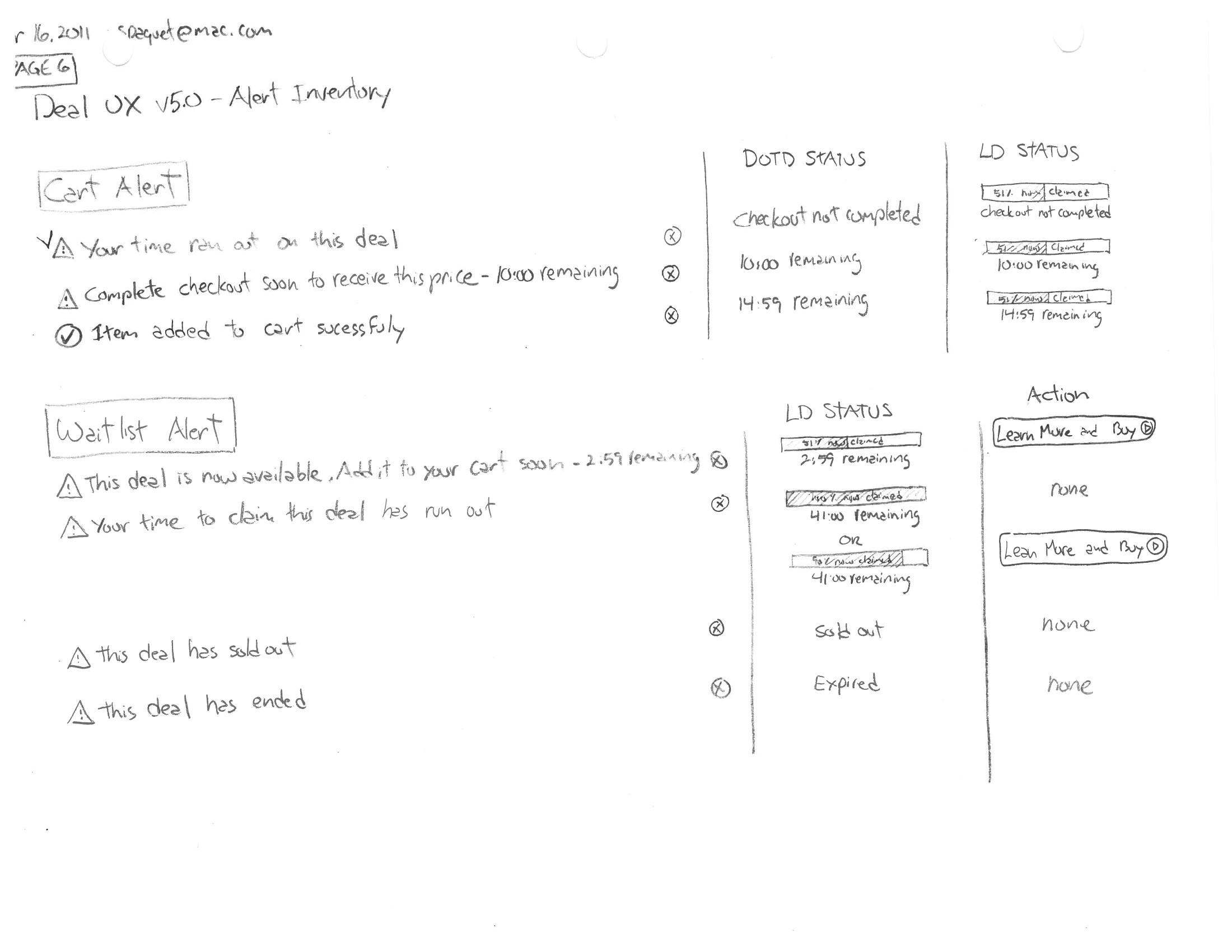
A pencil sketch titled “Deal UX v5.0 — Alert Inventory”, listing Cart Alert and Waitlist Alert with their trigger conditions on the left and tables of resulting states and actions on the right.
fig. 5 — Left, one tile in three states — the countdown and the claim bar exist because a lightning deal is a thing that is disappearing while you look at it. Right, the full alert inventory: every trigger enumerated against every resulting state, so nothing fires by accident.

II — Cheaper, Somewhere Else

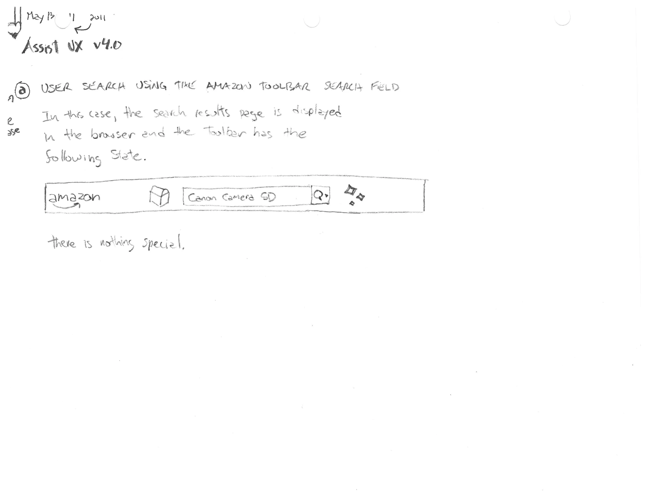
Assist UX, May 2011. The toolbar recognises the product you are looking at on another retailer’s page and knows Amazon has it for less. The design question is not whether to tell you. It is how loudly.
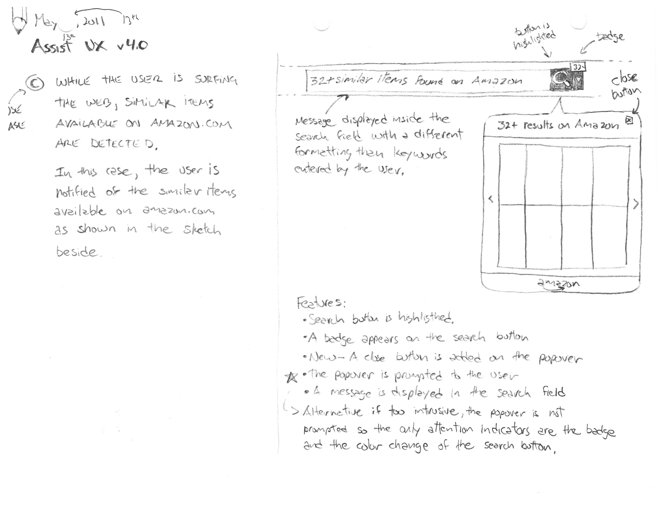
A pencil sketch headed “Assist UX v4.0”, with a paragraph of handwritten case description on the left and, on the right, a toolbar reading “32+ similar items found on Amazon” with a badged search button, a popover of results, and a handwritten feature list below.
fig. 6 — The design and the argument against it on the same sheet, 13 May 2011. Under the feature list, in my own hand: “Alternative if too intrusive, the popover is not prompted so the only attention indicators are the badge and the color change of the search button.”
A pencil sketch of the high-confidence case: a toolbar bar announcing an exact match found on Amazon, with handwritten notes on the hyperlink and button treatments.
A pencil sketch of the low-confidence case, headed “Assist UX #1 Low Confidence”, showing a quieter results indicator beside the search field rather than an announcement.
fig. 7 — Confidence sets the volume. When the match is certain, the bar may speak in a full sentence; when it is a guess, it gets an indicator next to the search field and nothing more. The product’s certainty about you determines how much of your attention it is allowed to ask for.

III — A Second Life on Windows 8

March 2012, under contract, and a change of instrument: pencil out, ink in. Microsoft’s “Metro” language was new and the toolbar had to become a full-screen application in it, seven months before Windows 8 reached the public. Designed to spec; not shipped.

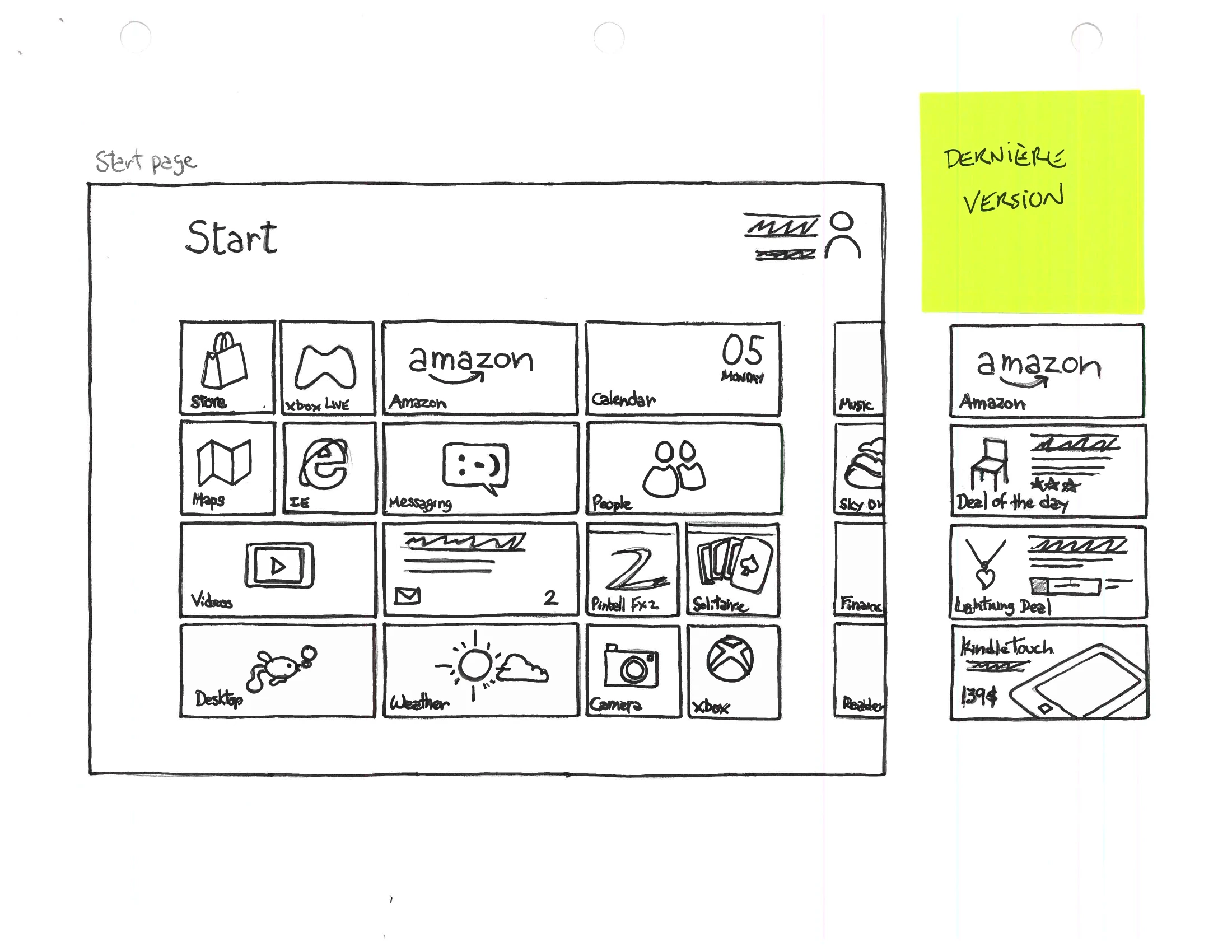
An ink wireframe of a Windows 8 Start screen drawn as a grid of live tiles, with an Amazon tile group at the right carrying deal and best-seller entries, and a yellow sticky note reading “Horizontal version”.
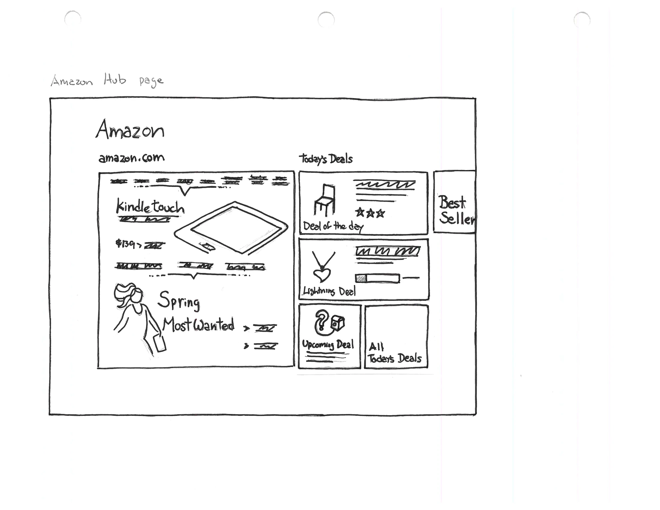
An ink wireframe of the Amazon hub page in Metro: a wide search field at the top, a large Kindle Touch promotional panel at the left, and a mosaic of tiles for Deal of the Day, Lightning Deals, Best Sellers and cloud apps.
fig. 8 — Left, the toolbar dissolved into the operating system as a group of live tiles. Right, the hub it opens into. The whole product had to be rethought: a strip that borrowed a sliver of someone else’s window now owned the entire screen, and every restraint rule from 2011 had to be re-derived for a surface with nothing to be polite to.
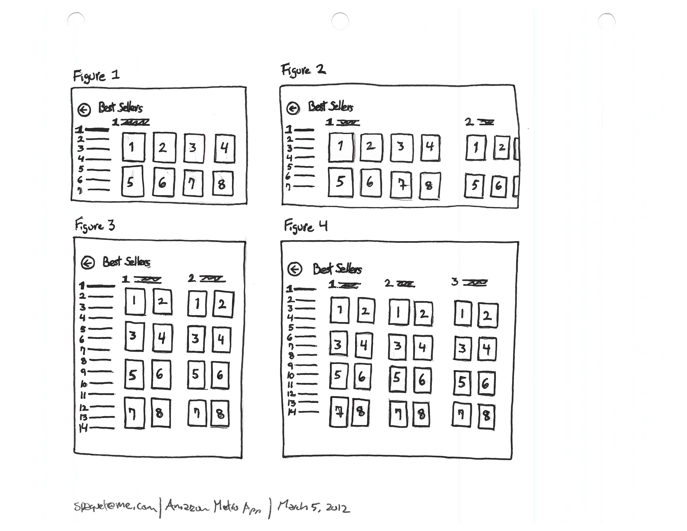
An ink sketch of four labelled figures, each a Best Sellers layout with a numbered rank list at the left and a grid of numbered product cells at the right, the grid subdividing into more columns from Figure 1 through Figure 4.
fig. 9 — The layout problem worked out as four figures, 5 March 2012 — how a ranked list of best sellers holds its meaning as the grid beside it subdivides. Rank is the one thing that must survive every level of zoom, because a best-seller list that loses its order is just a grid of products.
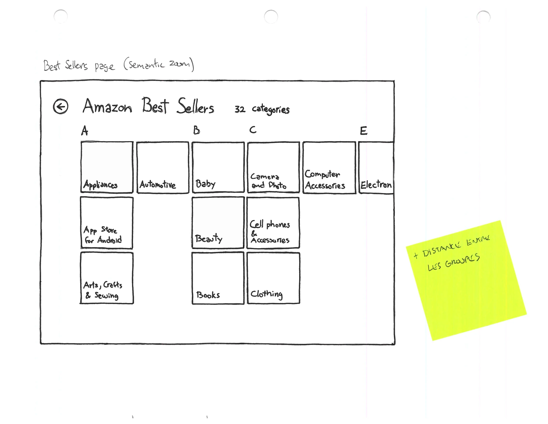
An ink wireframe headed “Amazon Best Sellers” showing the semantic-zoom view: a grid of twelve category cells labelled Appliances, Automotive, Baby, Beauty, Books, Camera & Photo, Cell Phones & Accessories, Computers & Tablets and more, with a yellow sticky note attached.
fig. 10 — Semantic zoom — Metro’s idea that pinching out should give you a different view rather than a smaller one. Zoomed out, the thirty best sellers become twelve departments you can aim at. The pattern was three months old when this was drawn.
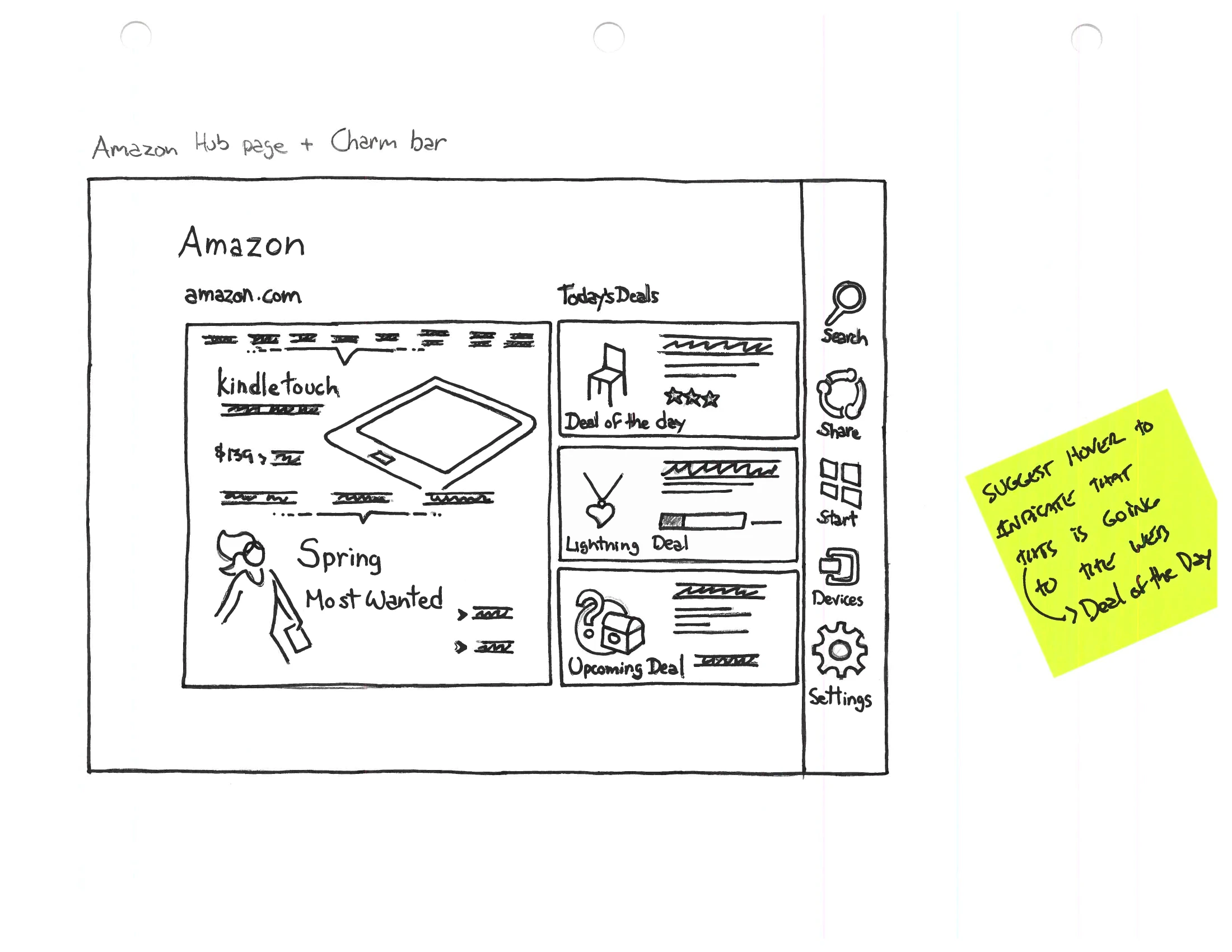
An ink wireframe of the Amazon hub page with the Windows Charm bar drawn down the right edge, carrying Search, Share, Start, Devices and Settings icons, with a yellow sticky note attached.
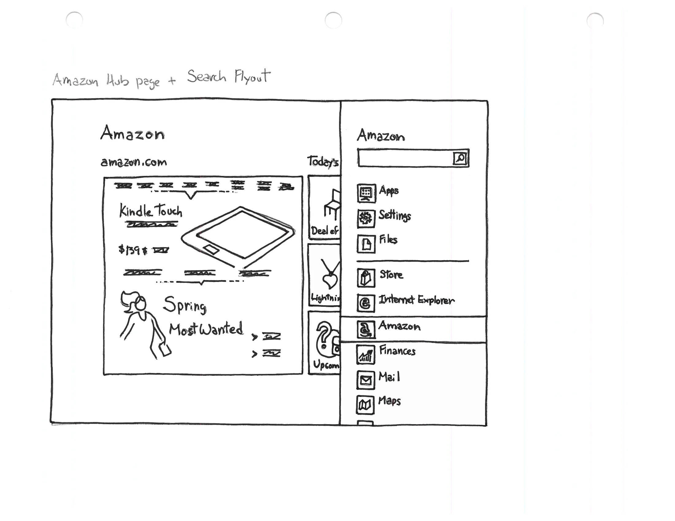
An ink wireframe of the same hub page with the Windows search flyout open at the right, listing searchable scopes — Amazon, Apps, Settings, Files, Internet Explorer, Finance, Mail — above the results area.
fig. 11 — Designing to somebody else’s system furniture. The Charm bar and the search flyout belong to Windows, not to Amazon, and the app has to make room for them and hand its search over to them. The same discipline as the toolbar, inverted: there, we were the guest on a page; here, the guest in an operating system.