Senior UX Designer, AccèsD Mobile
The Usable Bank
Mobile banking redesign for Desjardins’ AccèsD app, used by millions of Canadians for everyday banking, transfers, and payments — including the first mobile implementation of Interac e-Transfer for Desjardins. It shipped on Android first, where it earned 4.5 out of 5 on Google Play; that reception led Desjardins to commission the iPhone redesign, which carried the same patterns over. Both platforms ran a shared, mobile-optimized web view inside a thin native shell. Security and trust were a constant baseline, as they are for any banking app; the design problem was making a high-stakes product genuinely usable.
AccèsD is Desjardins’ consumer banking application, used by millions of Canadians for everyday transactions — balances, transfers, bill payments. It had been in market for years before I came in to redesign the mobile experience; Interac e-Transfer itself had existed as a service since the early 2000s, but this was the first time Desjardins offered it inside a mobile app.
The job had two halves. One was to bring something genuinely new and more usable — including Desjardins’ first mobile implementation of Interac e-Transfer. The other was to do it inside the constraints every banking app carries. A mobile banking app is a high-stakes product: people log in for thirty seconds to confirm a deposit cleared, or to send rent to a landlord, and every interaction has to earn its place against the alternative — opening a browser and using the desktop site they already trust. Security and trust were never the headline; they were the floor under everything.
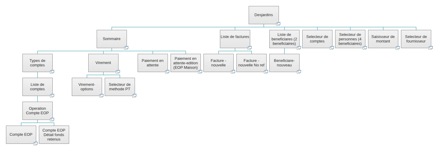
The first AccèsD I designed and shipped ran a comprehensive scope: account summaries and detail, transfers, and bill payments reaching real biller brands. The information architecture was documented as a hierarchy tree before a single screen was specified.
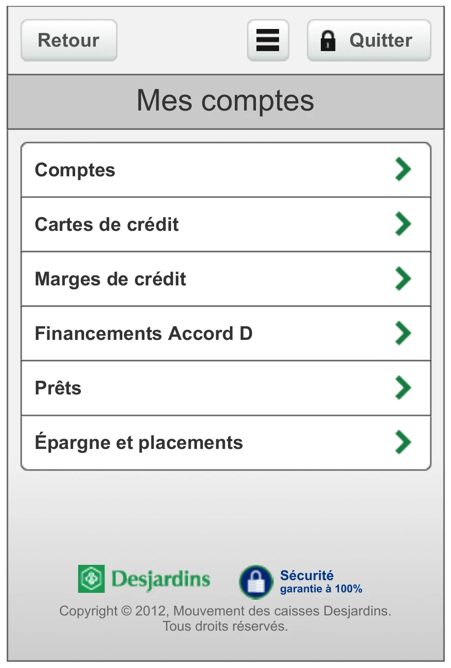
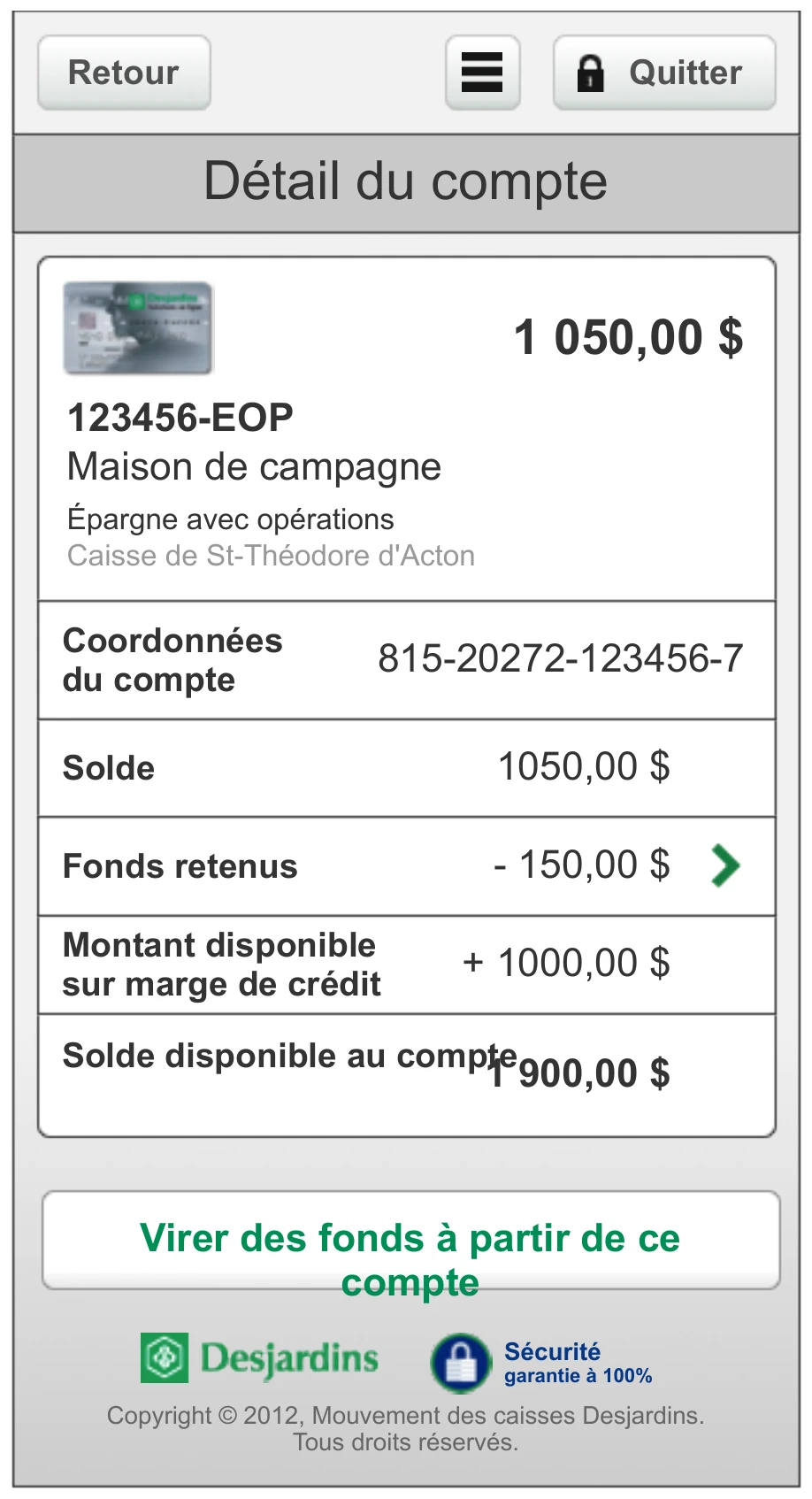
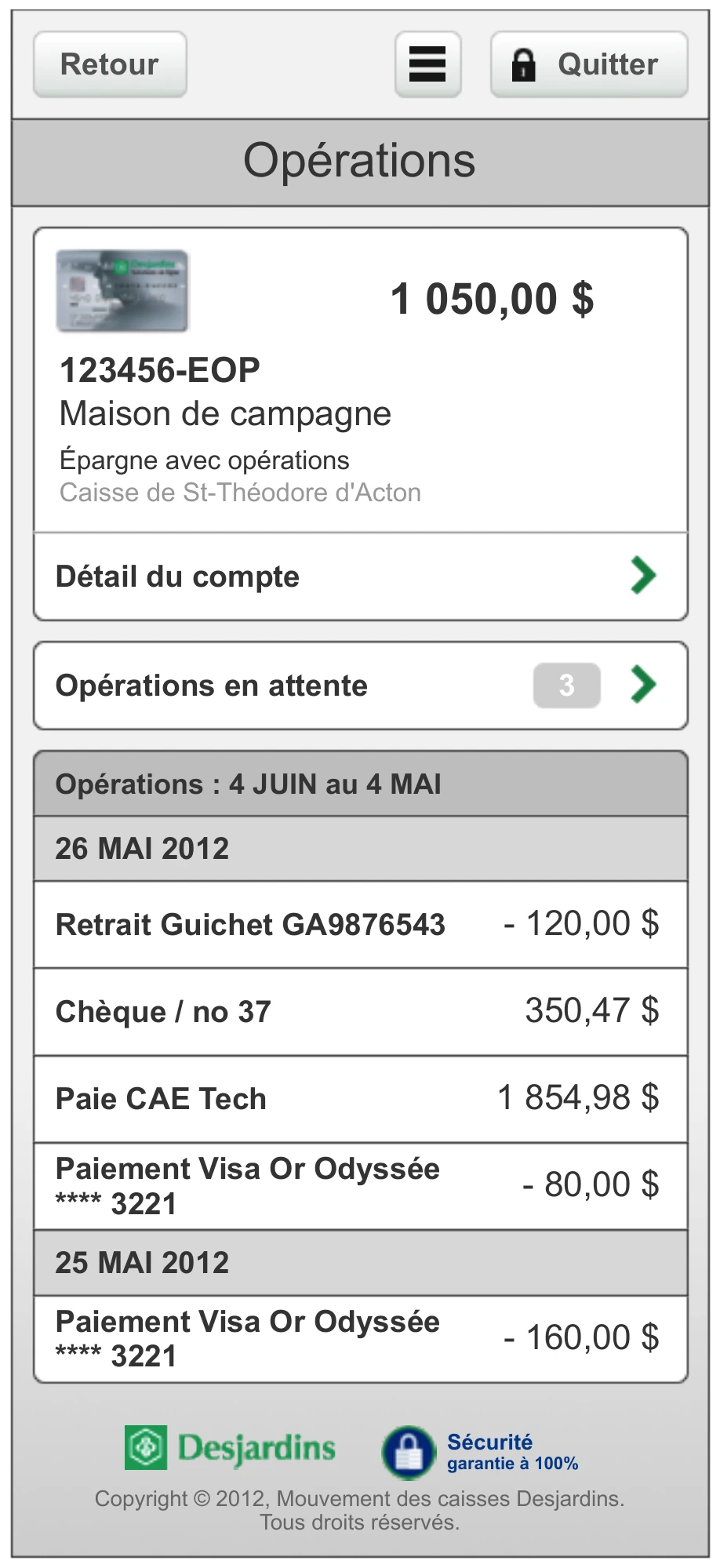
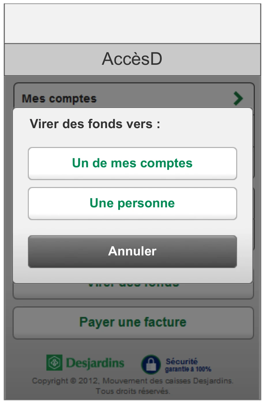
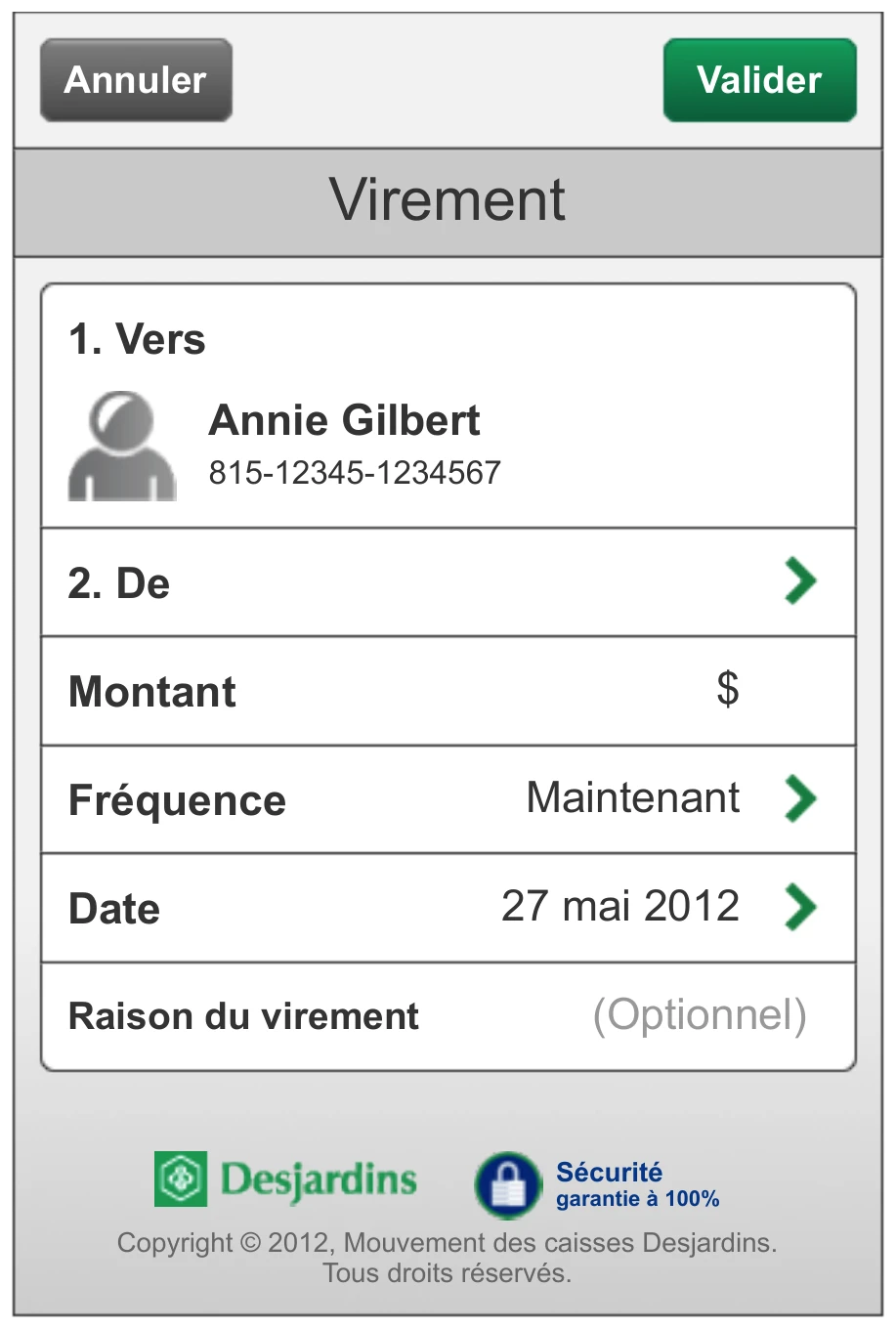
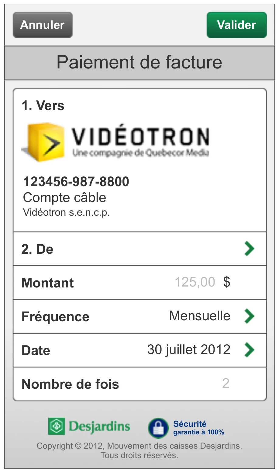
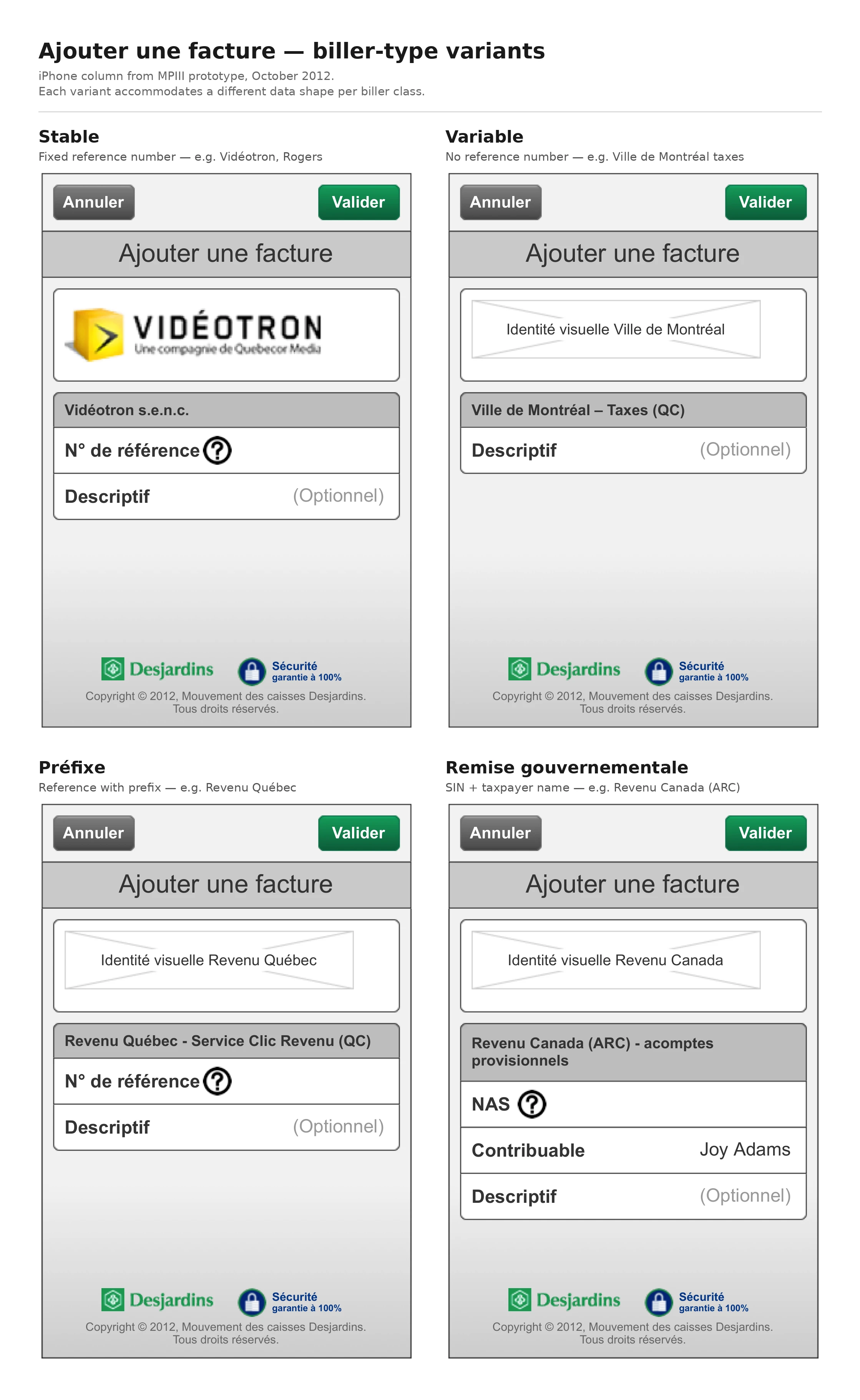
Phase III then redesigned the app down. The feature set narrowed toward core banking. Usability, not feature breadth, became the point. The work covered the full mobile surface — home with account summaries, account detail with progressive disclosure, transactions grouped by date with pending operations, transfers, and bill-pay integrating real biller brands across four distinct biller-type variants. The product shipped on Android first, built as a thin native shell hosting a shared, mobile-optimized web view — a UIWebView on iOS, a WebView on Android — itself a mobile variant of the broader AccèsD desktop platform; the interface was HTML, not native widgets. It reached 4.5 out of 5 on Google Play, and that reception led Desjardins to commission the iPhone redesign on the same foundation.
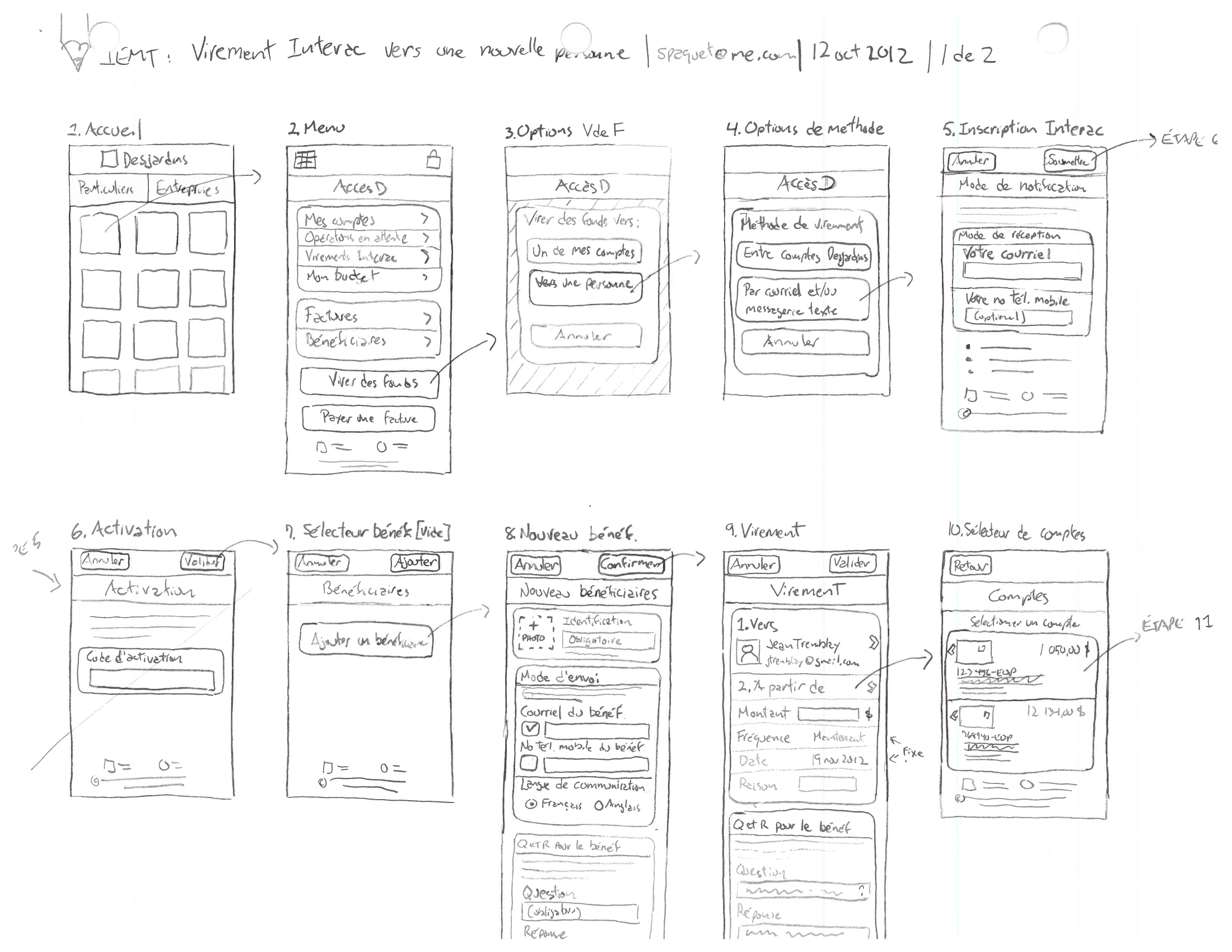
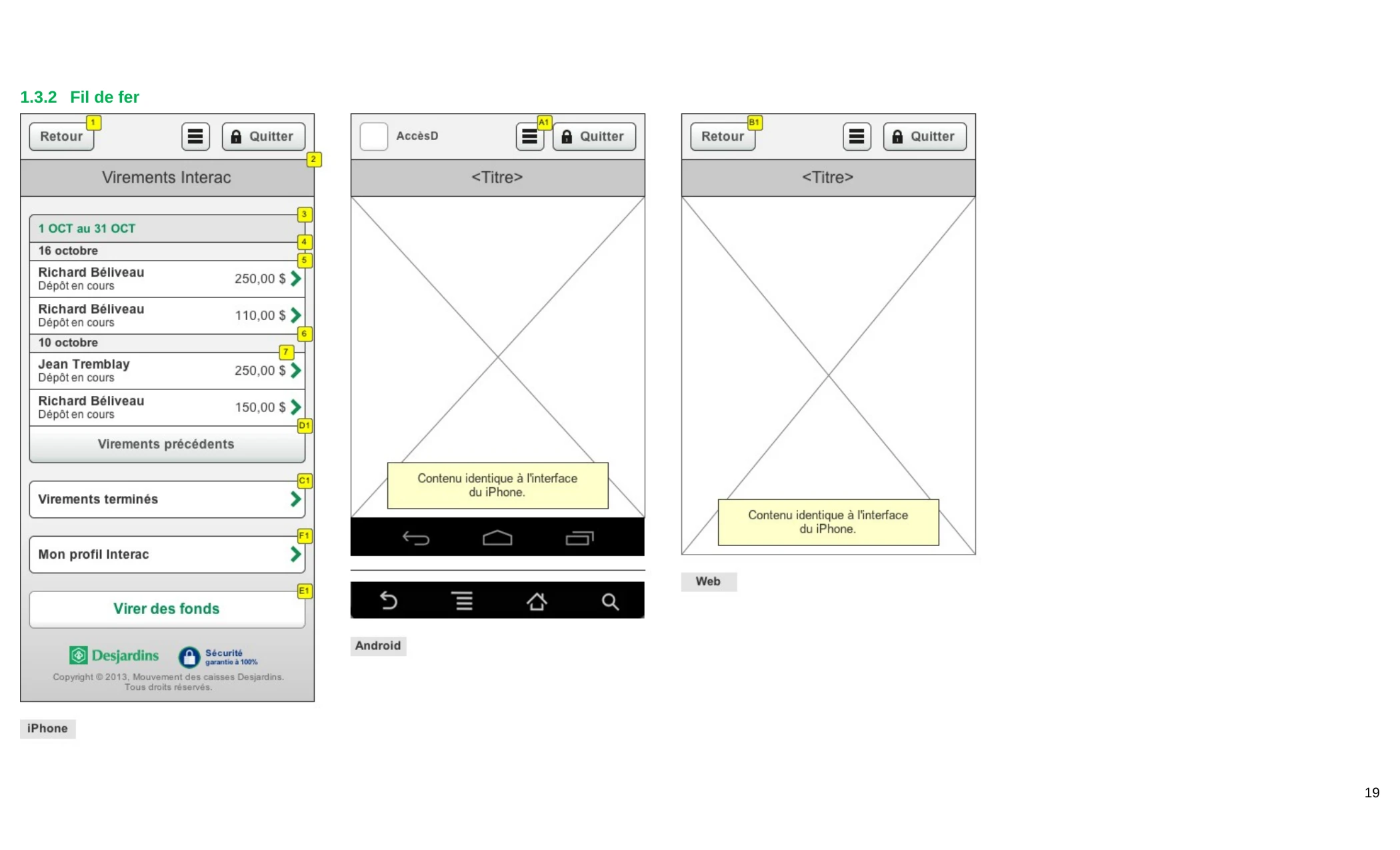
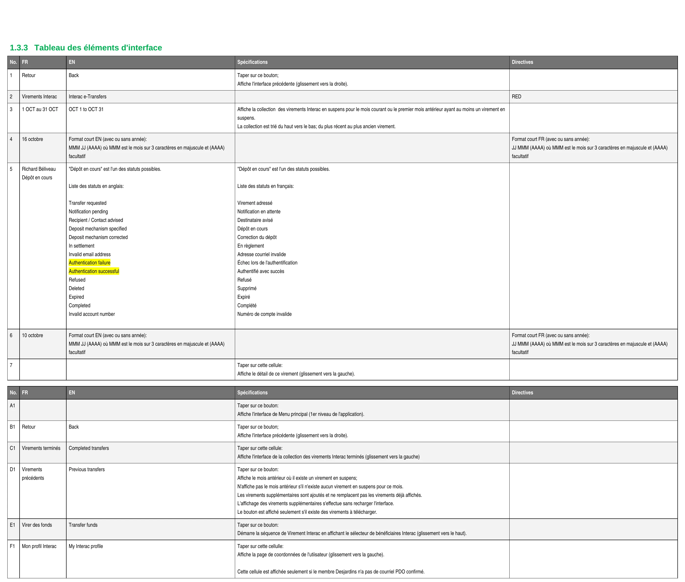
The Phase III scope ran across several sub-projects — the AccèsD redesign, prepaid cards, and Interac e-Transfer — each with its own spec discipline. The methodology was a documentation convention I authored: a DCI (Document de Conception d’Interaction) paired with a working HTML prototype. Interac e-Transfer — Desjardins’ first mobile implementation of the service — alone ran through nearly a year of mobile iteration — send-to-person, the security challenge, confirmation, and accept-transfer flows across iOS, Android, and web — before consolidating into a 242-page bilingual specification co-authored with Émilie Valcourt.
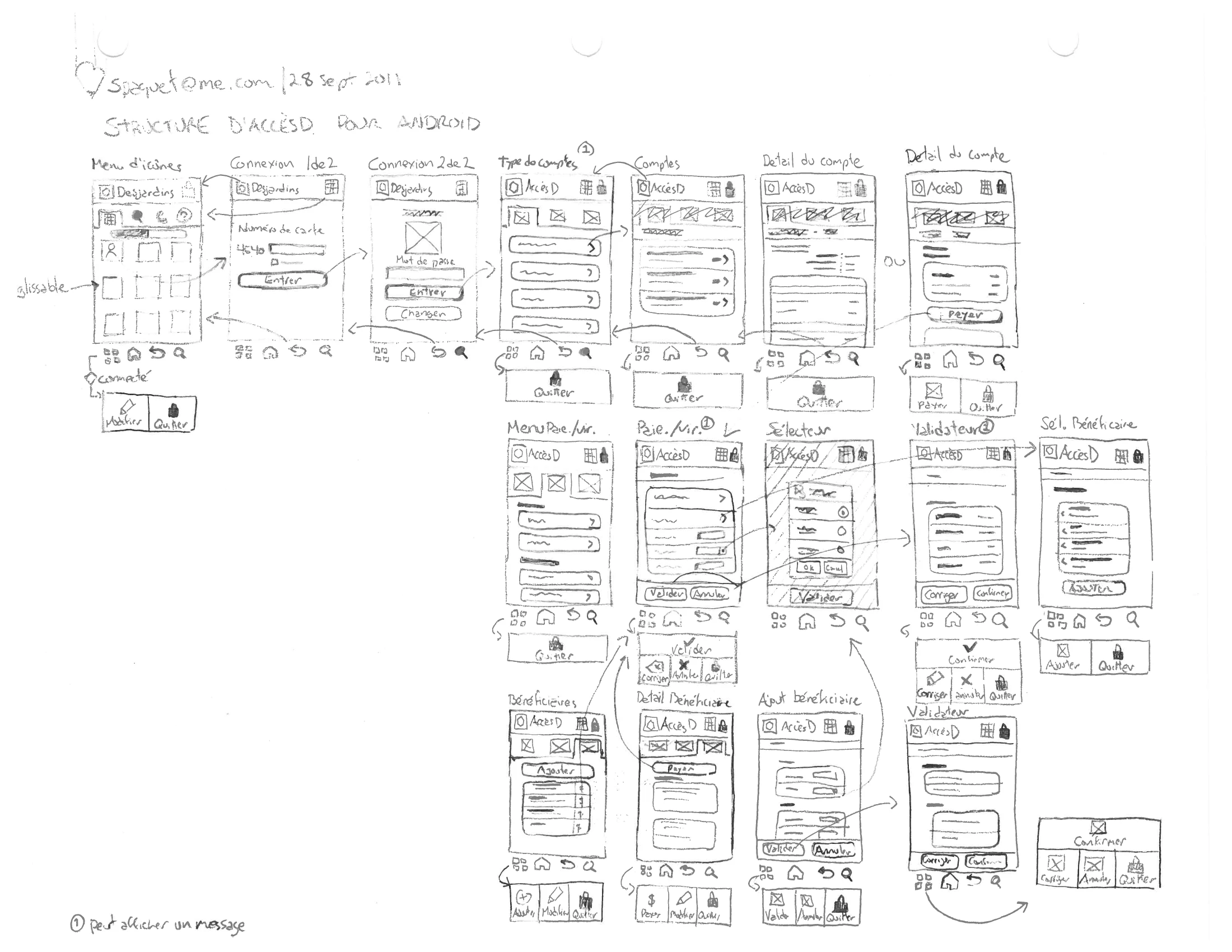
The work shown spans the whole arc — dated sketches and flow diagrams, the working HTML prototypes I delivered, and the bilingual specifications. Production screenshots from this era did not survive; for the shipped screens, the prototype is the medium of evidence, not the work itself. AccèsD shipped and ran in production for years.
What I took from the work was a clearer sense of how regulated industries actually operate. Compliance, accessibility, security, and brand sit at the same table as user experience. A bank’s app cannot ship the way a startup’s can. The design that survives is the one that passes every review without being compromised by any of them. That constraint is the design.
I — Research & Method
In a regulated bank, the method is the deliverable. Before a single screen was drawn, the work lived on paper — the architecture mapped, the documentation convention set, the process agreed, the bilingual behaviour settled as logic. The design that ships is the one that has already passed every review; this is how it earned that.
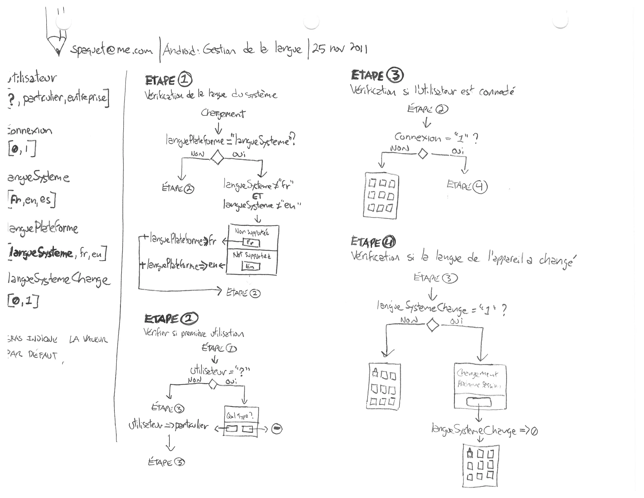
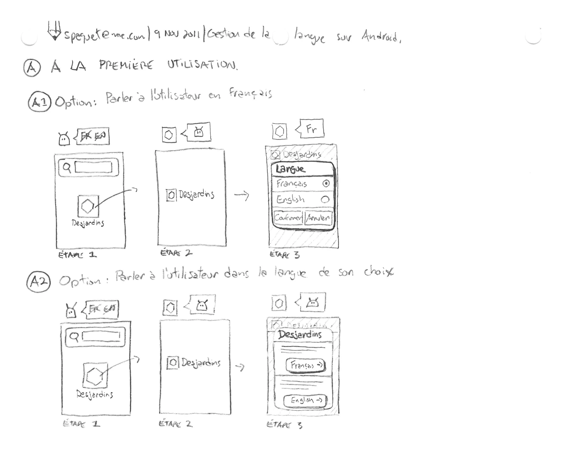
The same discipline ran through testing. Usability sessions were scripted to real tasks — a first-time transfer to a “Pierre Tremblay,” confirming a cheque had cleared — and what they surfaced fed straight back into the redesign.
II — AccèsD Mobile
The redesign earned its simplicity. The architecture was mapped before a screen was drawn, a comprehensive first release shipped, and then — unusually — the app was redesigned down, trading feature breadth for the clarity and everyday usability a banking app lives or dies on.
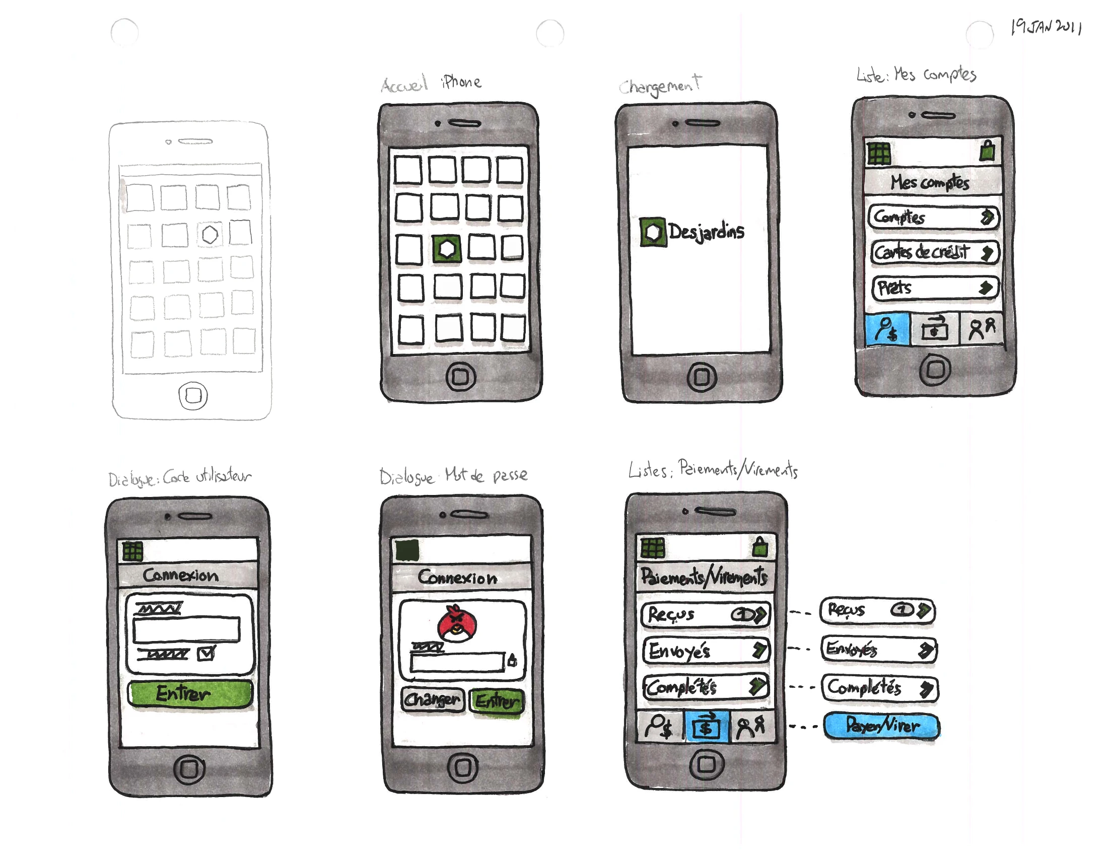
Then Phase III pared it back. The scope narrowed to core banking, and progressive disclosure kept each screen quiet until the account holder asked for more.
III — Interac e-Transfer
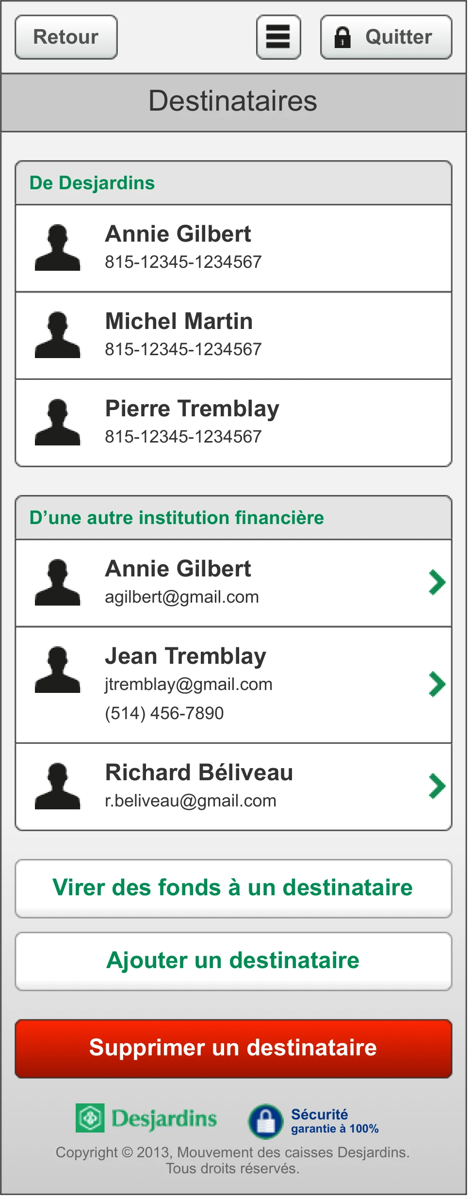
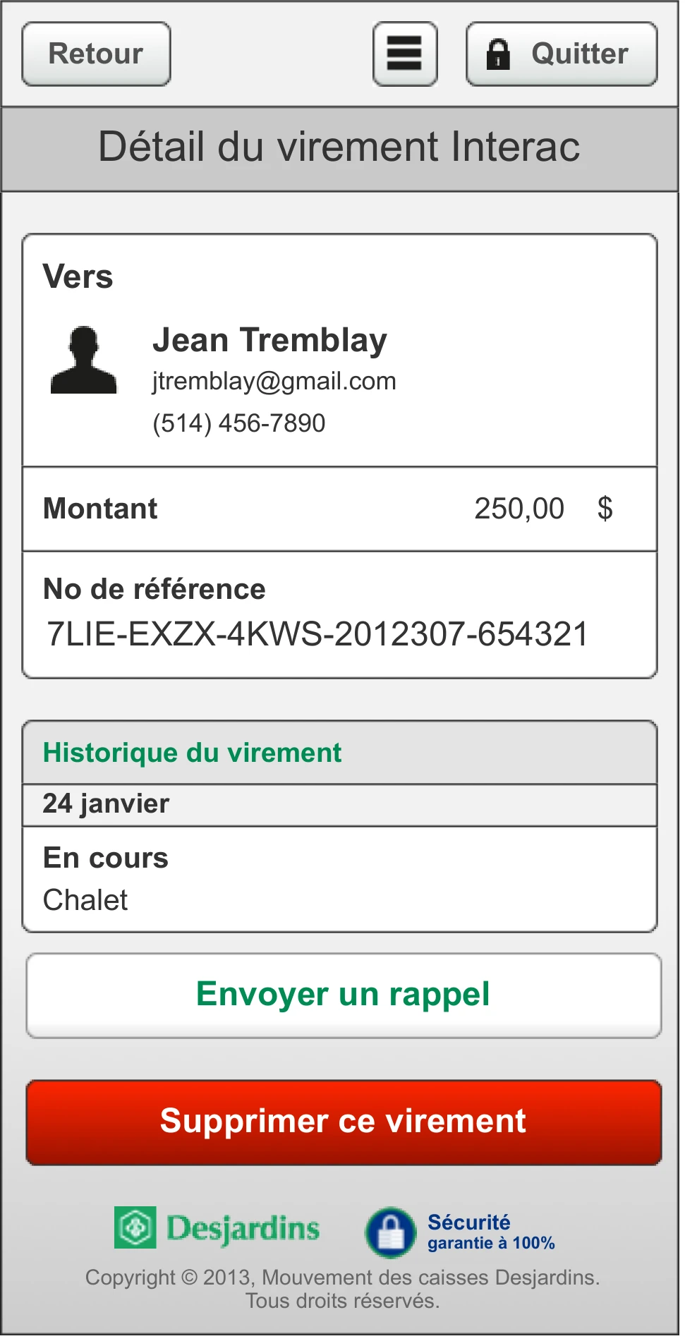
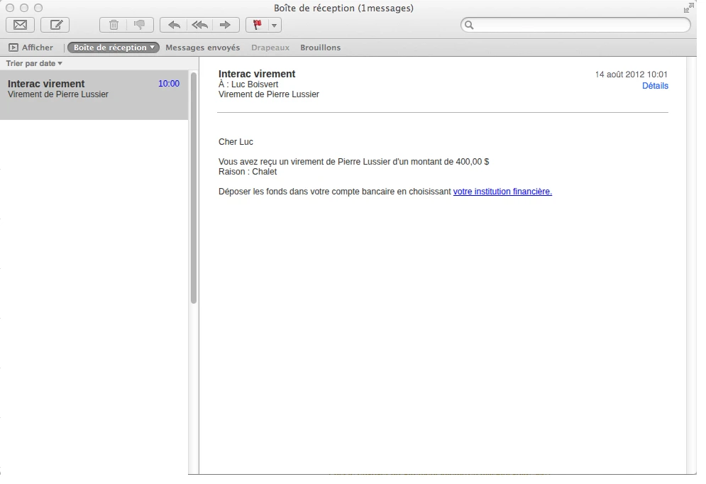
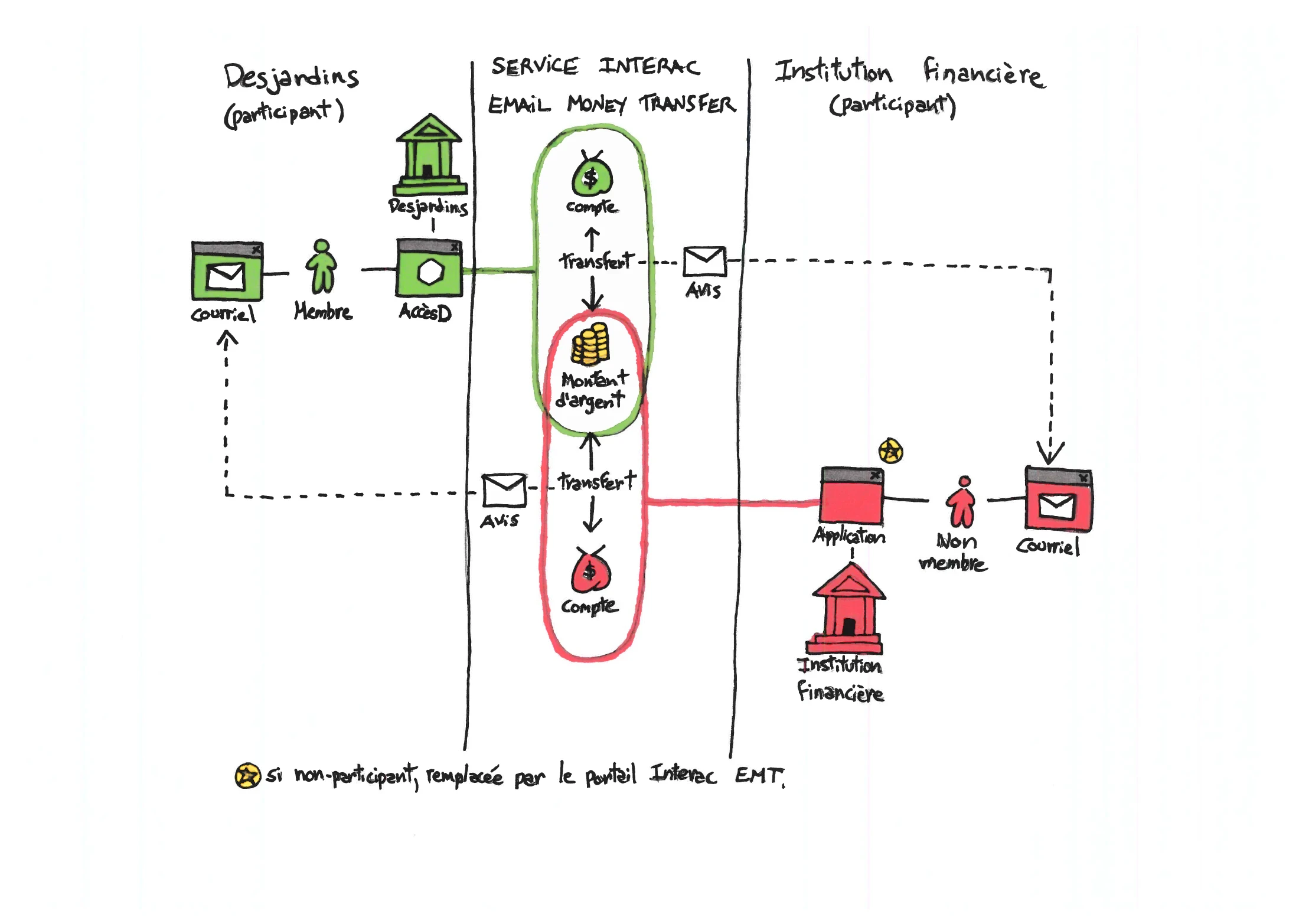
Moving money to another person is the moment a banking app is trusted most, and watched most. Interac e-Transfer — which I designed as Desjardins’ first mobile implementation of the service — covered the full lifecycle: register, send, receive, accept, refuse, cancel, remind. One detail set the rest: the recipient’s first encounter with the transfer happens in their inbox, not in the bank’s app.