Sign In Once

Lead Designer, Identity Platform

Sign In Once

052013

Single sign-on makes a quiet promise: everything you use sits adjacent to one identity. For CA CloudMinder, an enterprise identity platform delivered as a service, I designed both halves of that promise in 2013 — the admin console that connects an application’s sign-on, and the sign-in, registration, and step-up flows the people behind those applications meet.

CA CloudMinder was CA Technologies’ identity-and-access platform in the cloud — single sign-on, registration, and adaptive authentication for an enterprise and its customers. Adjacent to One was engaged to design its SSO experience: how a tenant administrator onboards an application so its users can sign in once, and how those users — employees, partners, and consumers — sign in, register, and prove themselves when the stakes rise.

The console had to serve four very different administrators at the same time. We ranked them on a whiteboard: a shell IT admin wiring up a corporate app, a website admin at a publisher like Reuters, an ADP administrator who happened also to be a CA customer, and a federation expert who knew SAML cold. One interface had to stay obvious to the first without insulting the last. The answer was progressive disclosure — a Basic / Intermediate / Advanced spine that let the same screen ask for two fields or twenty, depending on who was looking.

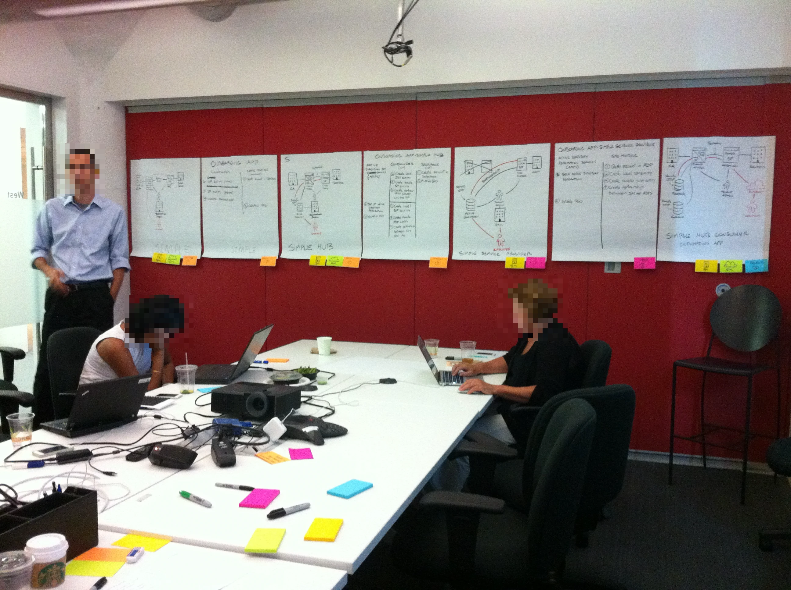
It was worked out on paper first. A war room papered with flow diagrams; the tenant-admin onboarding path drawn step by step before any pixel; the login patterns — simple, identifier-first, and identity-provider round-trips — storyboarded by hand. Only then did the work become the high-fidelity design spec that CA carried forward.

That design record is the evidence here, and it was a collaboration. The sketches, flows, and interaction design are mine; the high-fidelity colour mockups — branded as CA’s security product portfolio, copyright 2013 — were produced by visual designer Christina Beard from that work. CloudMinder shipped as CA’s identity-as-a-service product; what follows is the SSO experience as it was designed for it.

I — Onboarding an Application

Onboarding is the unglamorous heart of single sign-on. Before anyone can sign in once, an administrator has to connect each application to the platform — exchange certificates, map a SAML assertion, set access policies. Do that badly and the admin gives up; do it well and it disappears. The first question was simply who this admin is, and the whiteboard answered with four of them at once.
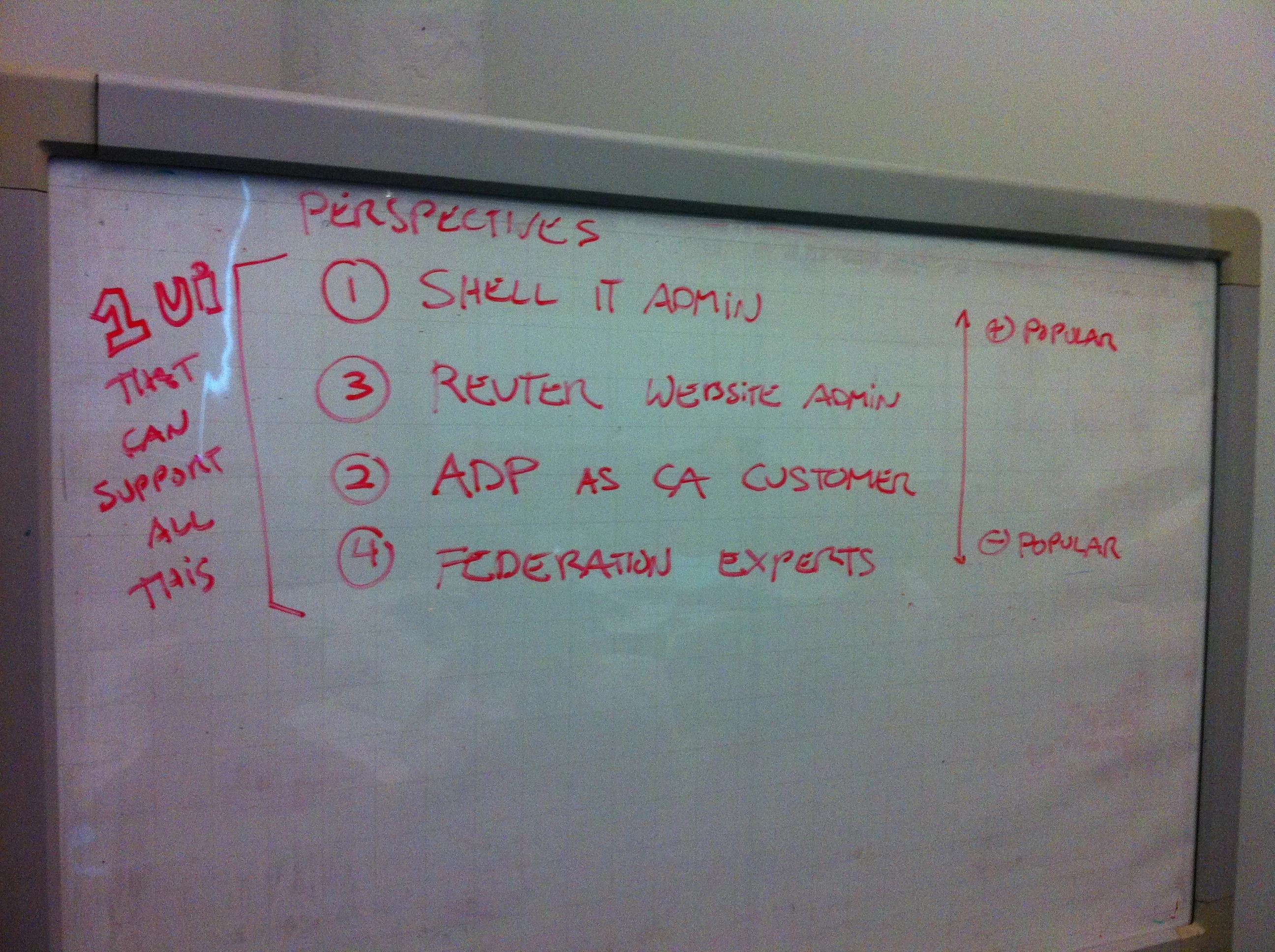
A red-marker whiteboard headed “Perspectives” listing four administrator types — shell IT admin, Reuters website admin, ADP as CA customer, federation experts — beside the note “1 UI that can support all this”.
fig. 1 — 2013, the problem named on a whiteboard — four kinds of administrator, ranked from the everyday IT admin to the federation expert, under a single bracket: one UI that can support all of them.
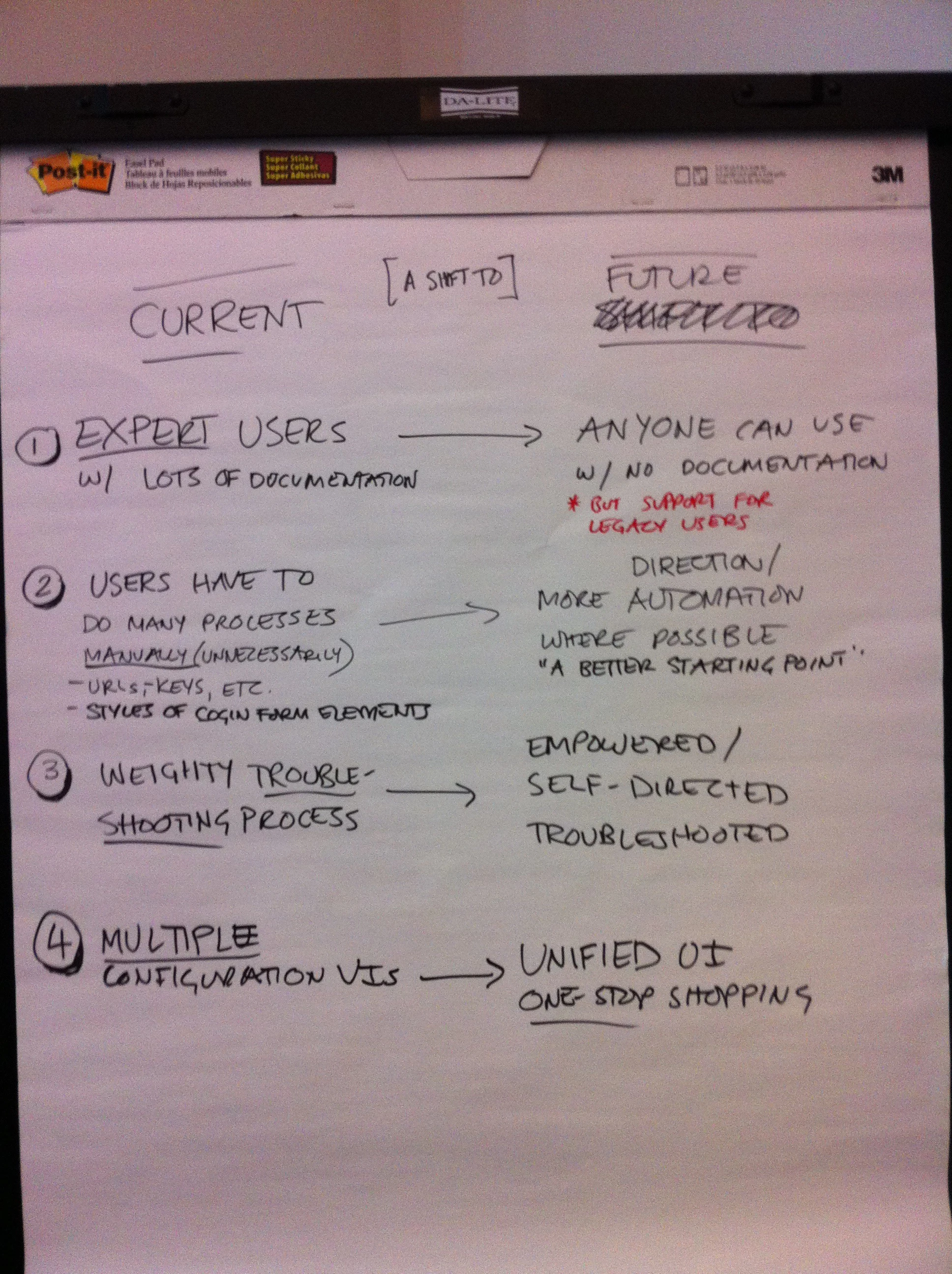
A flip-chart sheet headed “Current” and “Future”, listing four shifts: expert users with lots of documentation become anyone with no documentation; many manual processes become guided automation and a better starting point; weighty troubleshooting becomes empowered, self-directed troubleshooting; and multiple configuration UIs become one unified, one-stop interface.
fig. 2 — 2013, the ambition set down before any screen — a flip-chart contrasting the console as it was (expert-only, manual, many UIs) with what it had to become: usable by anyone, guided, and unified into one place.

So the onboarding path was modeled as a task before it was a screen — add an application, choose how it signs in, configure the SSO partnership, assign the people who get it. The same shape became a four-step wizard, with the SAML assertion settings folded into a Basic / Intermediate / Advanced control so the everyday admin never saw the federation machinery the expert needed.
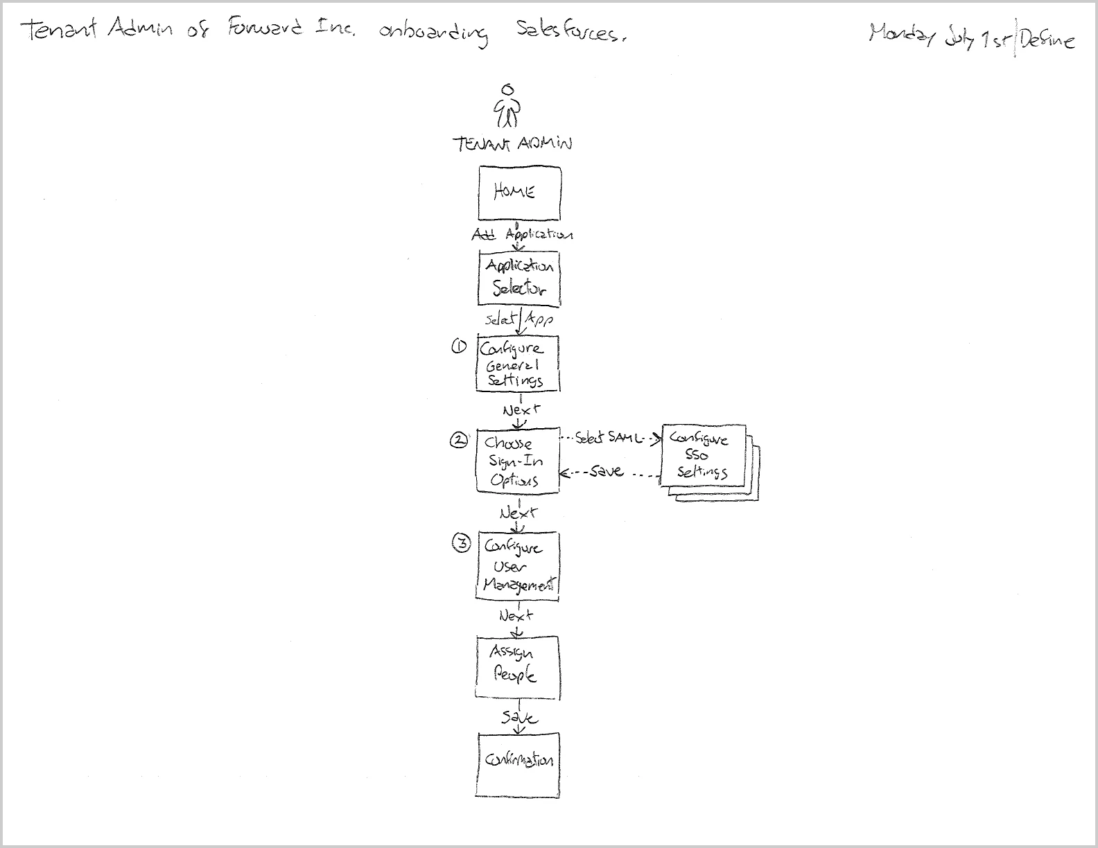
A hand-drawn task flow titled “Tenant Admin onboarding Salesforce”, running Home → Application Selector → Configure General Settings → Choose Sign-In Options → Configure User Management → Assign People → Confirmation.
fig. 3 — 2013, the onboarding task mapped before any screen — a tenant admin at the fictional Forward Inc. connecting Salesforce: add the application, choose its sign-in options, configure SSO, assign people, confirm. (Dated July 1.)
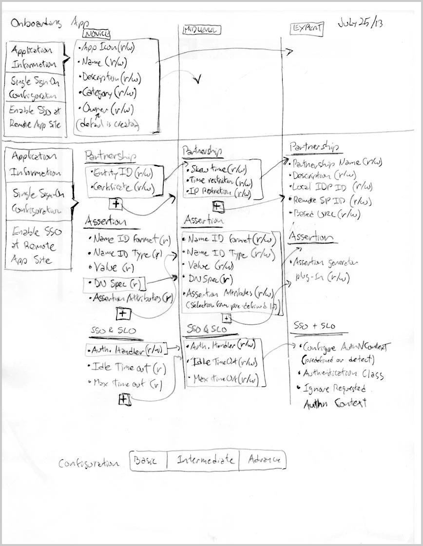
A hand-drawn matrix titled “Onboarding App” laying out every configuration section — Application Information, Single Sign-On Configuration, Enable SSO at Remote App Site — and the fields within Partnership, Assertion, and SSO & SLO, sorted into three columns: Novice, Mid-level, and Expert.
fig. 4 — 2013, the field inventory behind the three levels — every onboarding field sorted by who needs it, from the novice’s handful to the expert’s full set. The decision about what each level shows, made on one sheet. (Dated July 25.)
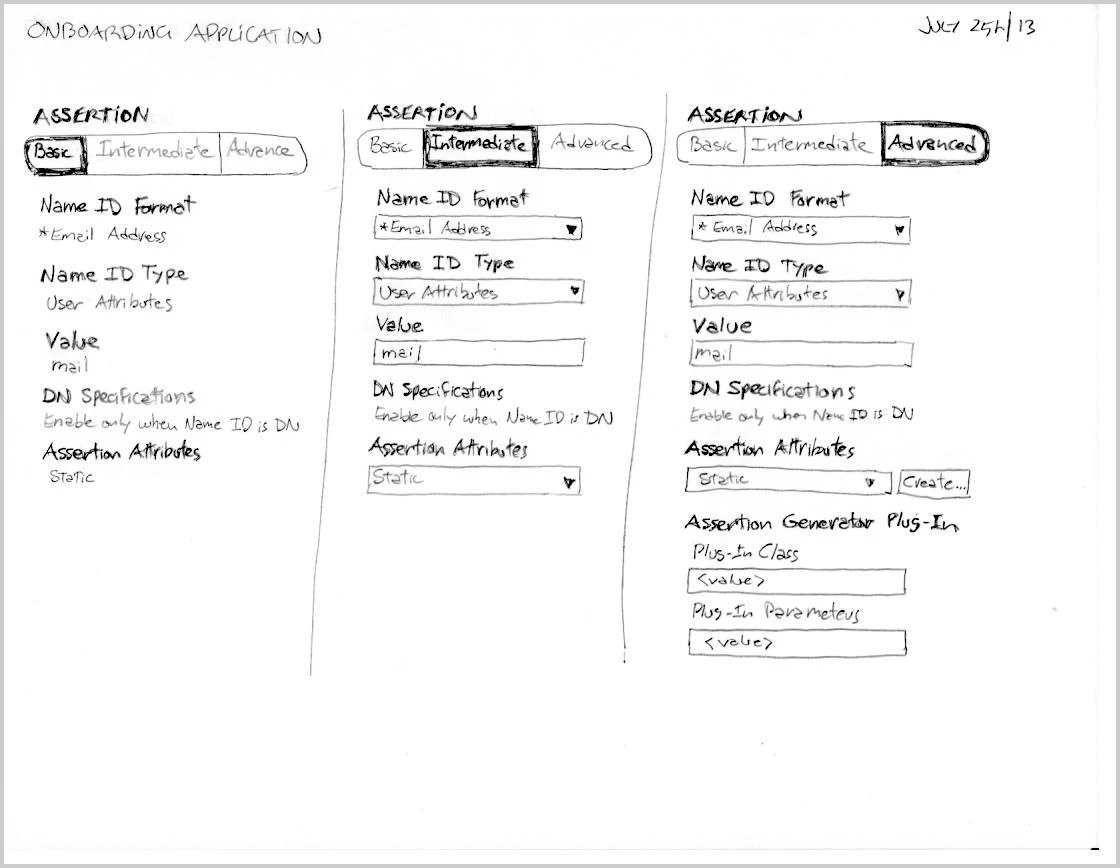
A hand-drawn study showing the SAML assertion settings three times — as Basic, Intermediate, and Advanced — with the field list growing at each level.
fig. 5 — 2013, progressive disclosure worked out by hand — the SAML assertion settings at Basic, Intermediate, and Advanced, the same screen growing from a few fields to the full federation kit. (Dated July 25.)
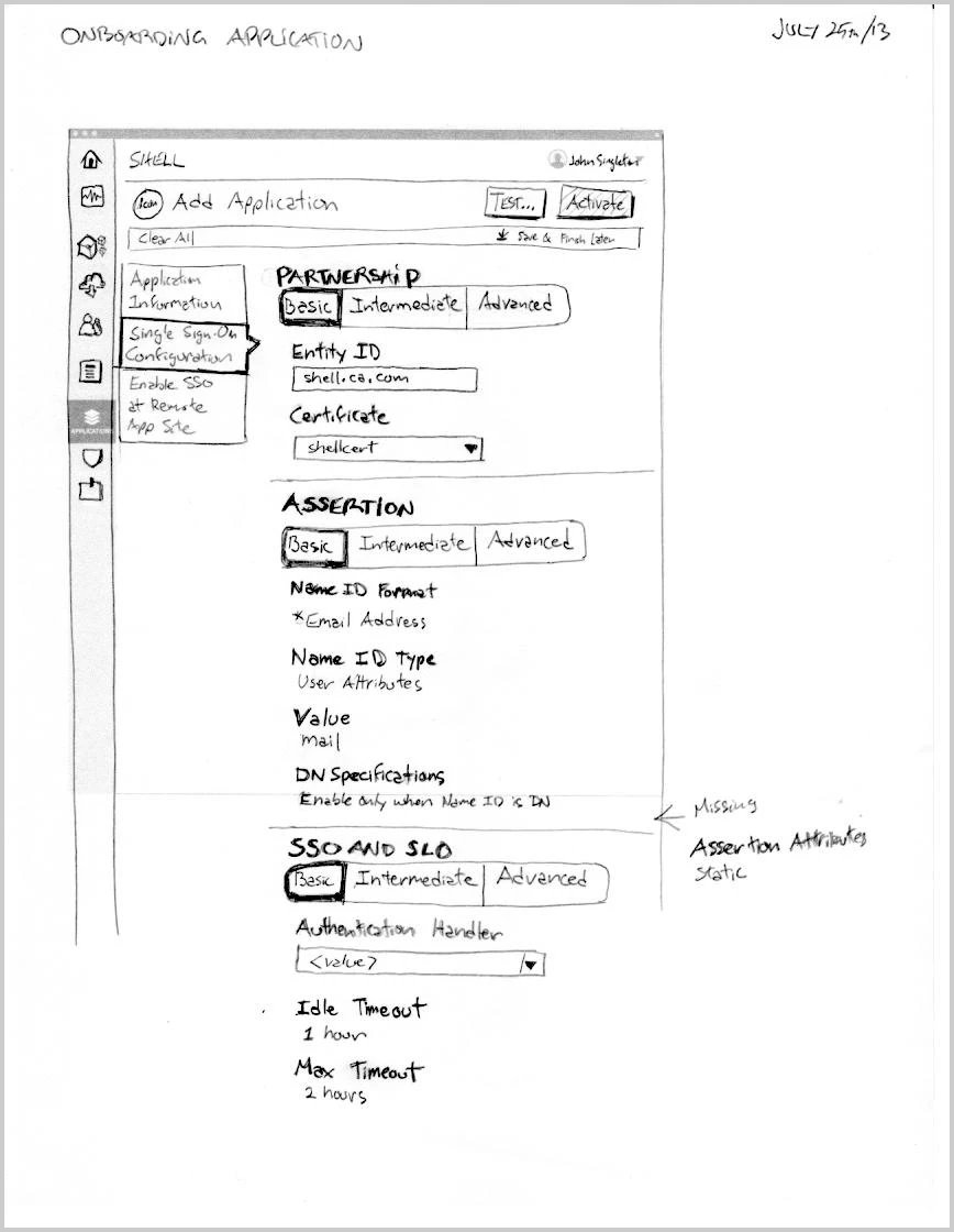
A hand-drawn wireframe of the Add Application screen for the tenant “Shell”, its Partnership, Assertion, and SSO and SLO sections each carrying a Basic / Intermediate / Advanced toggle, with field lists and a margin note flagging a missing static assertion attribute.
fig. 6 — 2013, the three levels worked into the actual screen — the Add Application form with a Basic / Intermediate / Advanced control on every section, and a margin note catching a field still missing. The progressive-disclosure idea, pressure-tested on the real layout. (Dated July 25.)
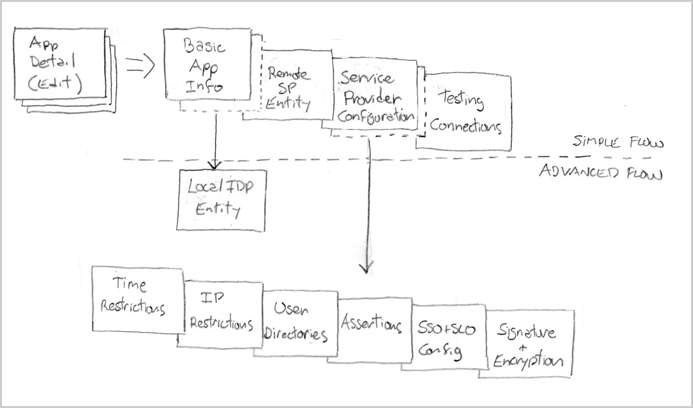
A hand-drawn diagram splitting an application’s configuration into a Simple Flow — Basic App Info, Remote SP Entity, Service Provider Configuration, Testing Connections — and an Advanced Flow that adds a Local IdP Entity plus time and IP restrictions, user directories, assertions, SSO/SLO config, and signature and encryption.
fig. 7 — 2013, the same split mapped across the whole app-detail flow — a short Simple path for most admins, with the federation depth (restrictions, directories, signatures) held below the line until an expert needs it.

Delivered, the console opened on the tenant’s assets — every connected application and identity provider with its sign-on status — and let an admin add the next one from a template of common providers or a custom SAML partnership.
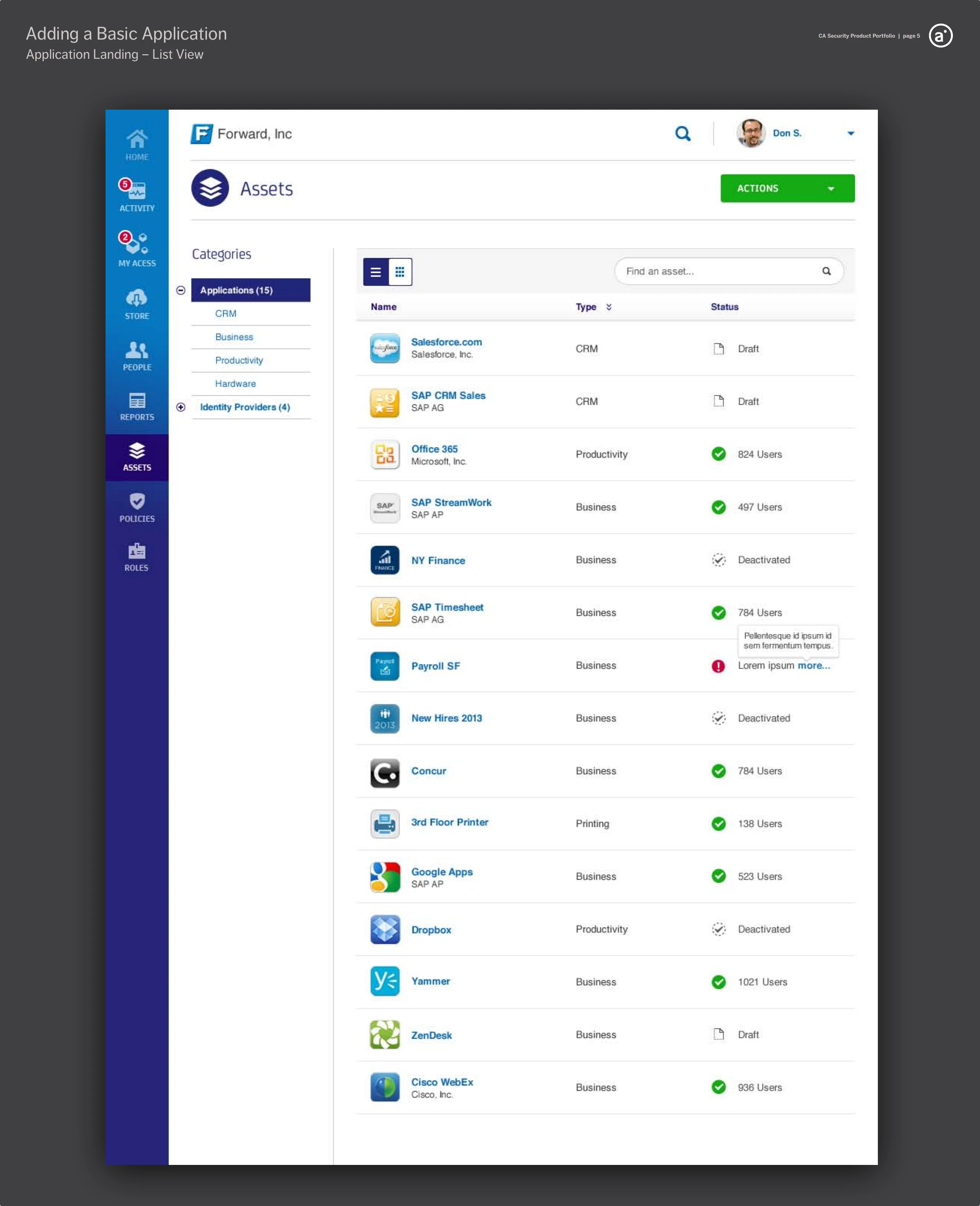
The CloudMinder Assets landing screen listing fifteen connected applications with type and sign-on status — draft, active with a user count, or deactivated.
fig. 8 — 2013, the delivered console — the tenant’s Assets landing: every connected application with its sign-on status, from draft to live, in one list. Hi-fi visual design by Christina Beard.
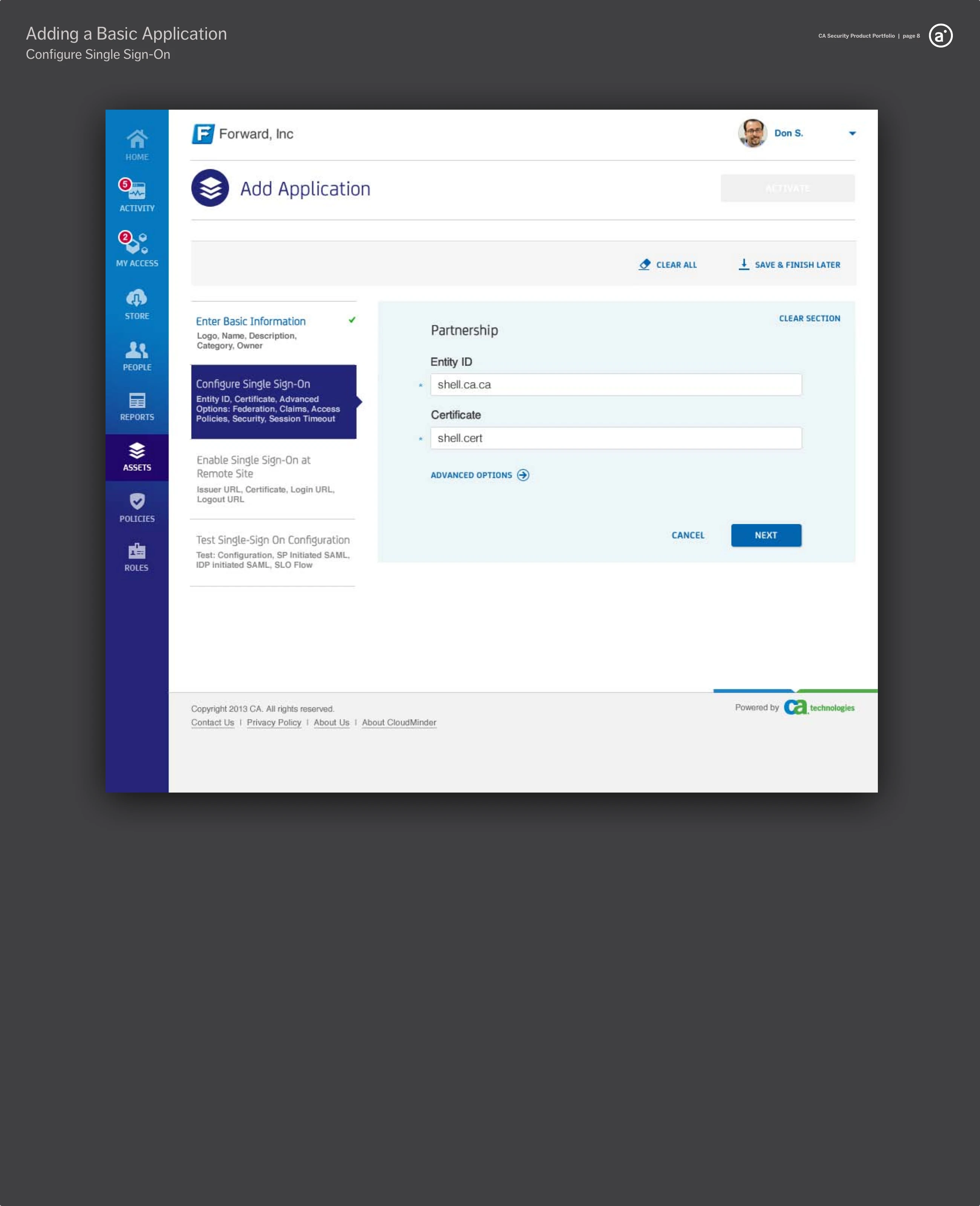
The Add Application wizard on its “Configure Single Sign-On” step in its Basic form, showing the Partnership section with Entity ID and Certificate fields and an Advanced Options link.
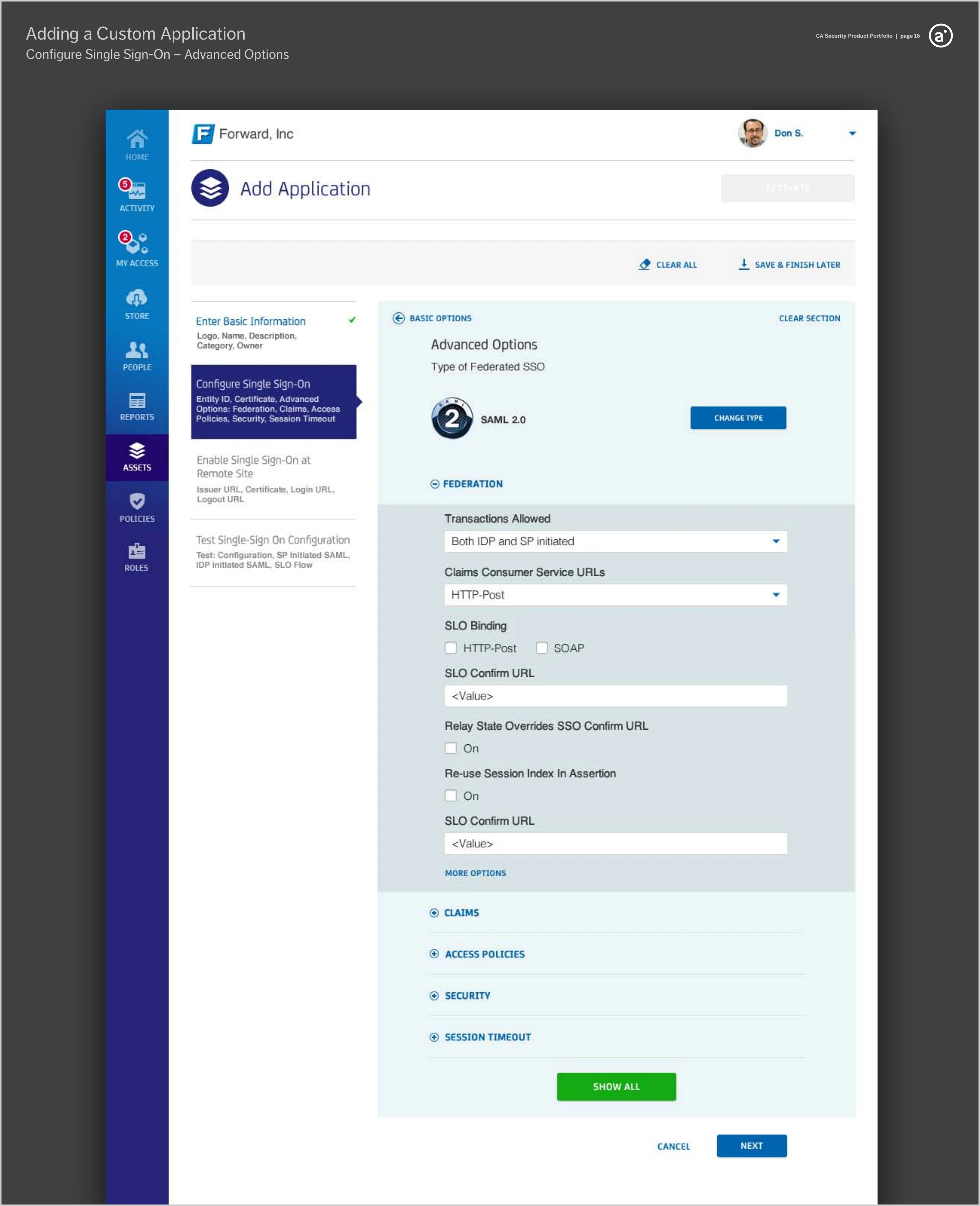
The same Configure Single Sign-On step expanded to Advanced Options, showing Federation settings with collapsed Claims, Access Policies, Security, and Session Timeout sections.
fig. 9 — 2013, the three levels as delivered — the Configure Single Sign-On step in its Basic form, just the partnership essentials (left), and the same step at Advanced, opening federation type, claims, access policies, security, and session timeout (right). The whiteboard’s spine, built into one screen. Hi-fi visual design by Christina Beard.

II — Signing In

The other half of the promise is the moment people actually sign in — and they are not one kind of person either. An employee reaches a SaaS app through the company’s own login; a partner is identified by email first, then routed to wherever their identity lives; a consumer registers on a publisher’s own site with a social account. The design kickoff mapped all of them as one flow, with a step-up gate in front of the higher-assurance services.
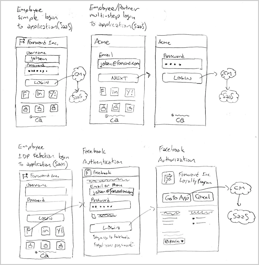
A hand-drawn sheet of login storyboards — an employee simple login, an employee/partner multi-step login, and an employee identity-provider-selection login routing through Facebook authentication and authorization.
fig. 10 — 2013, the sign-in patterns storyboarded by hand — a simple username and password, an identifier-first multi-step login, and an identity-provider round-trip through Facebook.

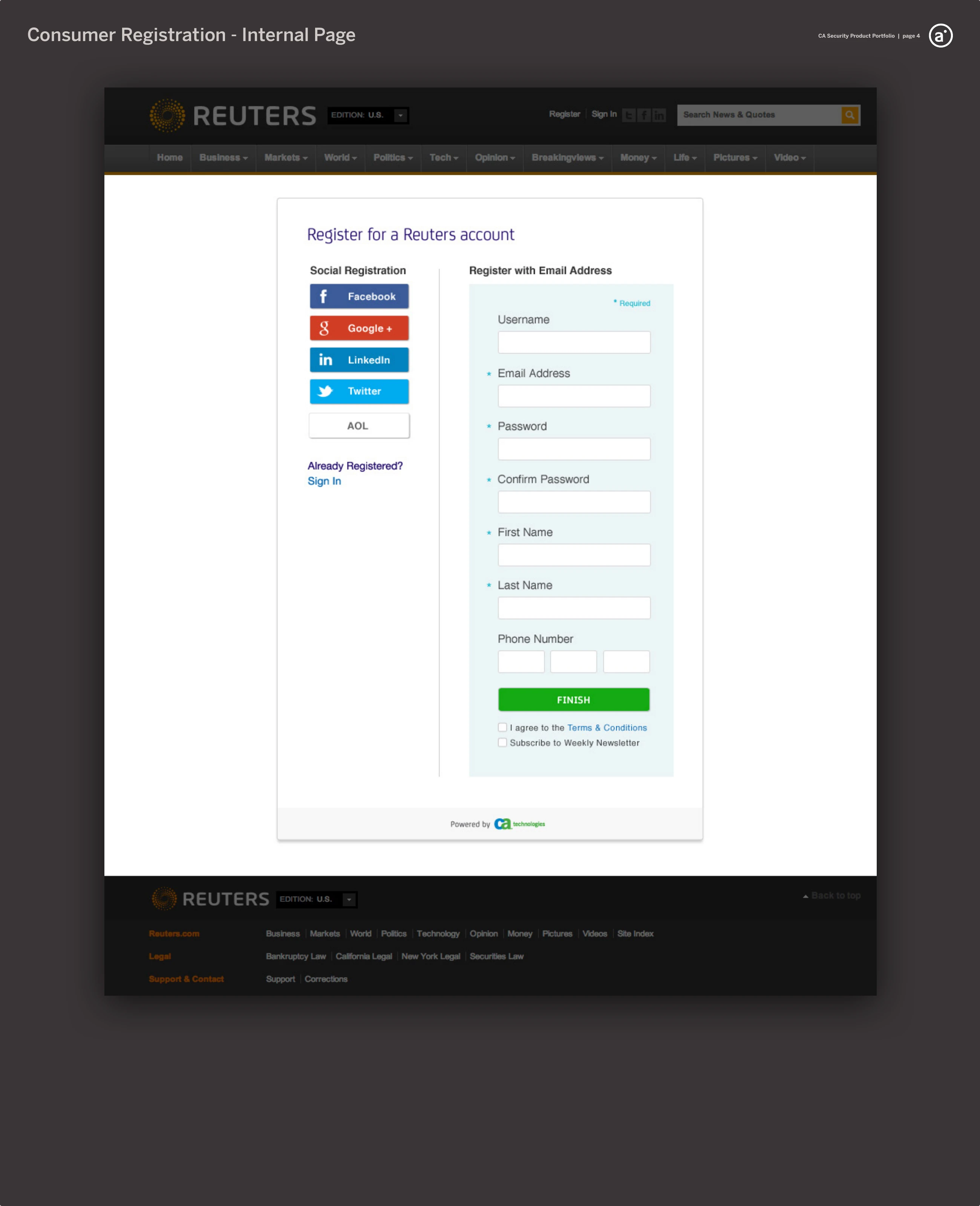
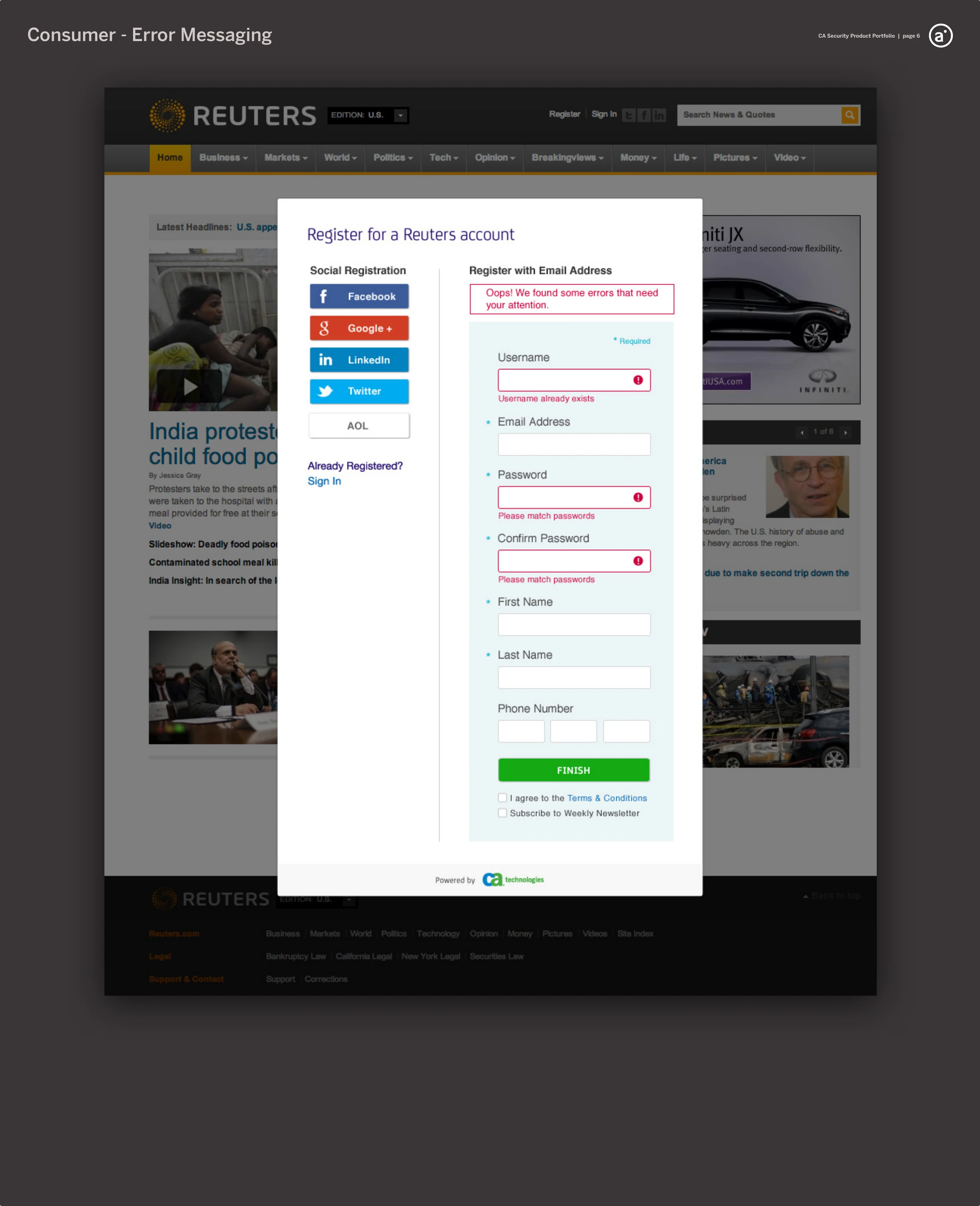
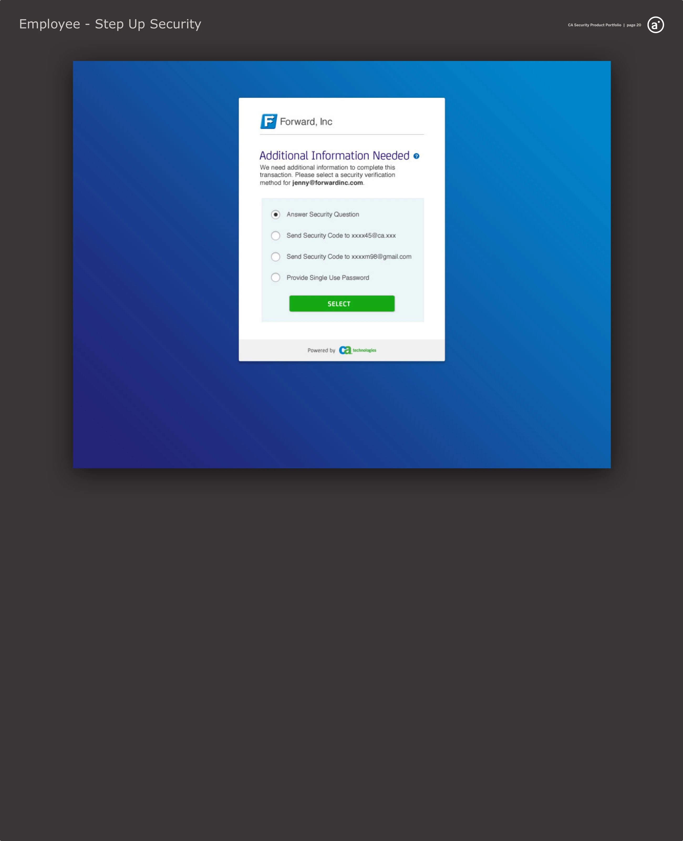
The delivered sign-in let an employee use a company email or an external credential — RSA SecurID, ArcotID, VASCO — and asked for a second factor only when the transaction warranted it. For consumers, the same identity ran quietly behind a host site’s own registration form, social or email, validating inline.
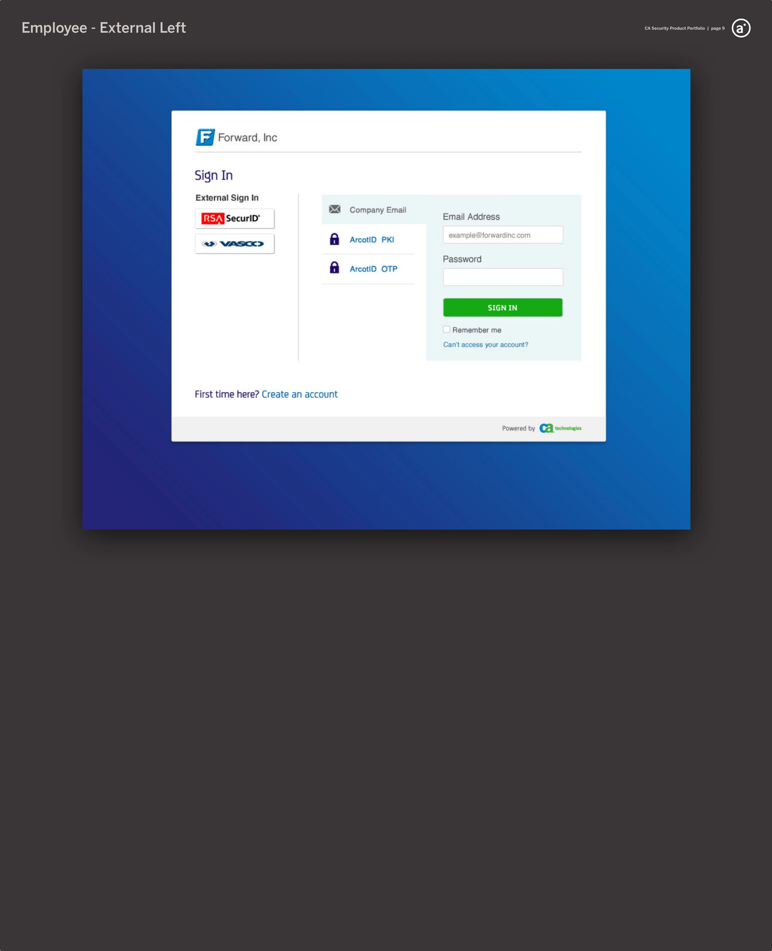
A Forward Inc. sign-in page with an External Sign In column (RSA SecurID, VASCO), ArcotID PKI and OTP options, and a company-email and password form.
A step-up “Additional Information Needed” card offering a security question, a security code by email, or a single-use password to complete a transaction.
fig. 11 — 2013, the delivered sign-in — an employee signing in with company email or an external credential such as RSA SecurID, ArcotID, or VASCO (left); and step-up security requesting a second factor when the transaction demands it (right).
A Reuters registration page powered by CloudMinder, offering social registration (Facebook, Google+, LinkedIn, Twitter, AOL) beside a register-with-email form.
The same registration form returning inline validation errors on the required fields.
fig. 12 — 2013, registration on the host site — a reader creating a CloudMinder-backed account on Reuters with a social provider or email (left), and the same form returning inline validation when something is missing (right).

III — Searching, Filtering, Sorting

Underneath both halves of single sign-on sat the same raw material: data. The CloudMinder console was, in the end, a stack of dense tables — applications, identity providers, access requests, audit events — that an administrator had to search, filter, sort, and edit all day. The same engagement asked me to make those tables fast to work in. I treated it as a design system of its own, worked out on paper across the autumn of 2013, before any of it was built.
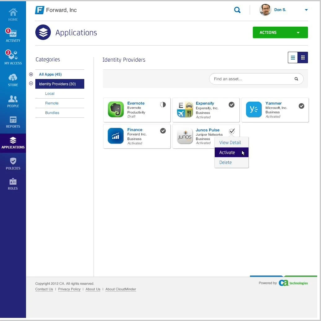
The CloudMinder admin console for the tenant “Forward, Inc” — an Applications screen with a left navigation rail, a Categories sidebar (All Apps, Identity Providers, Local, Remote, Bundles), a “find an asset” search field, a list/grid view toggle, and a grid of application cards (Evernote, Expensify, Yammer, Finance, Junos Pulse) each showing type and activation status, with an open View Detail / Activate / Delete menu.
fig. 13 — 2013, the product the table system served — the CloudMinder admin console, where an administrator searched, filtered, and sorted dense Assets lists all day. The Categories sidebar, the “find an asset” search, and the list/grid toggle are the live controls the studies that follow worked out. Hi-fi visual design by Christina Beard.
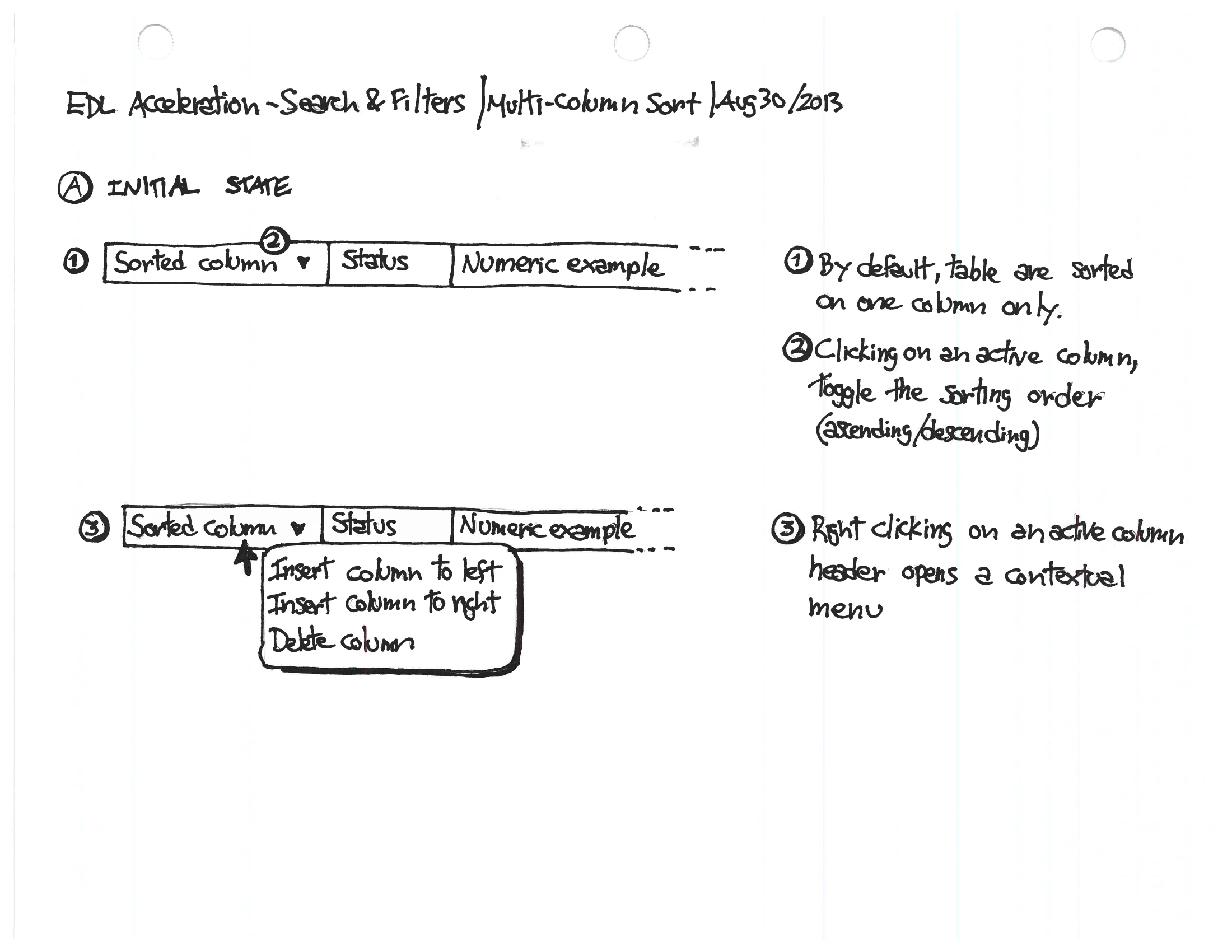
A hand-drawn study headed “EDL Acceleration — Search & Filters / Multi-column Sort, Aug 30 2013”, showing a data-table header row with a column context menu (insert column left/right, delete column) and three numbered notes explaining default single-column sort, click-to-toggle sort direction, and right-click to open the column menu.
fig. 14 — 2013, the sorting model reasoned out from first principles — by default a table sorts on one column; a click flips the direction; a right-click opens the column’s menu. The starting state, before any multi-column behaviour. (Dated Aug 30.)
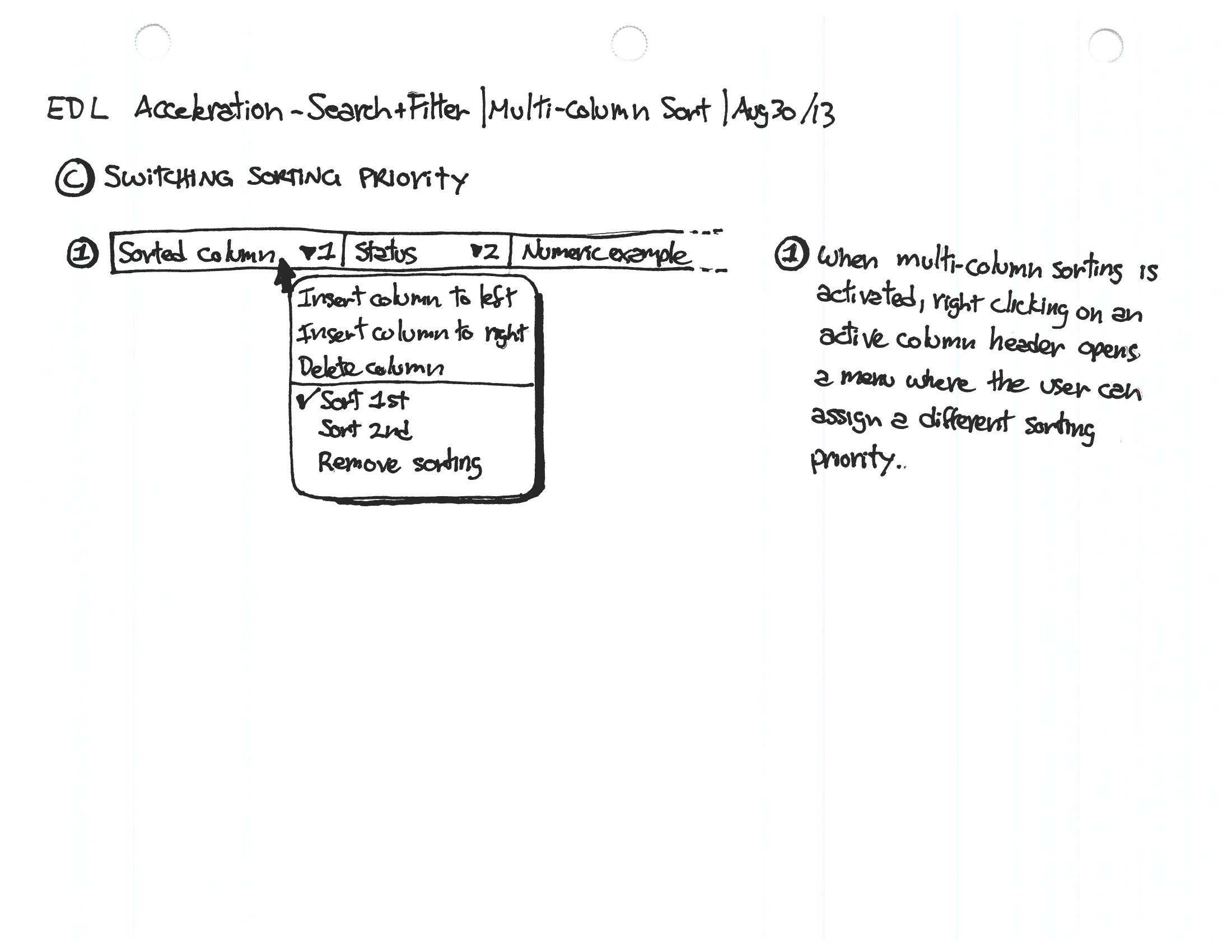
The same study at “Switching sorting priority” — an active column’s right-click menu now offering Sort 1st, Sort 2nd, and Remove sorting, with a note on reassigning sort priority.
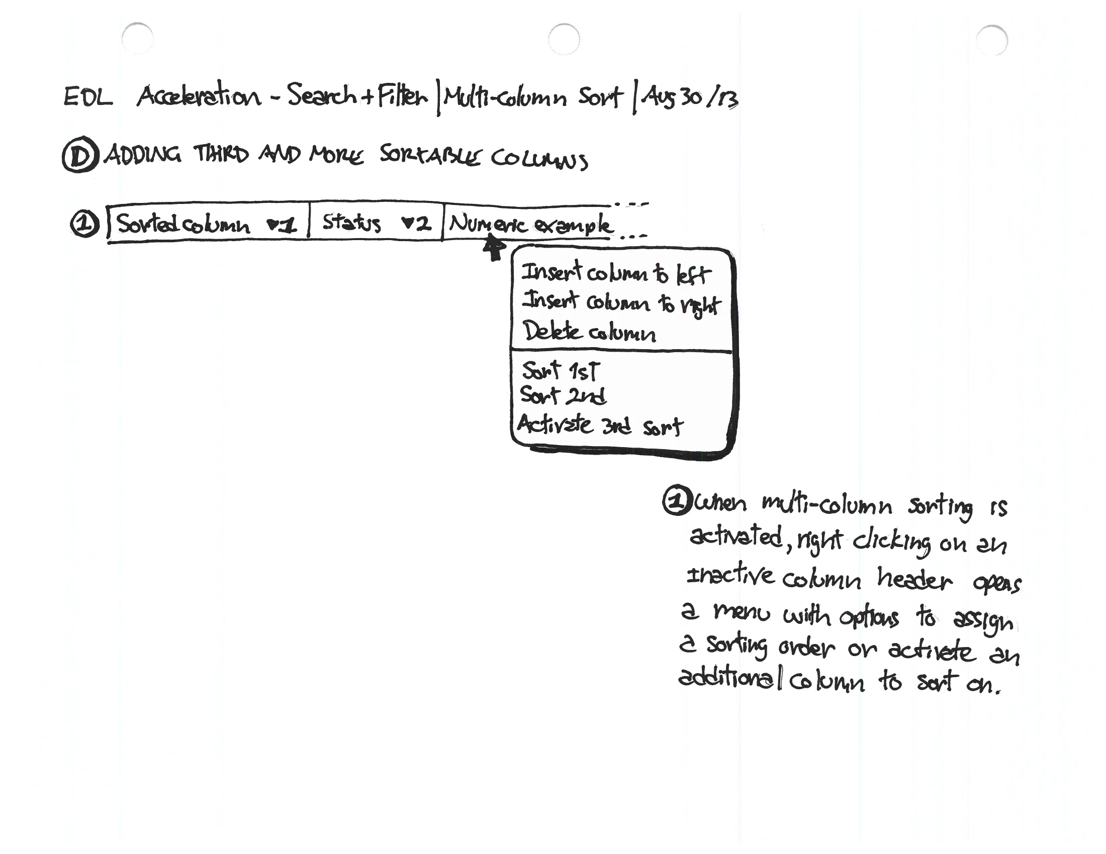
The same study at “Adding a third and more sortable columns” — the menu offering Sort 1st and Activate 3rd sort, letting an admin build a multi-column sort one column at a time.
fig. 15 — 2013, the same menu doing more work — reassigning which column sorts first or second (left), then stacking a third and beyond (right). Multi-column sort built up one right-click at a time, each step written out beside the frame. (Dated Aug 30.)

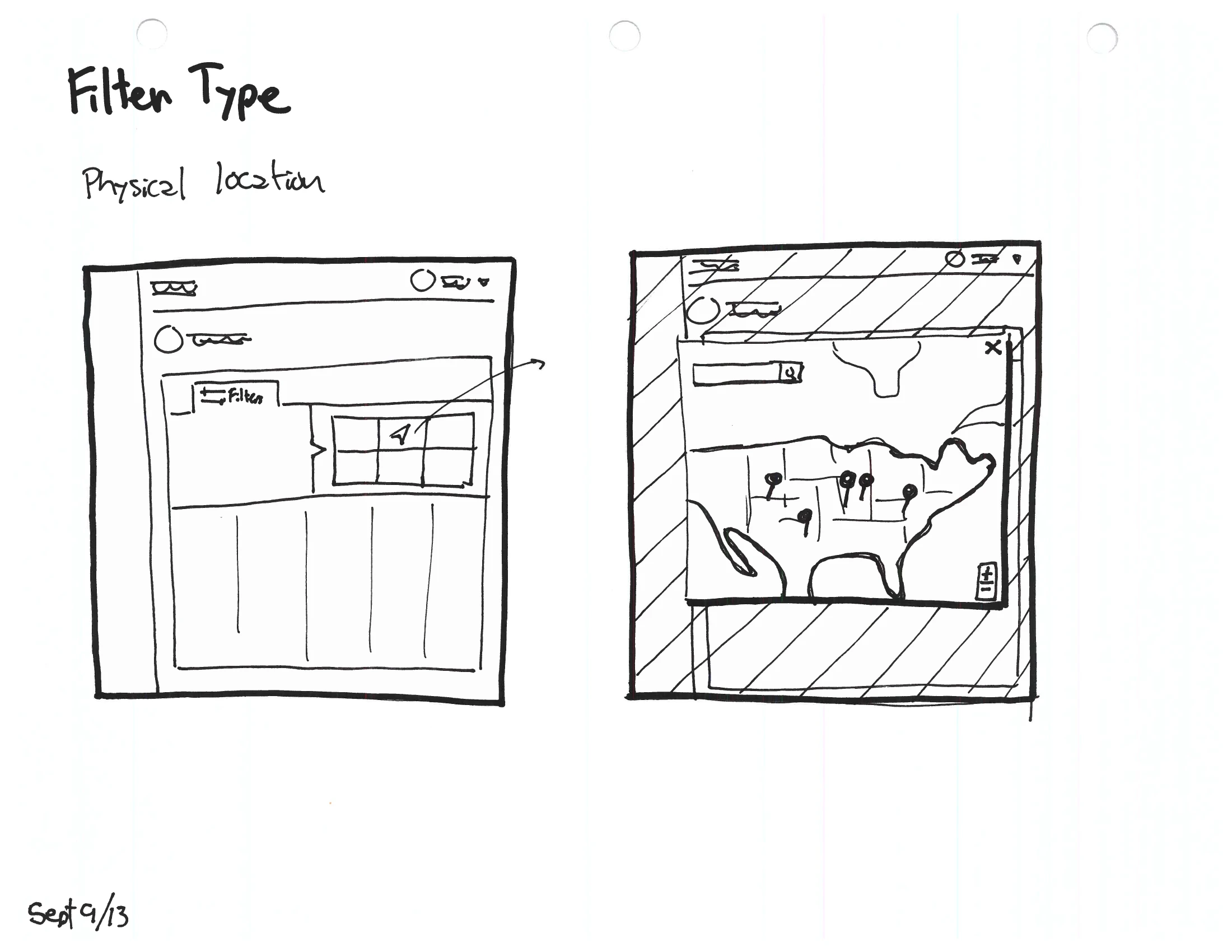
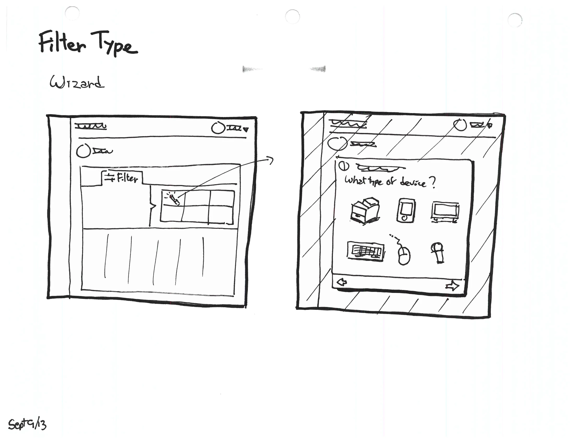
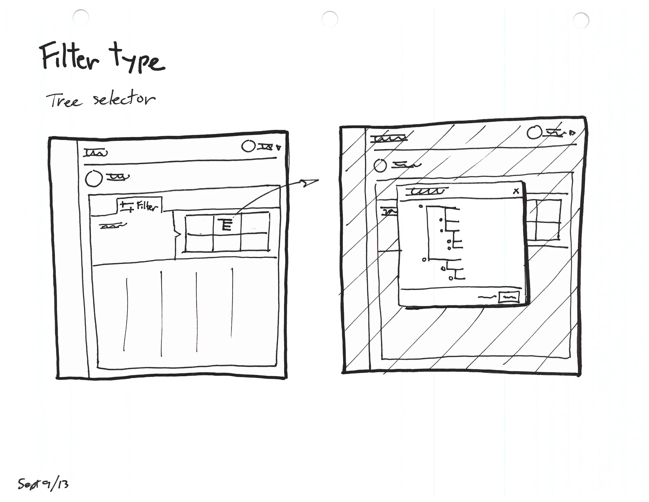
Sorting was the easy half. Filtering was the hard one: every column wanted a different way in — a date wants a calendar, a utilization figure wants a range, an owner wants a directory, a location wants a map. Rather than guess, I drew the alternatives out — roughly ten distinct filter types, each as the table before and the filter in action — so the choices could be compared on their merits.
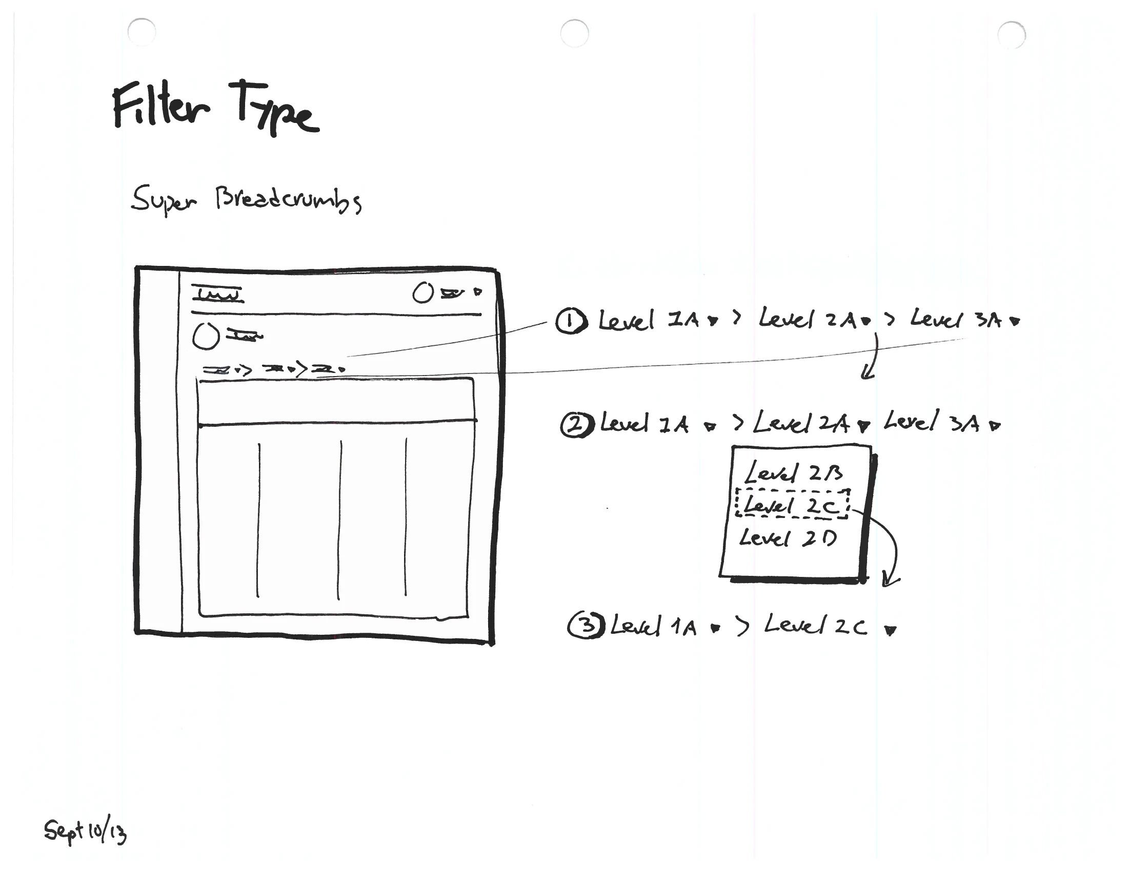
A two-panel filter sketch labelled “Super Breadcrumbs” — a data table whose filter is a chain of drill-down levels (Level 1A › Level 2A › Level 3A) with a dropdown to switch a level.
A two-panel filter sketch labelled “Tree selector” — a data table opening an overlay that filters by picking a node from an indented tree hierarchy.
fig. 16 — 2013, two of roughly ten filter types explored on their own merits — a “super-breadcrumb” drill-down (left) and a tree selector (right), each drawn as the table before and the filter in action. (Sept.)
A two-panel filter sketch labelled “Physical location” — a data table opening a map of the United States with markers, to filter records by geography.
A two-panel filter sketch labelled “Wizard” — a data table opening a guided step that asks “What type of device?” with selectable device icons.
fig. 17 — 2013, two more from the same catalog — filtering by a location on a map (left) and a guided wizard for a multi-step choice (right). Ten ways to narrow a table, each tested before choosing. (Sept.)

The catalog needed a spine — one logic that told an admin where a filter would appear and how to put it away. That came as a metaphor I sketched out in five panels: the buffet.
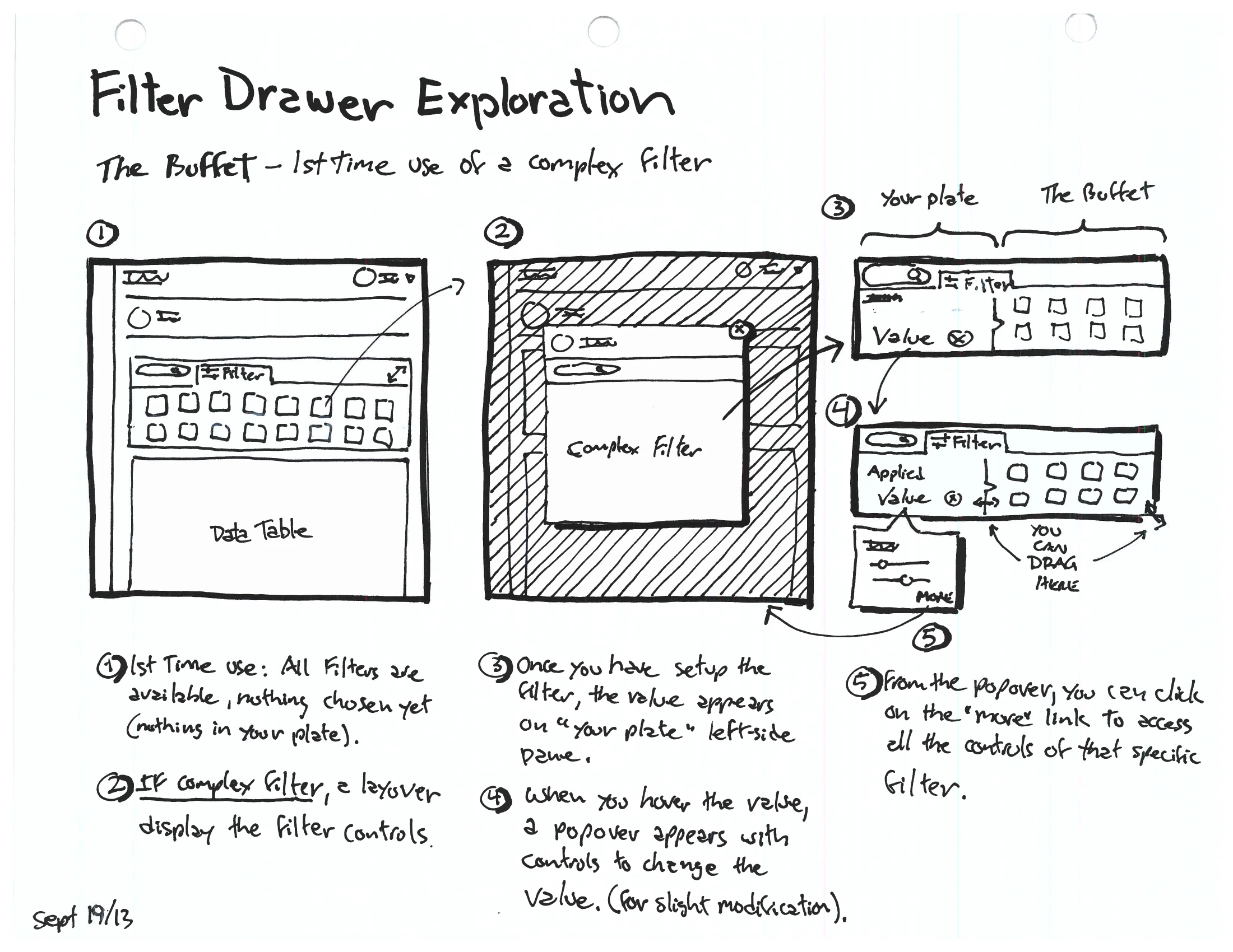
A landscape sketch titled “Filter Drawer Exploration — The Buffet, first-time use of a complex filter”, five numbered panels using a plate-and-buffet metaphor: all filters available but none chosen, a layover for a complex filter’s controls, the chosen filter’s value landing on a left-side “plate” pane, a hover popover to change it, and a “more” link back to the full controls.
fig. 18 — 2013, the idea that pulled the filter system together — “the buffet.” Every filter is available like dishes on a buffet; the ones you choose land on “your plate” down the side, where a hover edits the value and a “more” link reopens the full controls. The unifying metaphor, worked out in five panels. (Dated Sept 19.)
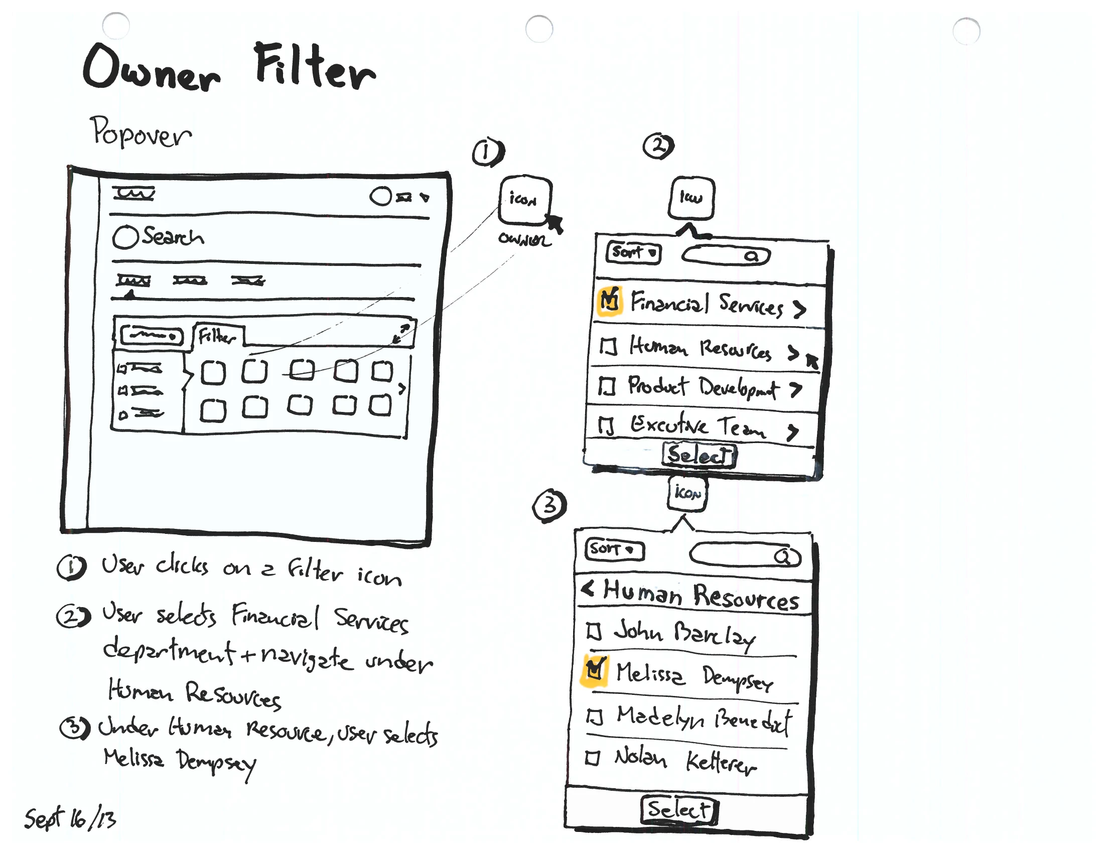
An “Owner Filter” popover sketch — clicking a filter icon opens a popover to search and drill from a department (Financial Services, Human Resources) down to an individual owner.
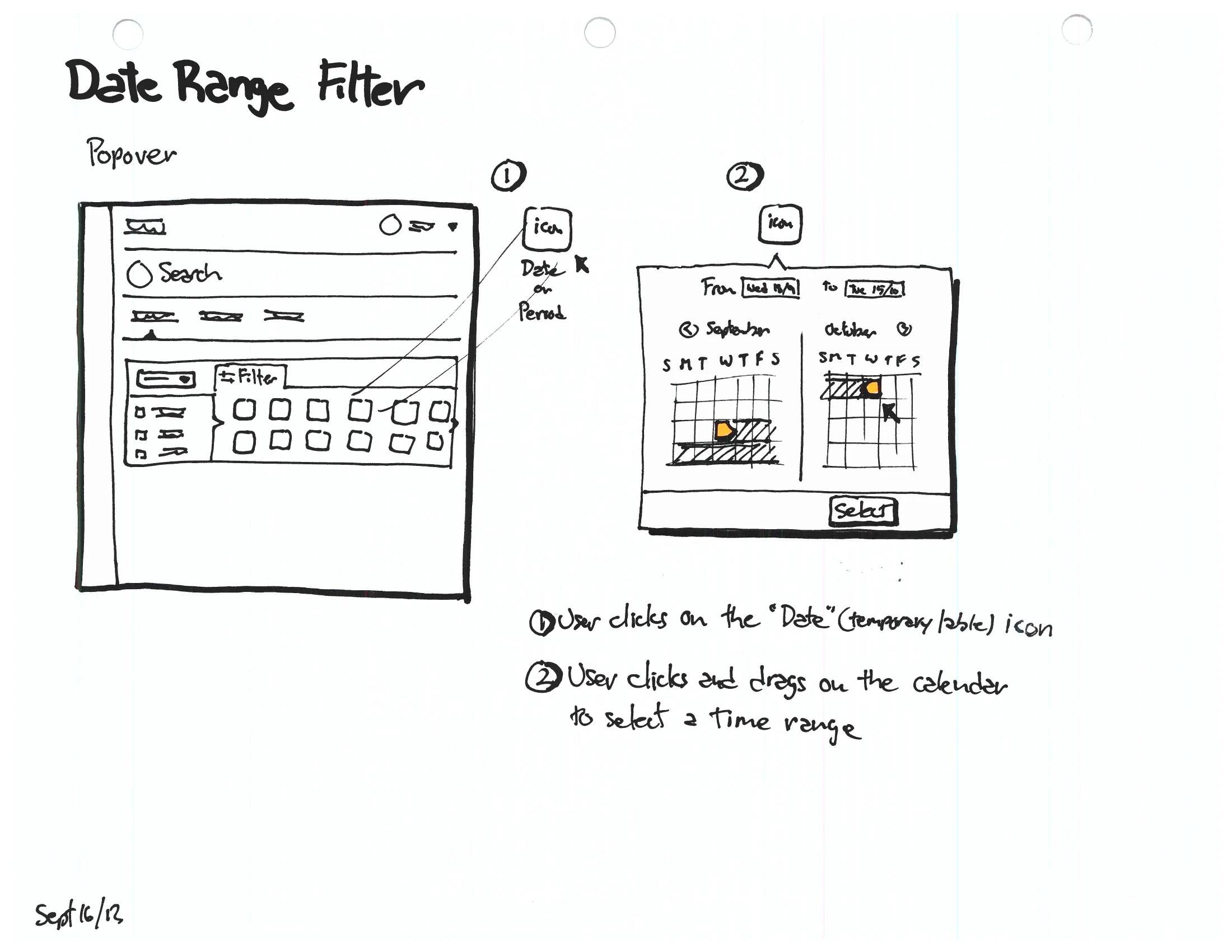
A “Date Range Filter” popover sketch — clicking a date icon opens a two-month calendar popover where the admin click-drags to select a time range.
fig. 19 — 2013, the same buffet logic in two concrete filters — owner, drilling from department to person (left), and date range, click-dragged across a calendar (right) — each anchored as a compact popover on its column. (Dated Sept 16.)

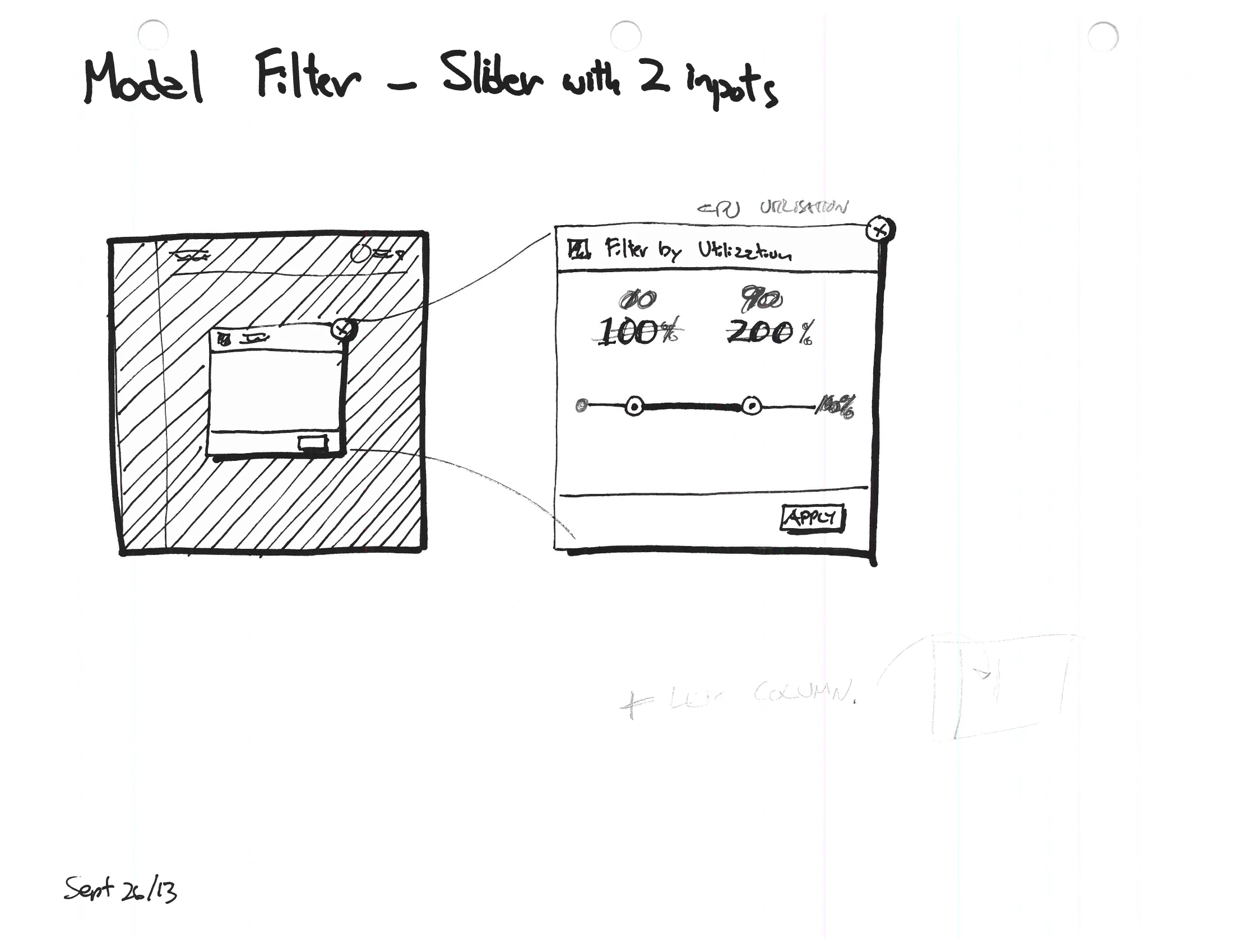
Once the behaviour was settled, the filters had to become parts — a small, reusable kit any table could draw from instead of inventing its own.
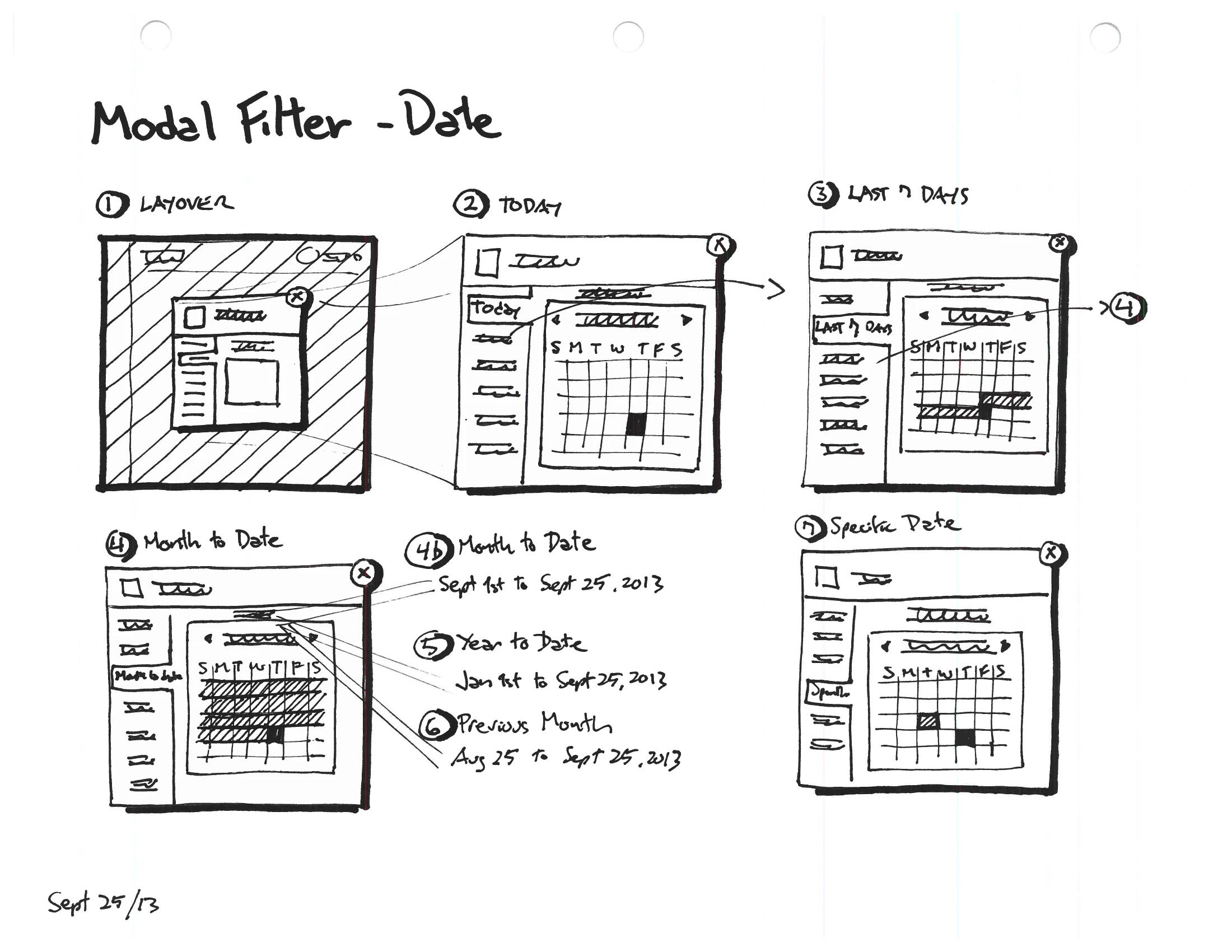
A “Modal Filter — Date” sketch laying out date-filter presets — Today, Last 7 Days, Month to Date, Year to Date, Previous Month, Specific Date — each with a small calendar.
A “Modal Filter — Slider with two inputs” sketch — a “Filter by Utilization” control with a two-handle range slider from 0% to 200% and an Apply button.
fig. 20 — 2013, the filters resolved into a reusable kit — a date filter with its presets (left) and a two-handle range slider (right), specified as standard components so every table could reuse them. (Sept 24–26.)

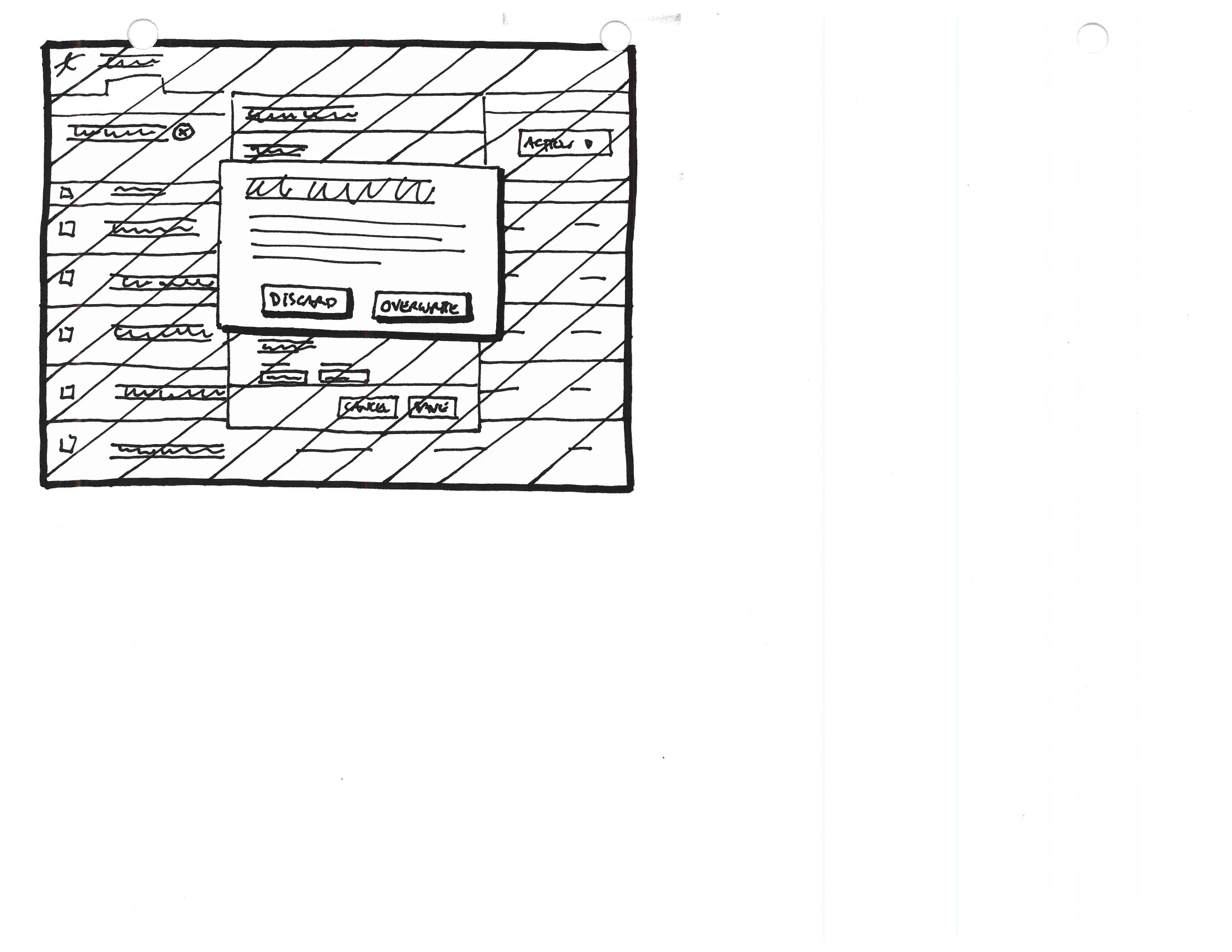
The last problem was the one nobody photographs: editing data many people share. A row has to lock while it is being changed, warn before the session expires, and resolve cleanly when two administrators reach for it at once.
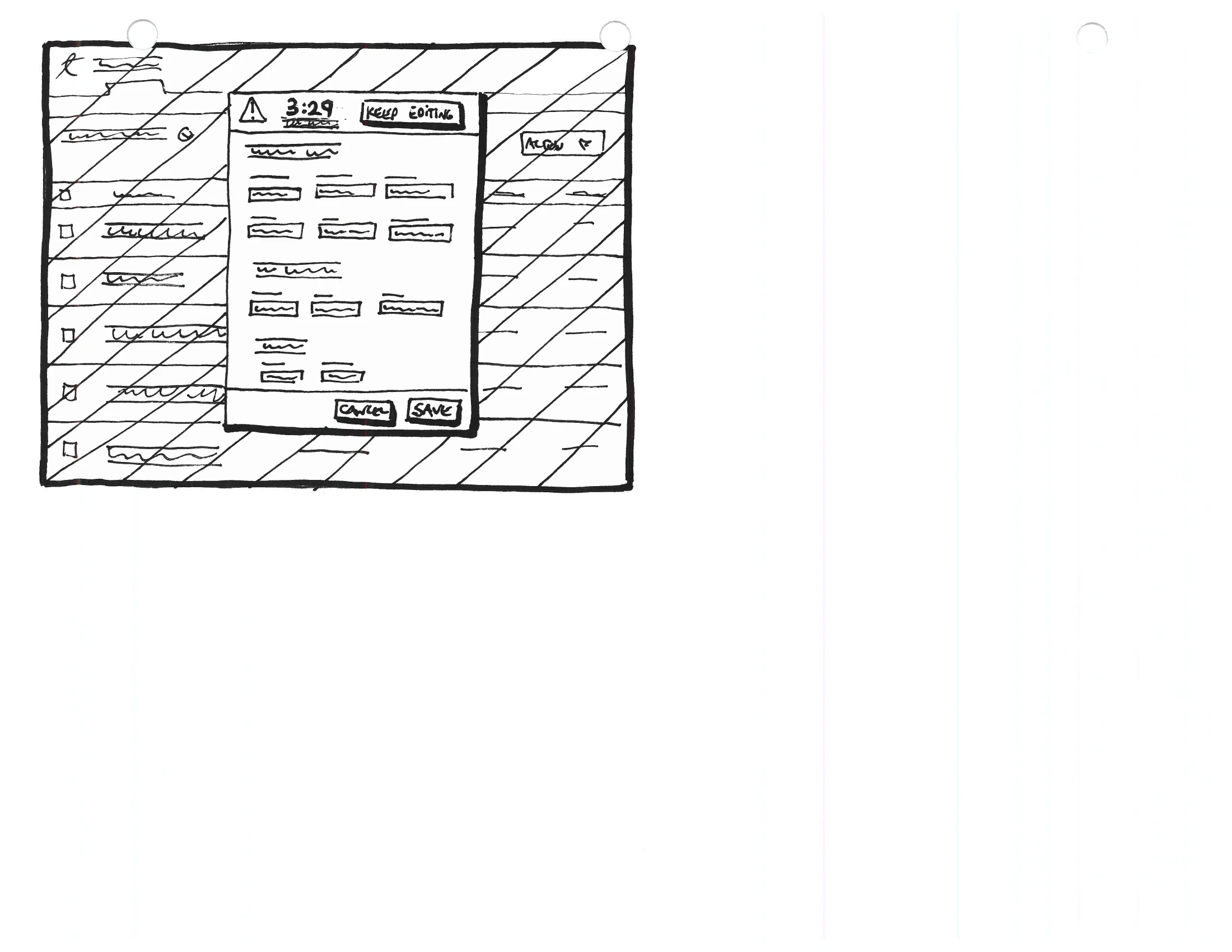
A data-table edit screen with a session-timeout warning modal counting down from 3:29, shown over a locked record.
A data-table edit screen with a conflict modal offering to discard or overwrite changes when another user has edited the same record.
fig. 21 — 2013, the unglamorous half of working in shared data — a record-locking edit session that warns before it times out at 3:29 (left), and a discard-or-overwrite dialog for when two administrators touch the same row at once (right).