Designer, Remote Patient Monitoring
Who Needs Me First
TELUS Health’s remote-patient-monitoring dashboard — the screen a nurse opened each morning to see, across their whole panel, who was getting worse and who needed them first. I was the designer: from the nurse’s own questions and a hand-drawn vocabulary for the body’s signals, through the add-patient and first-time-login flows, to how a week of readings should be read at a glance. A design decision here carried life-safety consequences, and clinicians reviewed every one.
TELUS Health builds the software Canadian clinicians use to monitor patients between visits. I was the designer on its remote-patient-monitoring (RPM) surface: the Clinical Dashboard nurses used to track recently discharged and chronically ill patients, and the flows that put a patient on the panel and a tablet in their hands. The work ran 2014–2016, and what shipped is the screen clinicians read each morning.
The product team was not a typical software team. The product managers were nurses who had practised clinically before moving into product. We held weekly co-design workshops, and every threshold setting, every alert, every symptom-entry path was reviewed by clinicians before it shipped — not as a final check, but as an embedded part of the design loop.
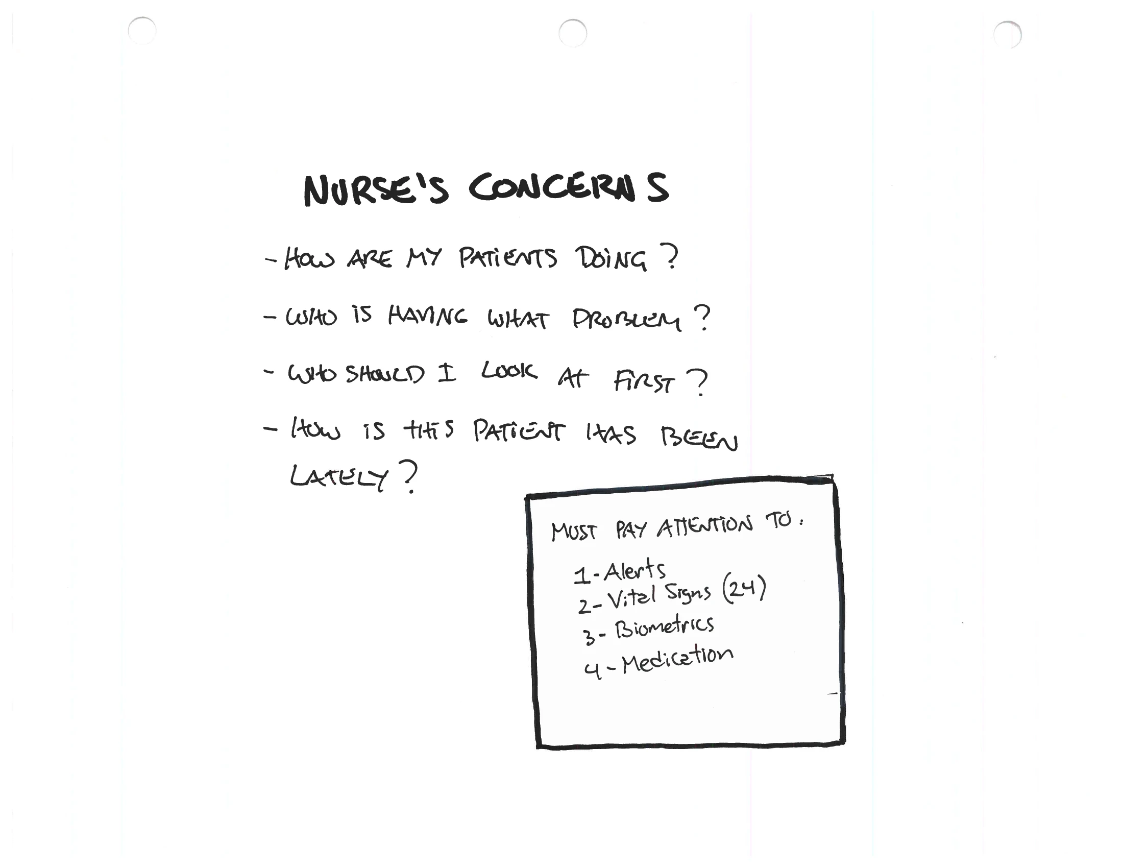
So the dashboard did not begin as a layout. It began with the nurse’s own questions — who needs me first, who has been getting worse — and a hand-drawn visual vocabulary for the body’s signals: weight, blood pressure, pulse, oxygen, glucose. Then a deliberately wide search for the form, including shapes that were never built, before a triage table won.
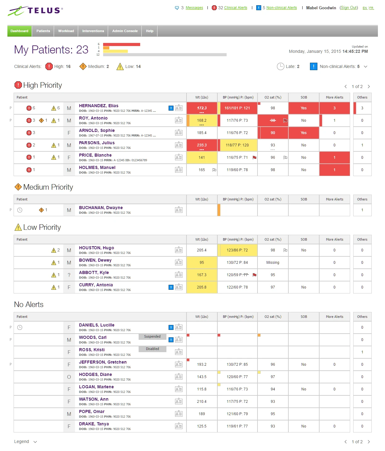
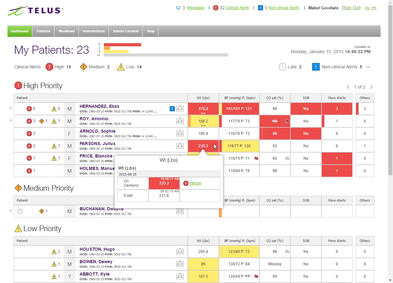
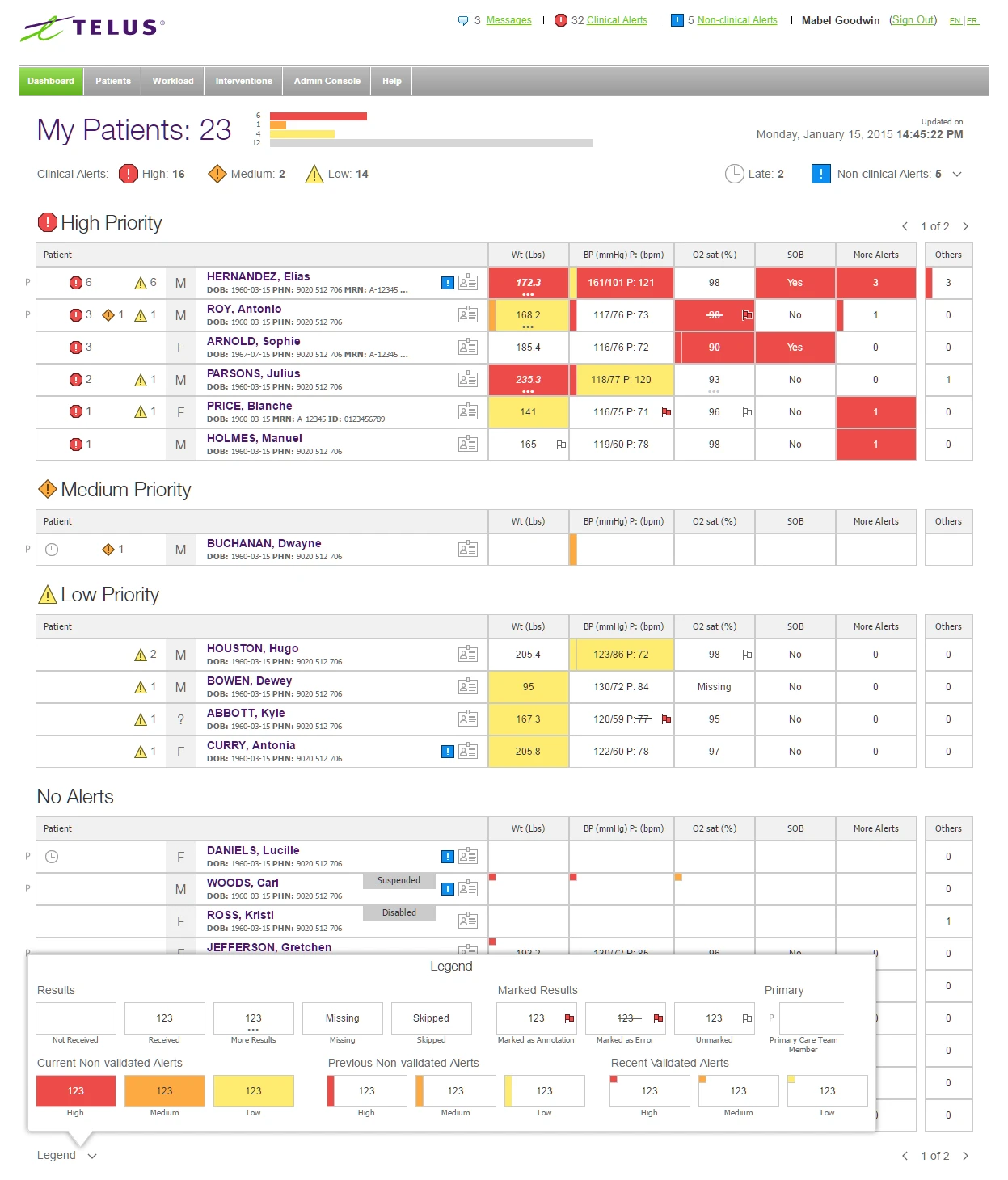
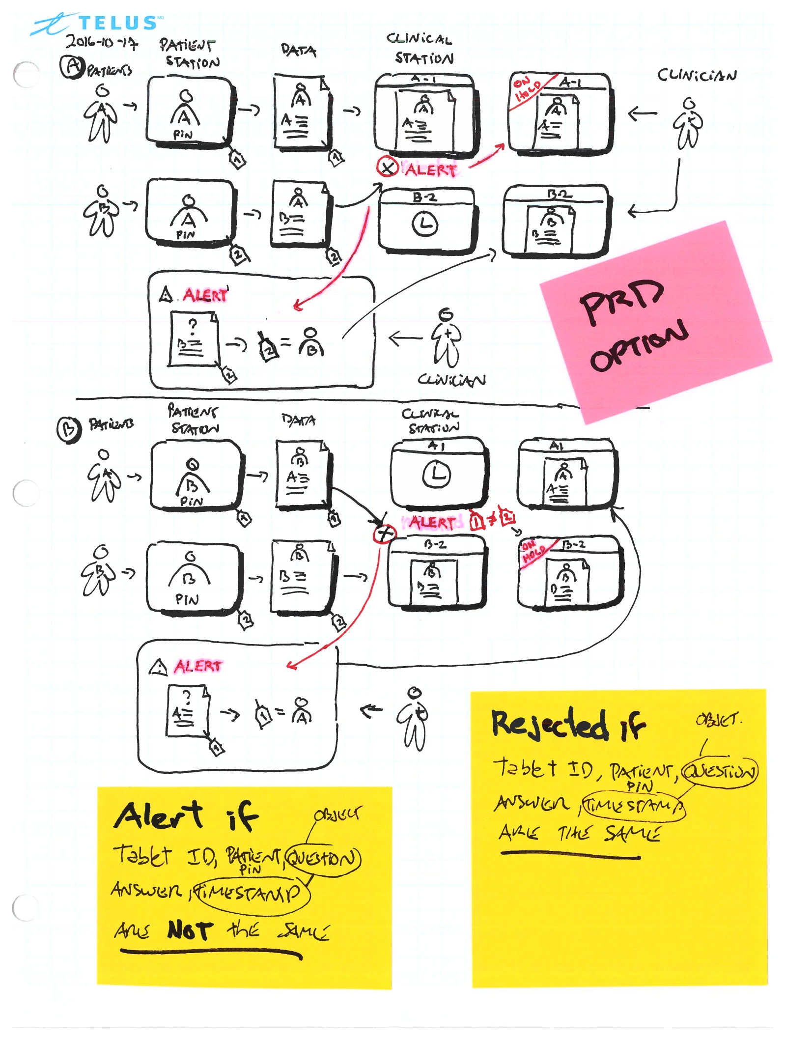
A nurse opened it and saw, for every patient on her panel, vital readings, reported symptoms, alert status, and lifecycle stage in one view — alerts tiered by severity, red for high, orange for medium, yellow for low. Around that screen sat the rest of the problem: matching the right patient to the right clinician at first login, and the human chain that put a monitoring device in an elderly patient’s home. The captions show the work — the questions first, the form searched wide, then the pixels.
I — The Clinical Dashboard
The dashboard did not begin as a layout. It began with the nurse’s own questions — who needs me first, who has been getting worse — and a hand-drawn vocabulary for the body’s signals. Then a deliberately wide search for the form, including shapes that were never built.
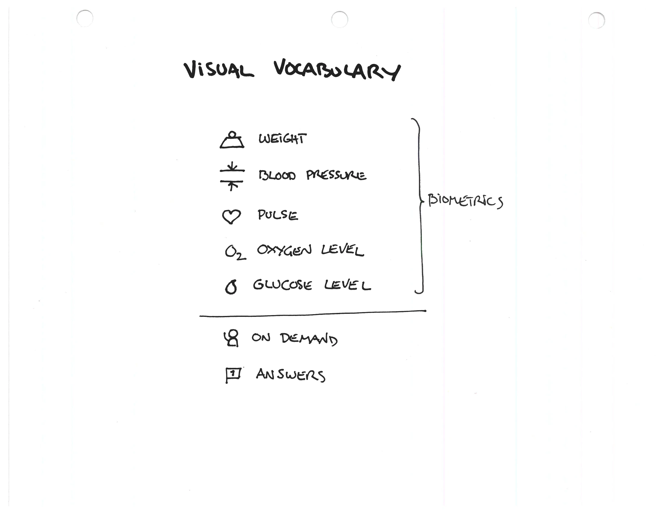
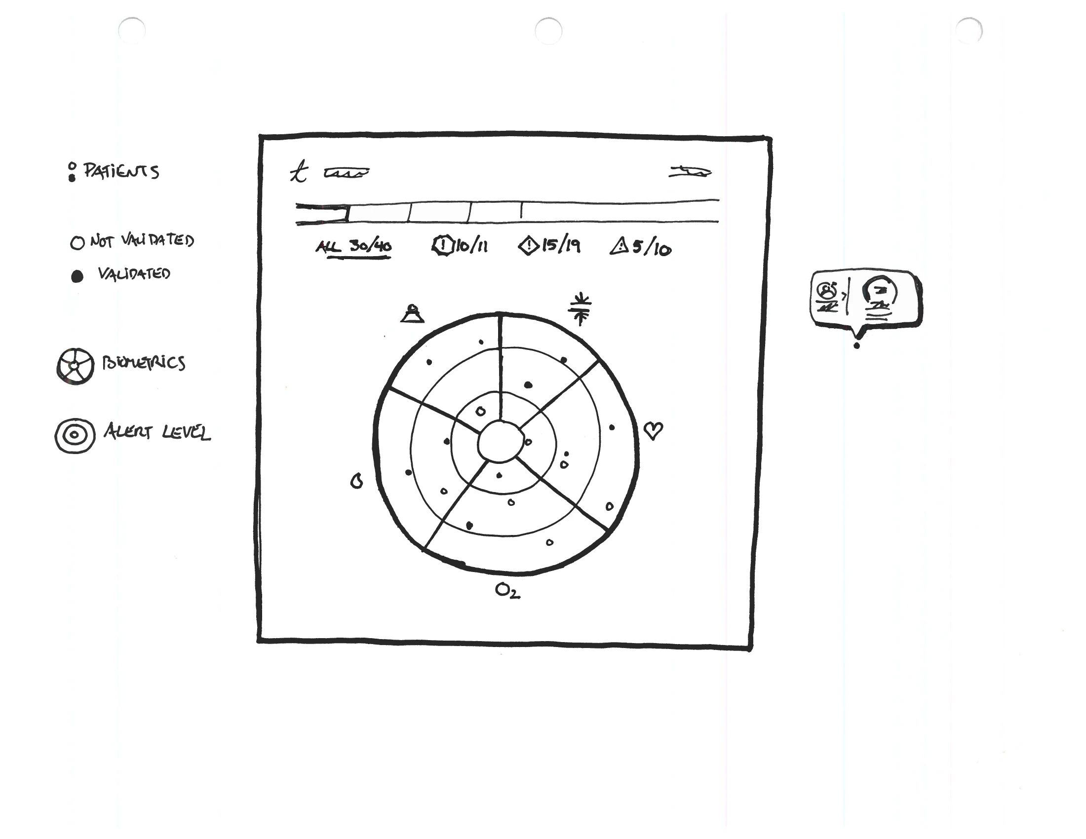
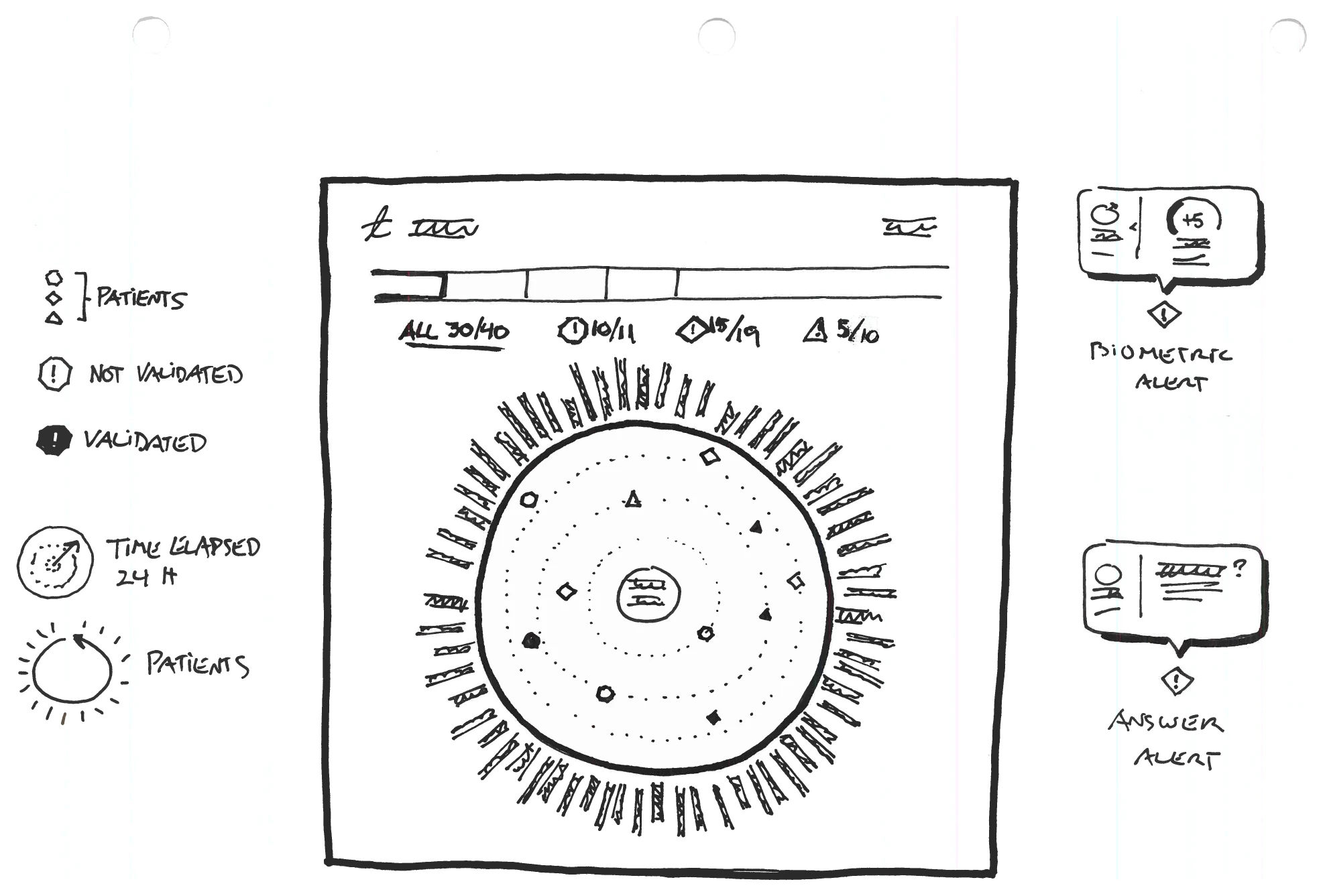
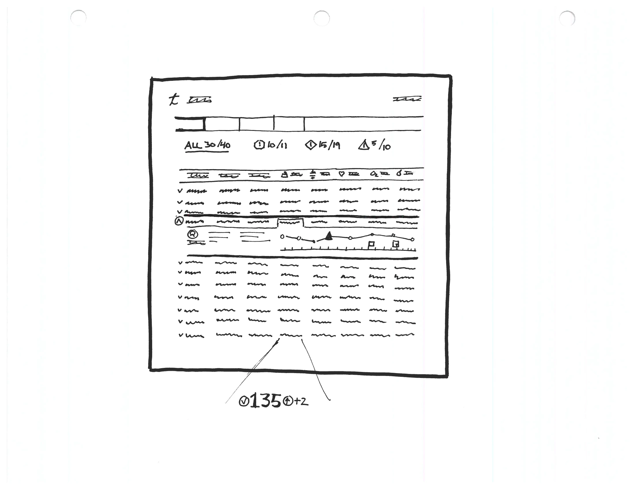
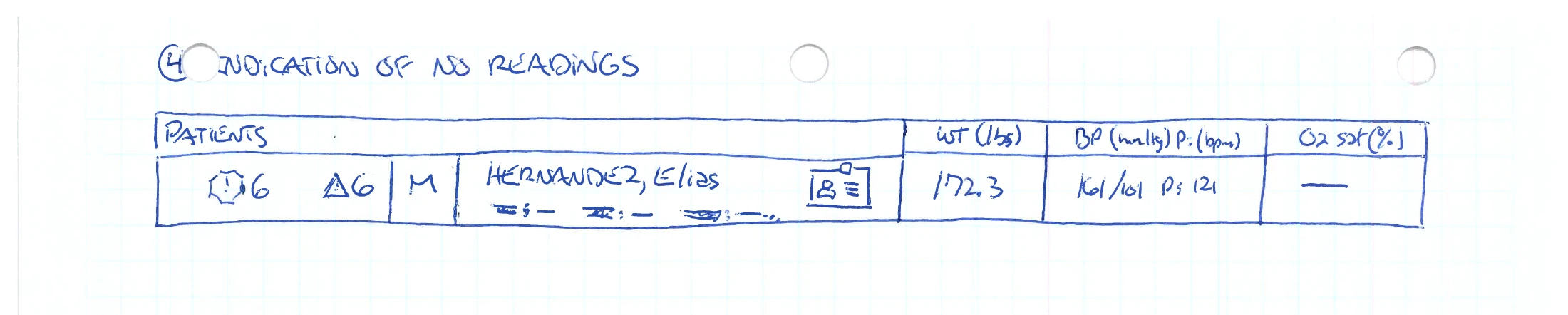
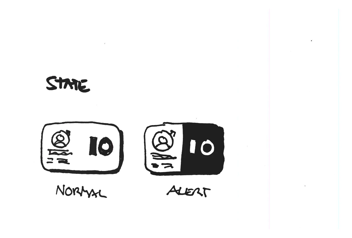
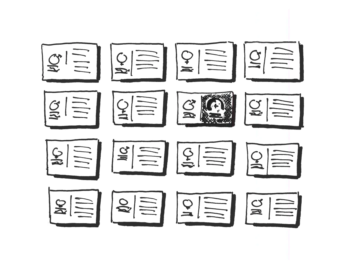
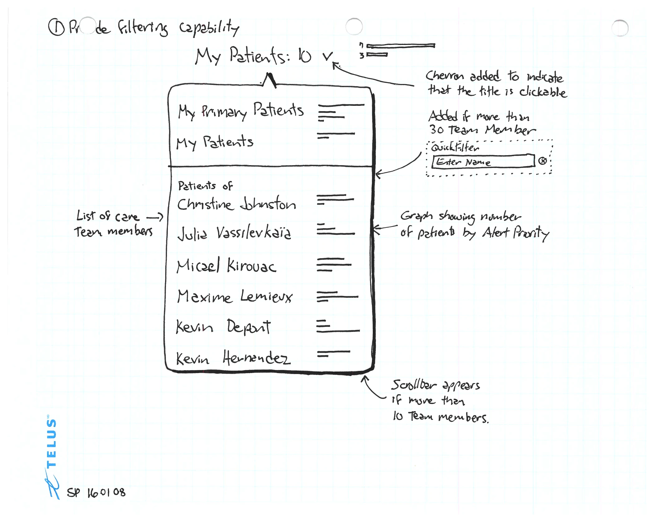
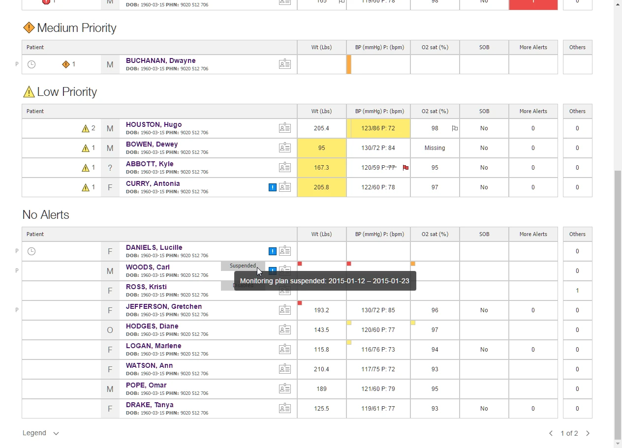
A nurse opened the dashboard in the morning and saw, for every patient on her panel, vital readings, reported symptoms, alert status, and lifecycle stage in one view. Alerts were tiered by severity: red for high, orange for medium, yellow for low. She could drill into a row to read the longitudinal data — a week of readings against the threshold, her own annotations inscribed back into the timeline.
II — Onboarding & First-Time Login
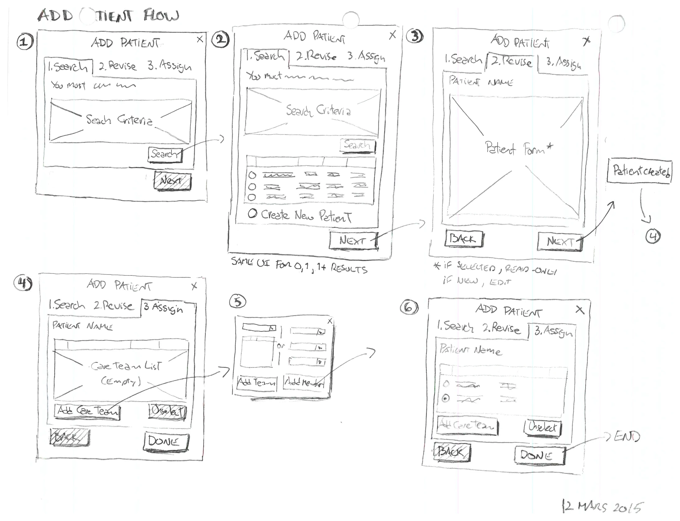
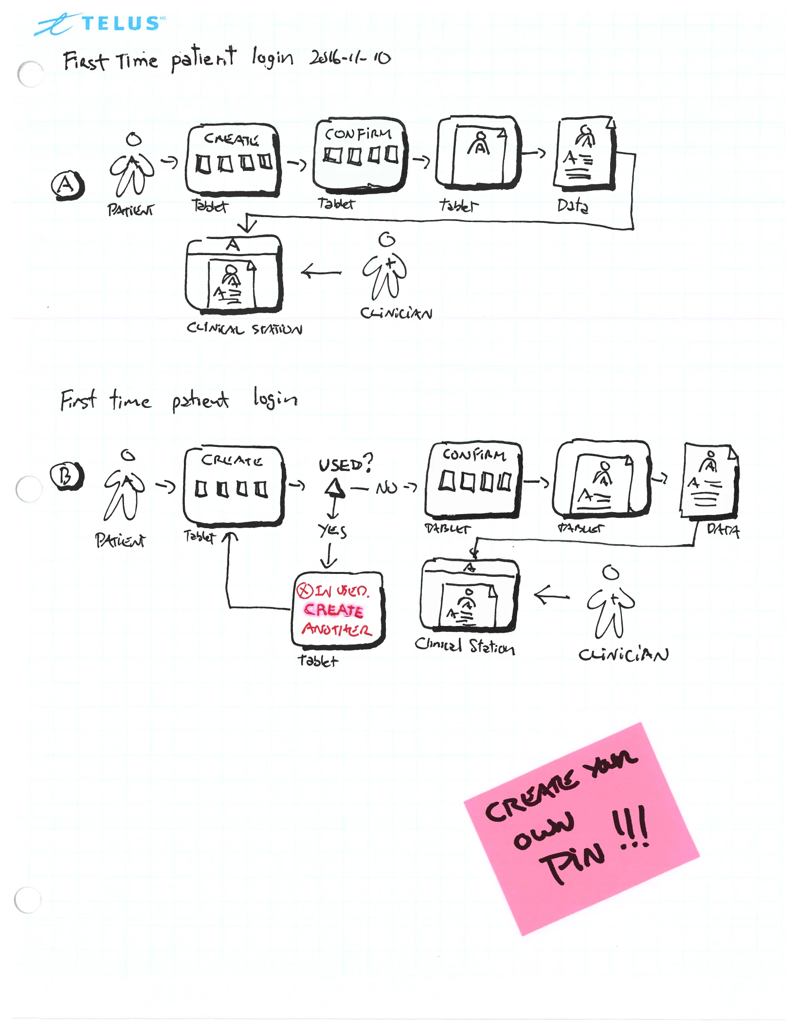
Two onboarding problems sat around the dashboard. The nurse created the patient’s account and added them to her panel herself — the right patient assigned to the right clinician, with the safeguards a monitoring program demands. The patient then had to log in on a tablet for the first time, at home, alone — receiving the credentials the nurse had set up, and turning them into their own PIN.
III — Reading the Results
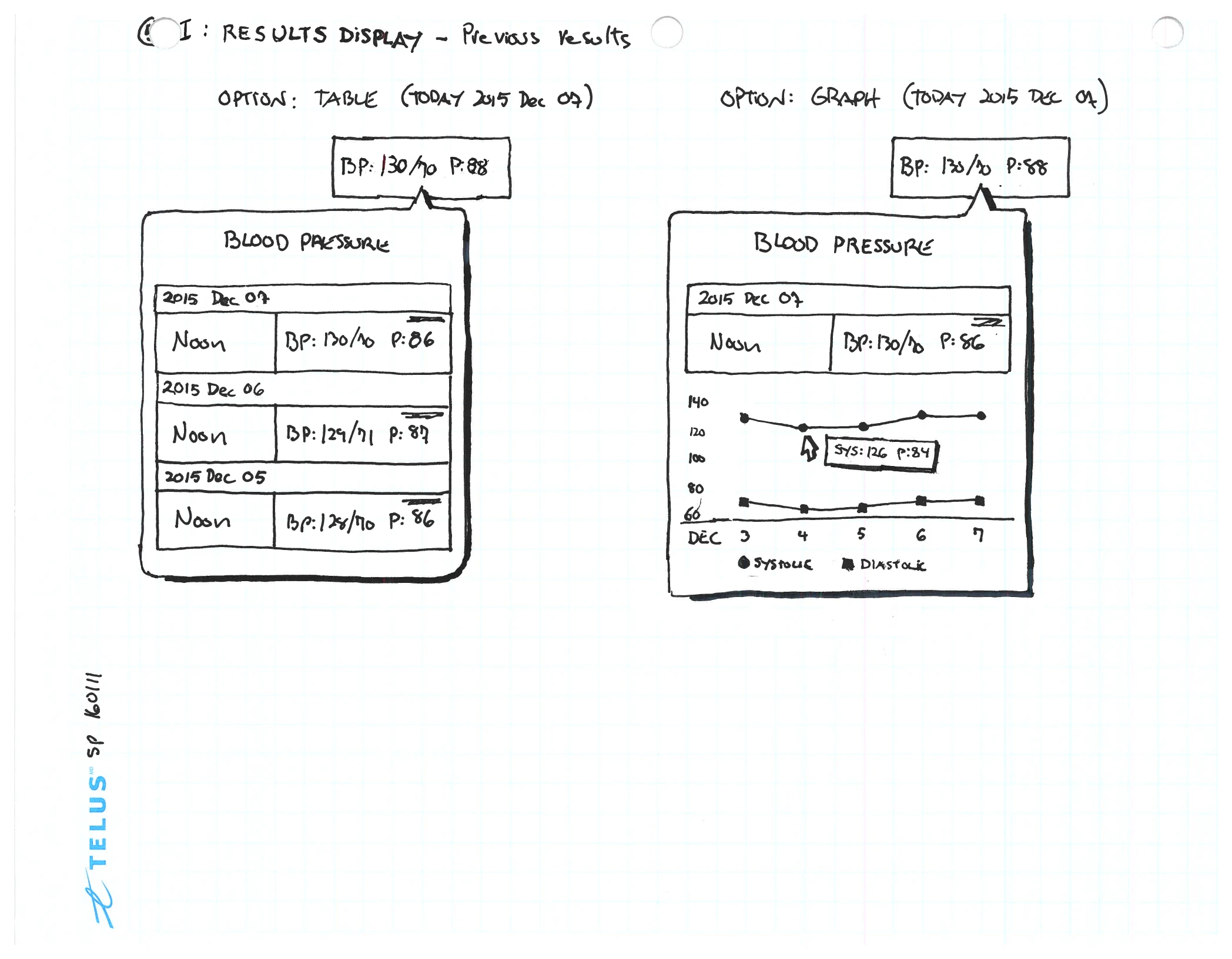
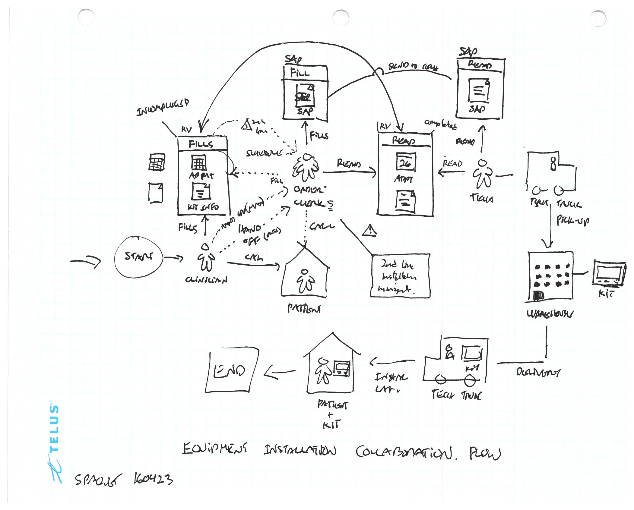
Two questions sat at the end of the loop: how a week of a patient’s readings should be read — as a table of numbers, or as a graph — and how the monitoring device got into the home in the first place, which took a chain of people, not a screen.