Designer, NextGen EMR
Point of Care
Two surfaces of TELUS Health’s NextGen mobile EMR, where a design decision carried life-safety consequences. A prescriber module that fed Canada’s national e-prescribing service — built across two acquired products with different data models; and a lab-report spec that fixed the position of a single result-dot with pixel precision. Every prescription, allergy, and drug-interaction flow was reviewed by clinicians before it shipped.
TELUS Health builds the software Canadian clinicians use to prescribe and review. I was the designer on two of its surfaces: the prescriber module of the NextGen mobile EMR, with its PrescribeIT® integration, and the Lab Reports module shipped across multiple EMR products. Different screens, one constant — the clinician’s decision was never far from the patient’s safety.
The product team was not a typical software team. The product managers were nurses who had practised clinically before moving into product. We held weekly co-design workshops, and every prescription flow, every allergy-interaction warning, every threshold setting was reviewed by clinicians before it shipped — not as a final check, but as an embedded part of the design loop.
That changed what each decision was. Shortening a path wasn’t a UX call in isolation; the question came back as — what does the clinician lose by not seeing the intermediate state? Sometimes the answer was nothing. Sometimes it was something I hadn’t anticipated. The interaction patterns came out of those conversations, and the rigour they demanded carried into every screen.
The work shipped and held. The prescriber module fed PrescribeIT®, Canada Health Infoway’s national e-prescribing service; in Prince Edward Island, roughly 70% of prescribers in the provincial EMR program and over half the province’s pharmacies had taken it up by 2023.
I — The Prescriber Module
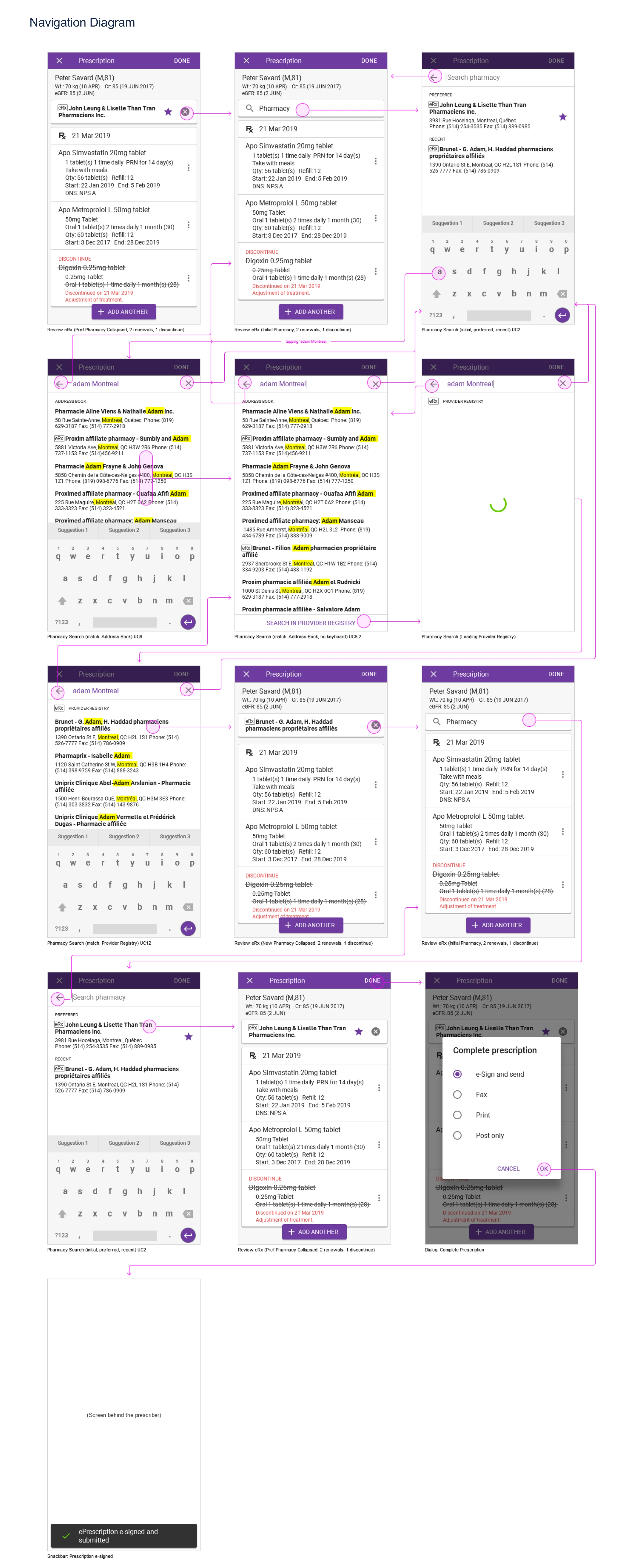
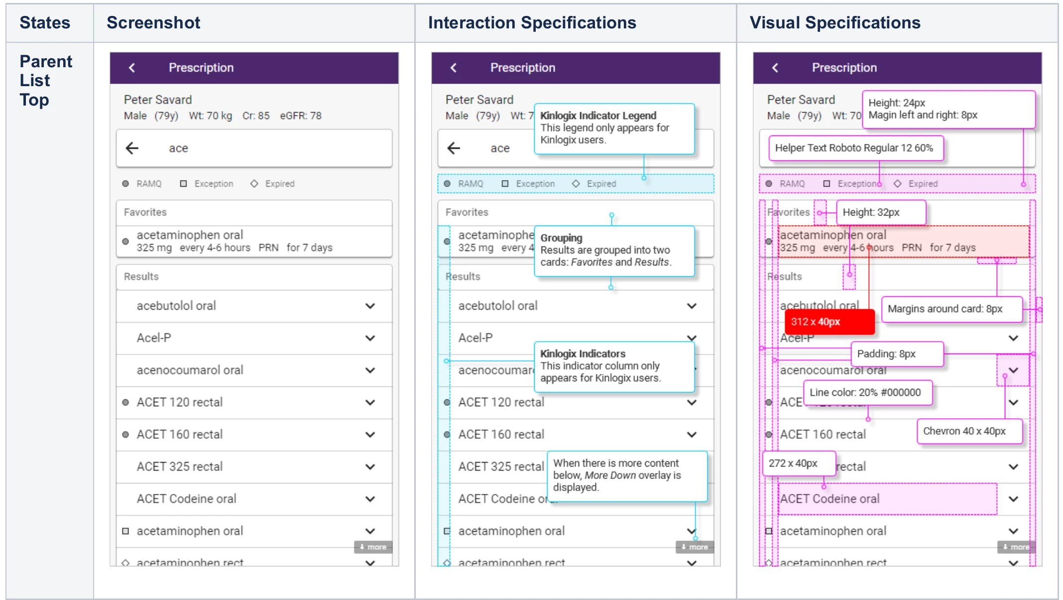
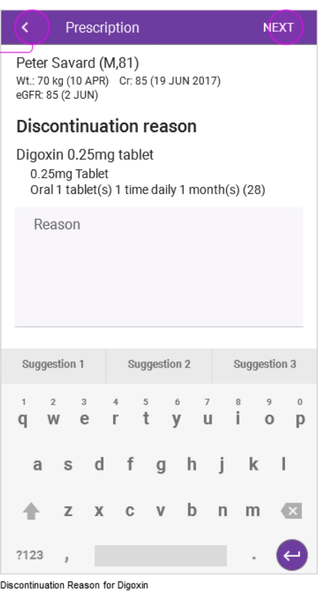
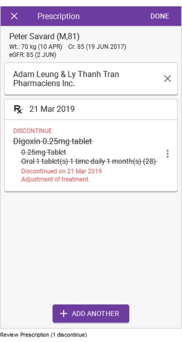
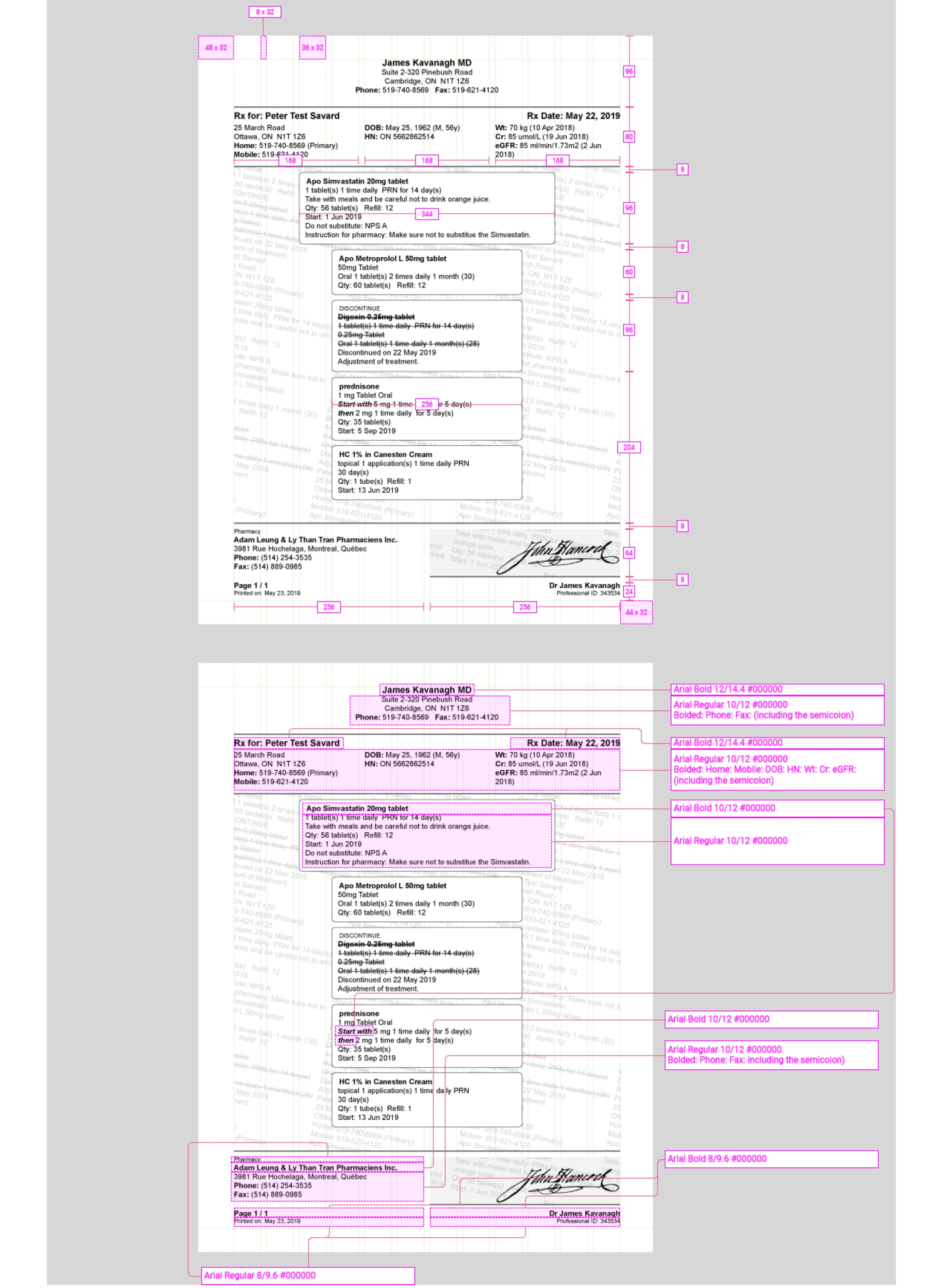
NextGen was TELUS Health’s mobile EMR: one prescriber-facing UI built on top of two acquired products with different data models — Kinlogix in Quebec, PS Suite in Ontario — with three more in the integration pipeline, plus the PrescribeIT® national service. The architectural job was to surface the differences where they mattered to the clinician and hide the seam where they didn’t. The module shipped; these eleven specifications are the design record.

II — Lab Reports
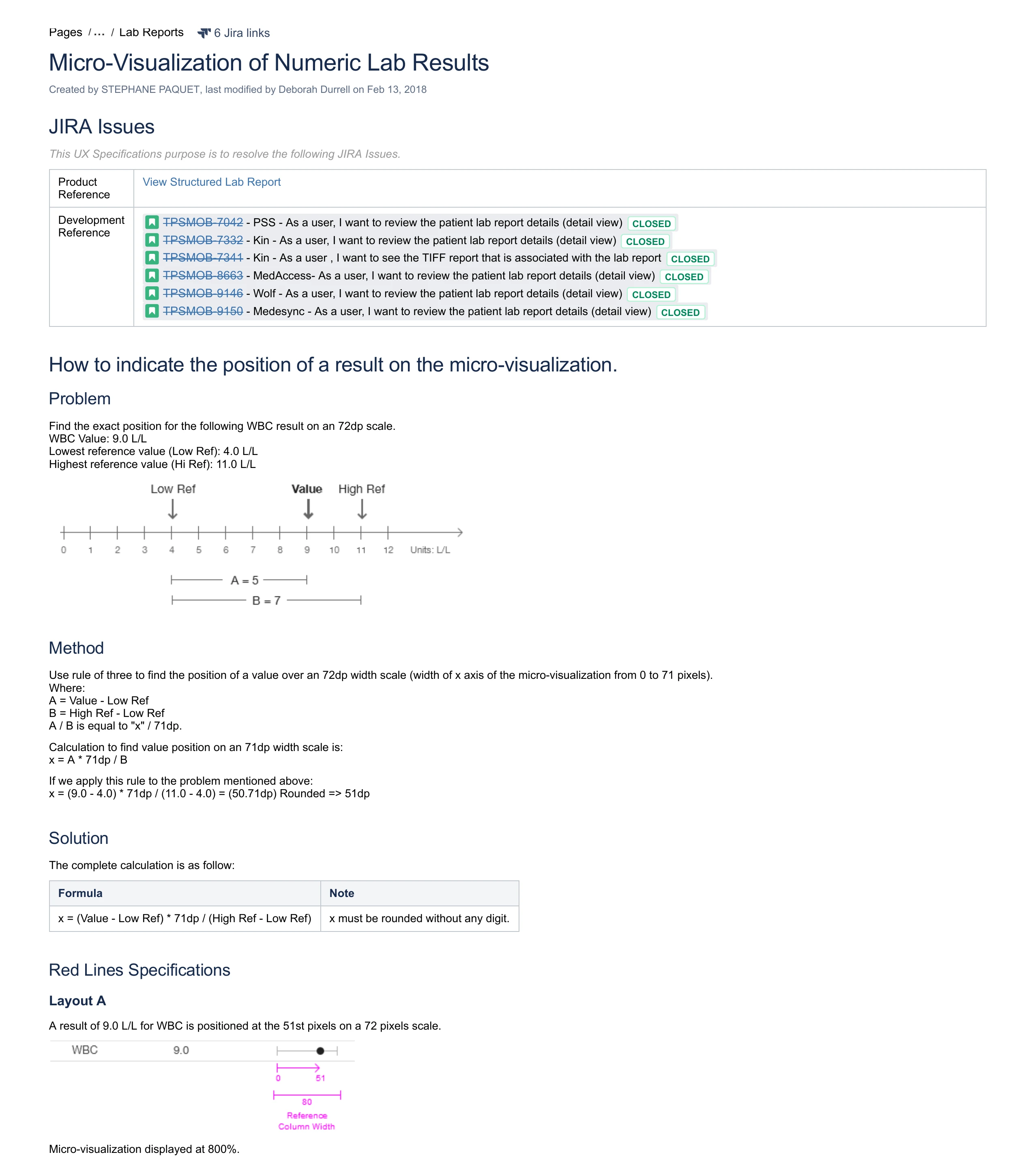
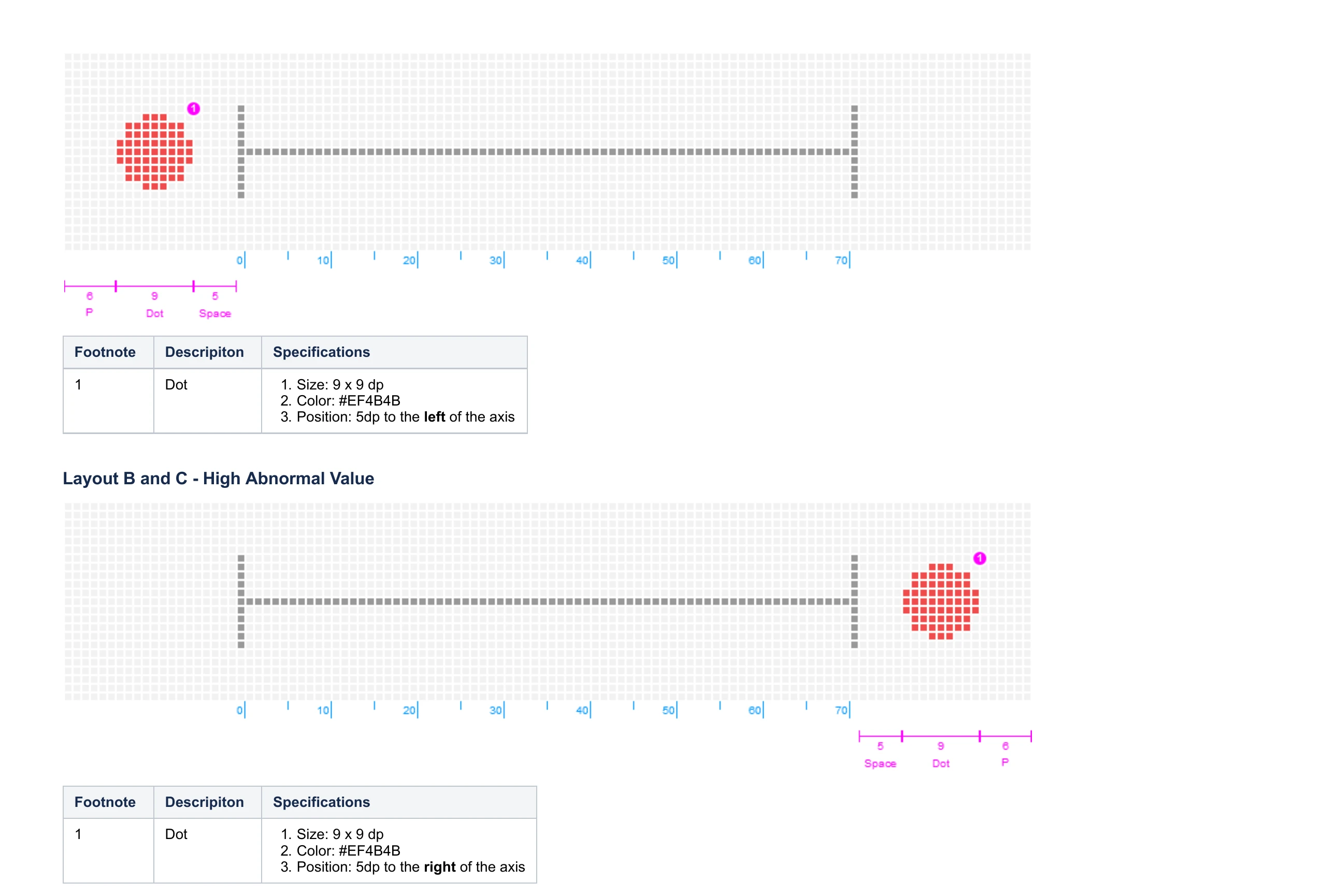
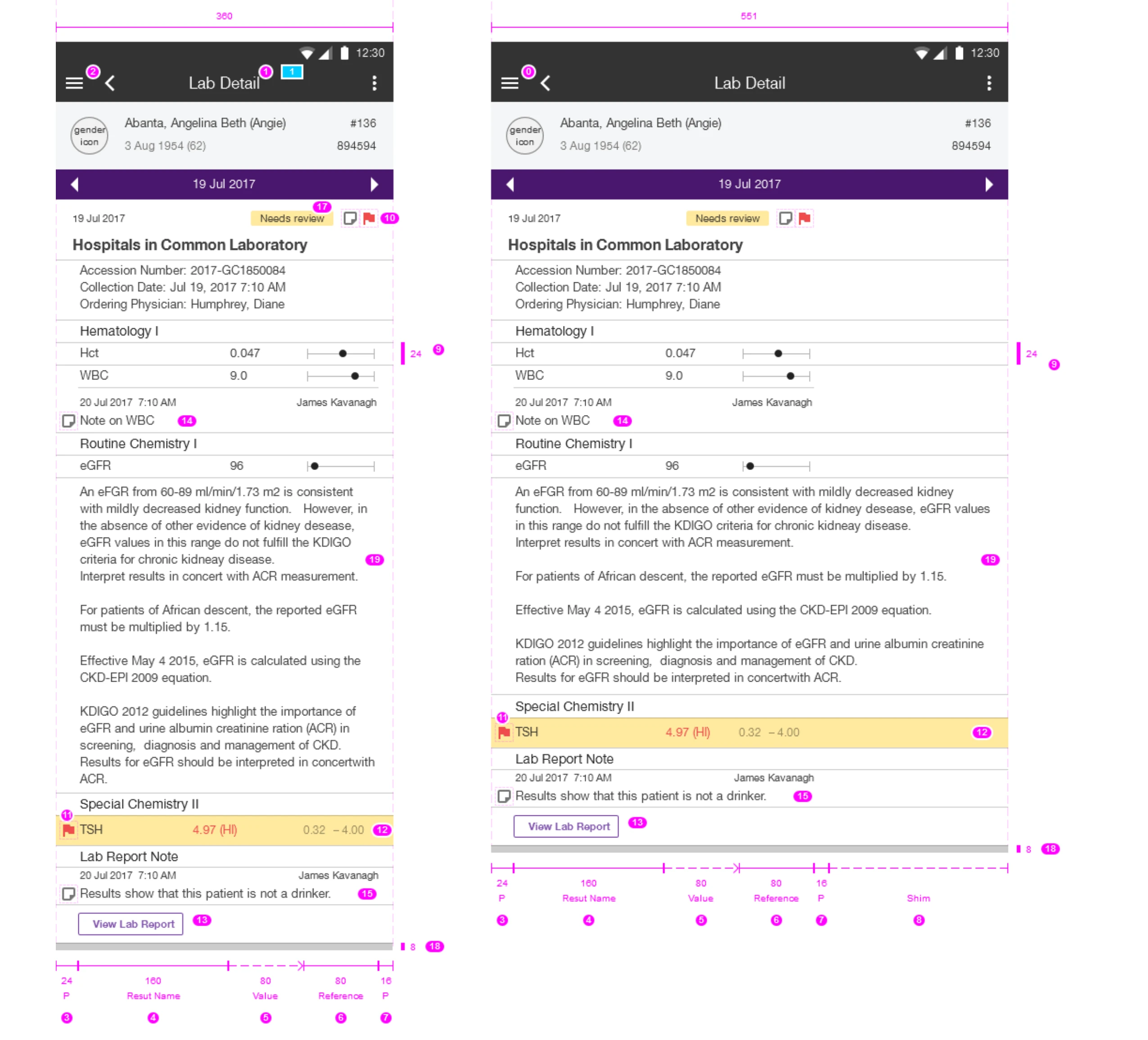
A clinician opens a lab report on a phone: twenty rows of numbers, and the job is to notice which values are abnormal, fast. The eye reads patterns, not digits — so a column of dots along a normal range beats a column of numbers. That choice raised one precise question: where exactly should the dot go?